A former set designer’s guide to making open shelving beautiful and functional, with shelf formulas, color tricks, safety notes, and real-life storage solu...
Havitza Home
7 Two-Tone Kitchen Cabinet Color Combinations That Work
Two-tone cabinets can make a kitchen feel taller, warmer, and more custom. These 7 foolproof color pairings (plus finish, sampling, and hardware tips) make the look easy to pull off.

Clara Jenkins
Clara Jenkins is a former theater set designer turned interior styling expert with over a decade of experience transforming everyday spaces into beautiful sanctuaries. Through her work at havitza.com, she shares practical styling tips, accessible furniture layouts, and inspiring color palettes to help anyone create a home they truly love.
Published October 17, 2026
Updated October 17, 2026
Two-tone kitchen cabinets are one of my favorite “set designer” tricks to borrow for real life. In theater, we used color blocking to control what the audience noticed first: height, depth, warmth, drama. In a kitchen, two tones can do the same thing, but with way more practicality. Lighter uppers can keep the room airy, deeper lowers can ground the space (and disguise everyday scuffs), and a thoughtful pairing can make even a builder-grade kitchen feel intentional.
If you’re staring at your cabinets and thinking, “I love the idea, but I don’t trust myself,” you’re in the right place. Below are seven combinations that work in everyday kitchens, plus the simple rules that keep two-tone from looking accidental.
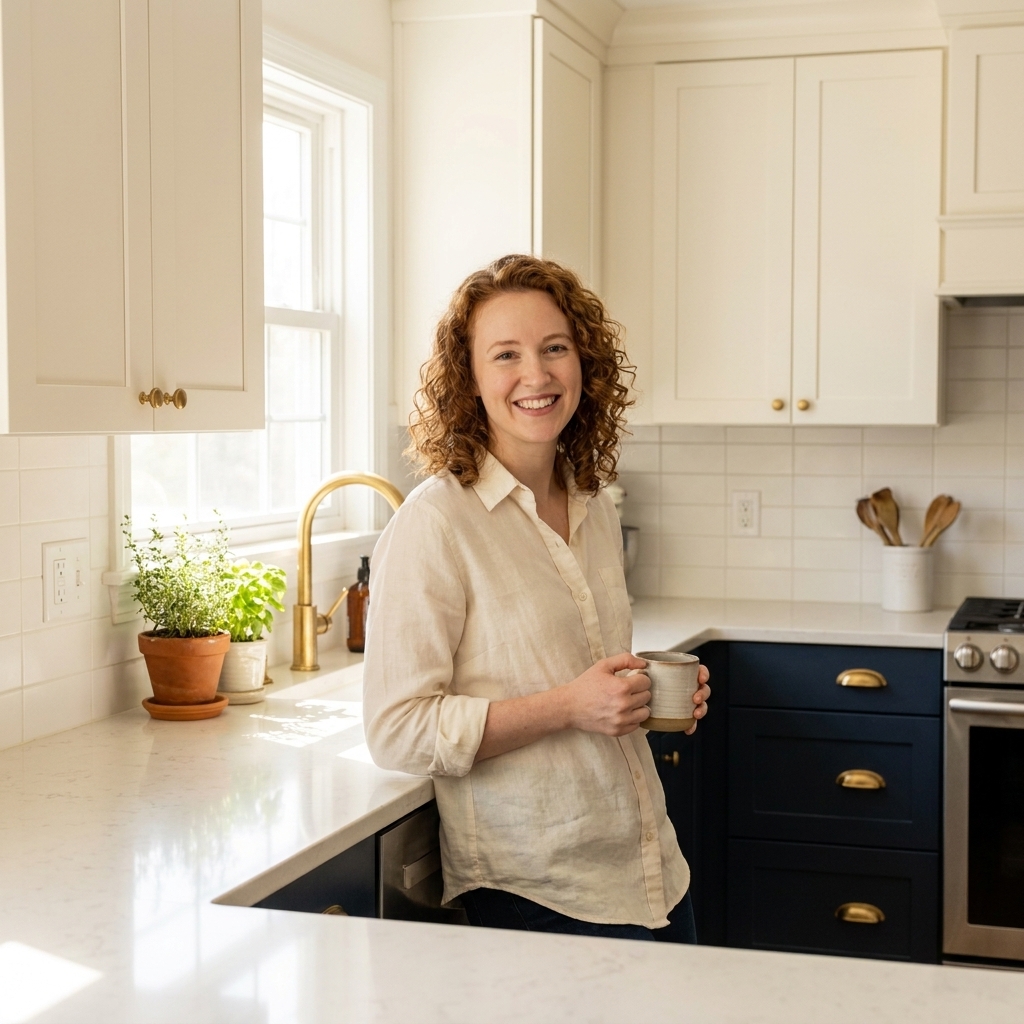
Before you pick colors: 5 easy rules
- Decide what you want to emphasize. Light uppers tend to make ceilings feel higher. Dark lowers tend to make a kitchen feel grounded and finished. If your kitchen is small or light-starved, keeping the lightest color up top is usually the safest move.
- Keep undertones friendly. Warm whites (creamy off-white) usually love warm woods, greige, and earthy greens. Crisp whites often play best with cool grays, navy, and blue-leaning greens.
- Let the countertop be the peacekeeper. Your counter sits between tones, so it should relate to both. White quartz is a great mediator. Busy granite can work, but it takes a little more care so your cabinets don’t start competing.
- Repeat each cabinet color at least once. Think: a rug that nods to the lower color, stools that echo the wood tone, or a piece of art that includes both shades. That small repetition is what makes the whole thing feel designed.
- For the easiest, most cohesive result, stick to one metal finish. Mixed metals can be beautiful (say, brass hardware with a matte black faucet), but keeping cabinet hardware consistent makes two-tone feel calm, not chaotic.
Quick planning tip: where to split
When the layout is straightforward, the “split” happens naturally at the countertop line: uppers are one color, lowers are the other. If your kitchen has tall pantry cabinets or a wall of full-height cabinetry, you have two clean options: make all tall cabinets match the lowers to anchor the room, or match them to the uppers to keep the wall feeling lighter. Pick the approach that supports your goal (grounded vs. airy), then keep that logic consistent.
Sampling and prep (the boring part that saves you)
Color is the fun decision. Durability is the decision you feel every day. Before you commit, paint large samples on poster board and move them around the kitchen in morning and evening light, right next to fixed finishes like flooring, backsplash, and countertops. If you’re DIY painting, degrease thoroughly, scuff sand, and use a bonding primer so your beautiful two-tone moment does not turn into a chipping situation.
1) Warm white uppers + natural oak lowers
This is the pairing I recommend when someone wants two-tone but also wants it to feel timeless. White up top reflects light and keeps things feeling clean. Oak down below adds warmth and texture, which is especially helpful in kitchens that feel a little stark.
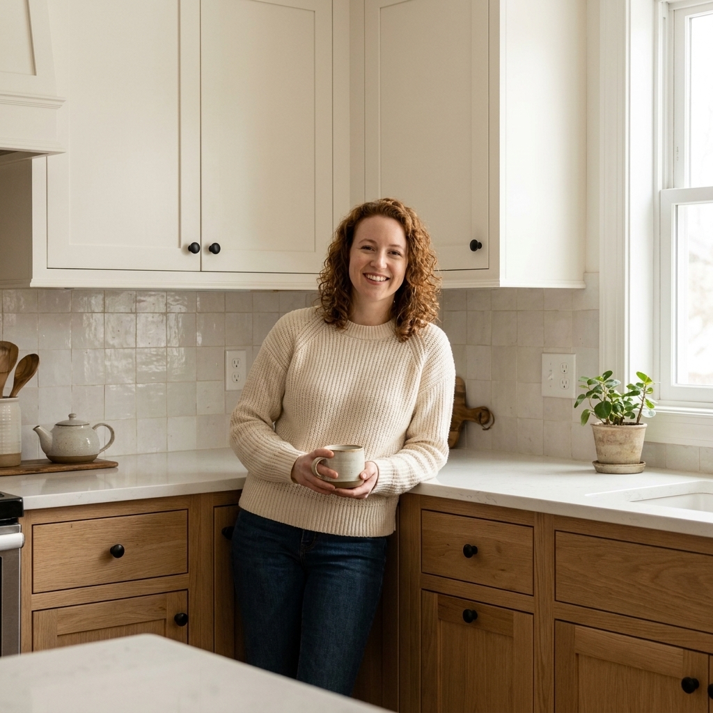
Why it works
- It reads bright but not cold.
- Wood grain adds movement so the kitchen feels styled even before you decorate.
- Oak’s grain can help disguise everyday wear, especially in mid-tone finishes.
Make it foolproof
- Choose an oak finish that relates to your floor undertone (for example, avoid pairing very orange oak with very pink floors).
- Use a soft, creamy white if your oak leans warm.
- Hardware: matte black for a modern edge, or brushed brass for warmth.
2) Crisp white uppers + charcoal lowers
If you want contrast that still feels classic, charcoal is the “little black dress” of lower cabinets. It’s dramatic without being as intense as pure black, and it plays nicely with most countertops.
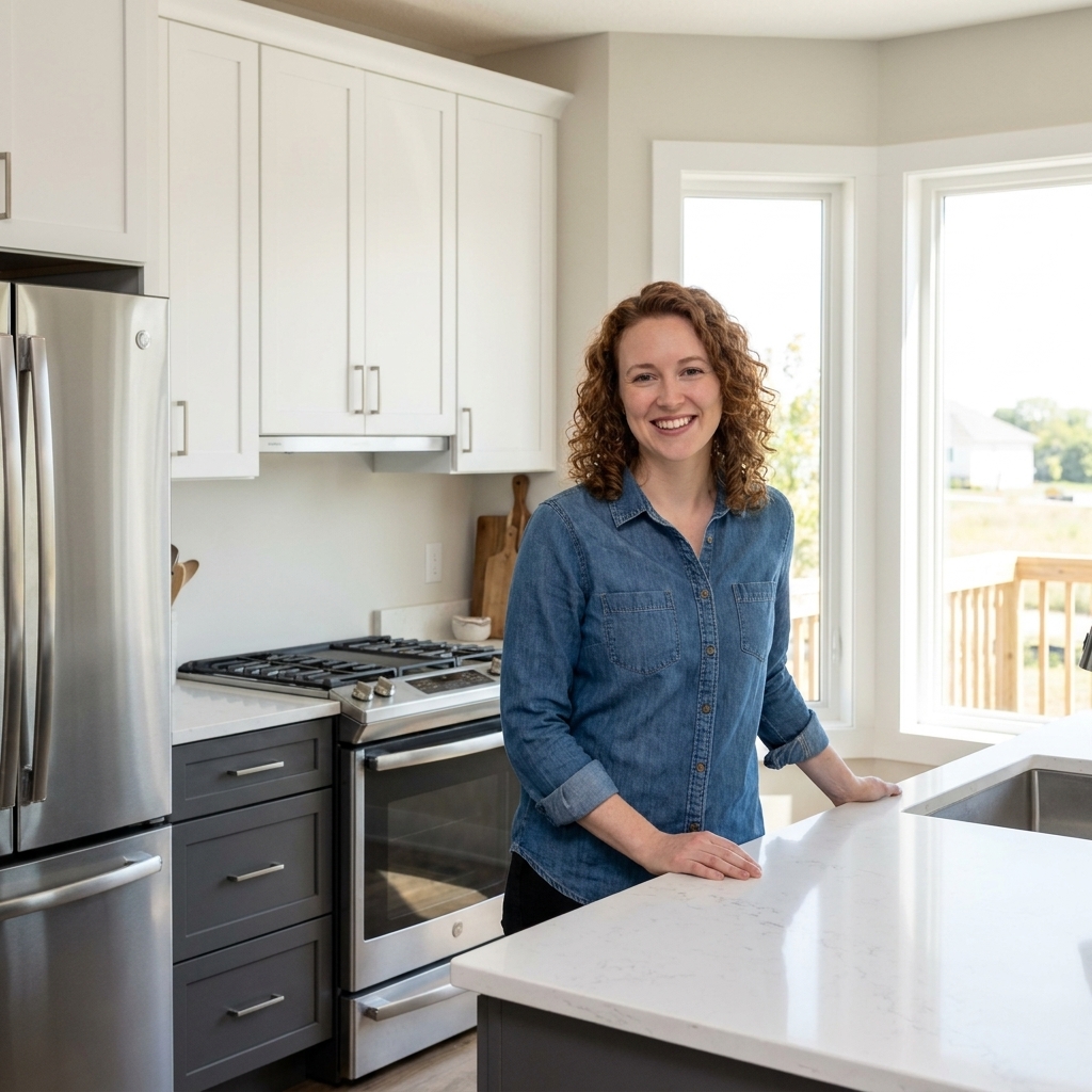
Why it works
- Charcoal often disguises scuffs and toe-kick marks better than lighter paint.
- White uppers help prevent the room from feeling heavy.
- It bridges modern and traditional styles easily.
Make it foolproof
- Pick a charcoal with a clear undertone (blue-leaning for cool spaces, brown-leaning for warm spaces).
- Add warmth through lighting. Bulbs in the 2700K to 3000K range typically make charcoal feel richer and less flat.
- One honest note: very dark paint can show dust and chips. A durable cabinet enamel and careful prep matter here.
3) Cream uppers + navy lowers
This is one of my all-time favorites for a kitchen that needs personality without feeling trendy. Cream keeps things soft and welcoming, while navy brings depth and that subtle, tailored drama.
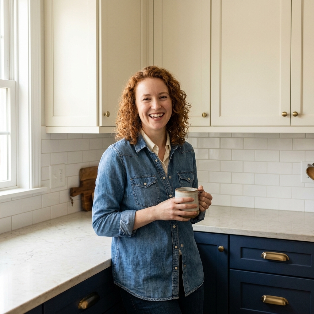
Why it works
- Navy feels bold but still like a near-neutral.
- Cream keeps the contrast from feeling harsh.
- Brass hardware looks especially good against navy.
Make it foolproof
- Choose a navy that is slightly muted (inky, not electric).
- Bring navy into the room again with a rug pattern or a couple of ceramics on open shelving.
- If your countertop has warm veining, cream uppers will usually look more harmonious than bright white.
4) Greige uppers + forest green lowers
Greige is the peacekeeper color for anyone stuck between warm and cool. Pair it with a deep green base and you get a kitchen that feels grounded, nature-inspired, and quietly expensive.
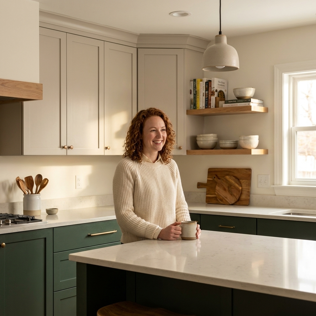
Why it works
- Green reads calming and classic when it’s deep and slightly muted.
- Greige keeps the uppers gentle so the green can be the hero.
- Works beautifully with wood floors and warm metals.
Make it foolproof
- Test greige paint next to your backsplash tile and countertop sample. Greige can swing pink, green, or taupe depending on what’s nearby.
- Hardware: aged brass or oil-rubbed bronze leans into the earthy vibe.
5) Pale sage uppers + warm white lowers
Yes, you can break the “light uppers, dark lowers” rule and put the color up top. If you want color but you’re nervous, a pale sage on uppers can read like a whisper of paint, especially in a bright kitchen. Keeping the lowers warm white helps the whole space stay airy and calm.
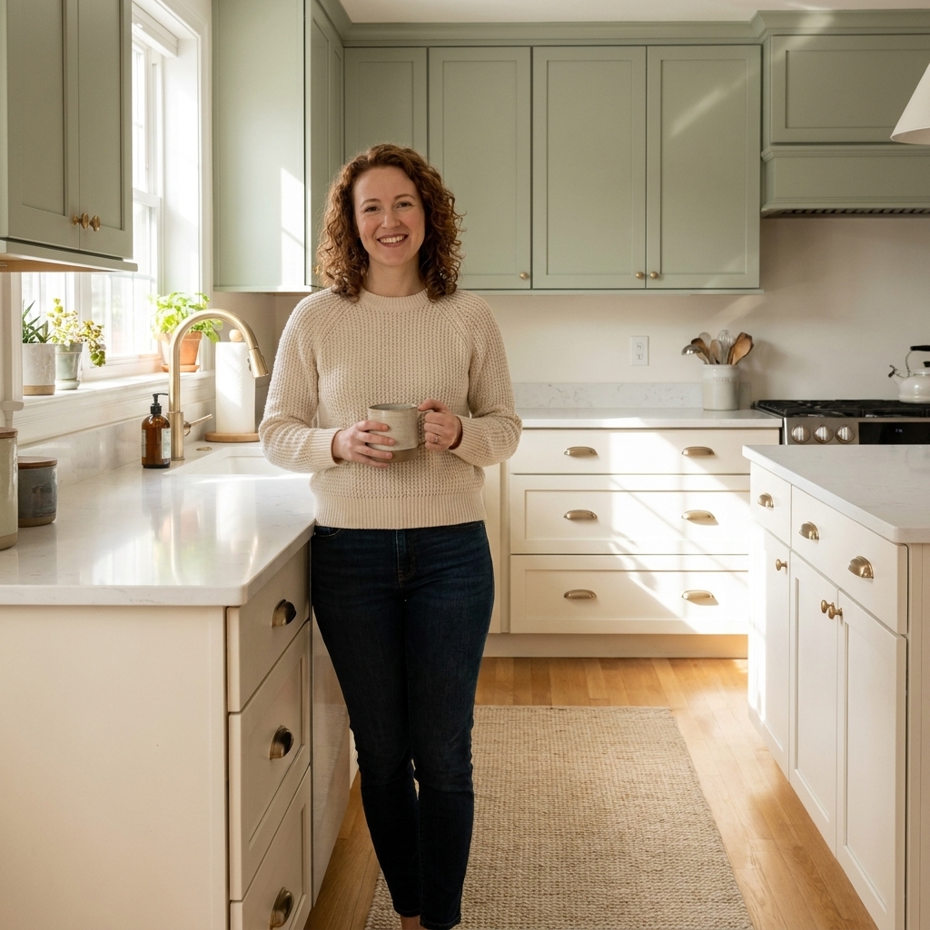
Why it works
- Upper color draws the eye up and adds charm without making the room feel smaller.
- Warm white lowers keep the kitchen feeling clean and cohesive.
- Sage plays well with both brass and black accents.
Make it foolproof
- Choose a sage that’s muted, not minty.
- Keep the backsplash simple (white tile or a quiet stone) so the upper color doesn’t fight visual clutter.
6) White uppers + soft black lowers
Black lowers can be stunning, but the magic word is soft. Think near-black: an inky black with a hint of warmth or blue. Paired with white uppers, it looks architectural and crisp.
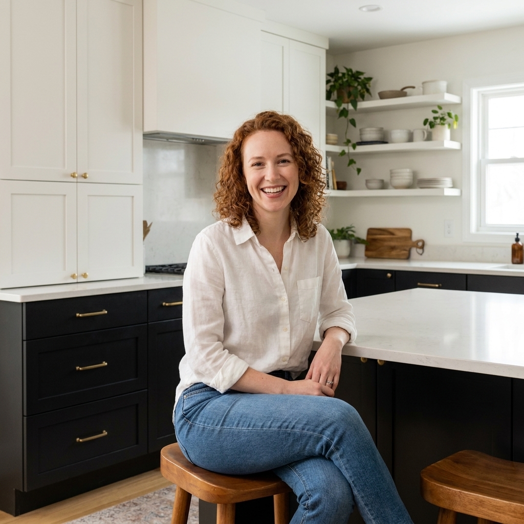
Why it works
- It’s high contrast and graphic, which can feel clean and modern.
- Lower cabinets take more daily wear, and darker paint can be more forgiving of smudges and scuffs.
- White uppers help keep the room from feeling boxed in.
Make it foolproof
- Break up the contrast with a warm element: wood shelves, a vintage runner, or woven pendants.
- Pick a countertop with warmth (soft white with creamy veining) if you want the kitchen to feel less stark.
7) Dusty blue uppers + putty beige lowers
If you love a collected, slightly vintage look, this pairing is quietly magical. Dusty blue feels gentle and nostalgic. Putty beige adds warmth and looks especially pretty with handmade-feeling tile and vintage-inspired lighting.
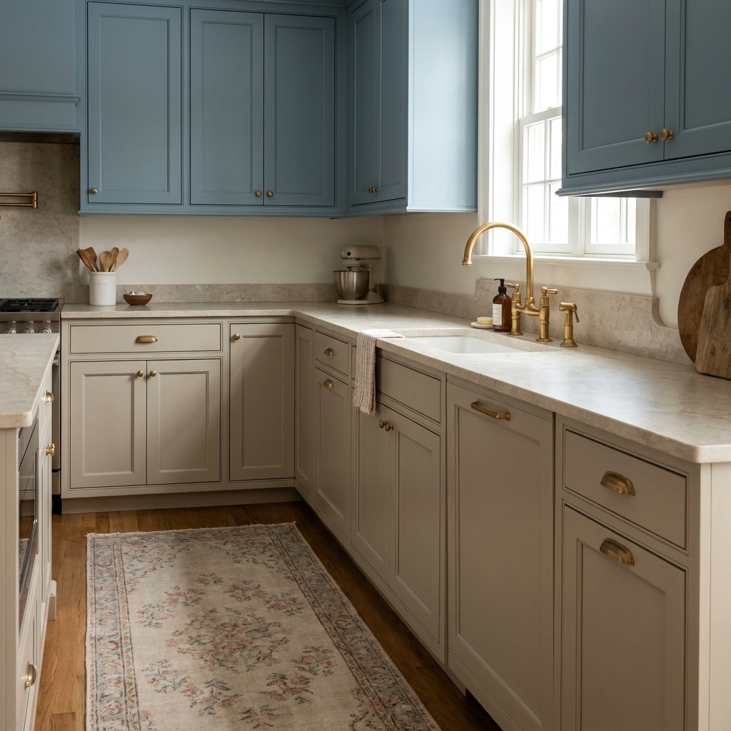
Why it works
- Both colors are muted, so the kitchen feels calm, not busy.
- It flatters a range of finishes: brass, nickel, even unlacquered brass.
- It brings character without needing a full renovation.
Make it foolproof
- Keep one element consistent across both zones (same door style, same hardware, same sheen).
- Use warm lighting to bring out the cozy undertones in beige and soften the blue.
Two-tone placement ideas
If your kitchen layout is a little quirky, here are a few placement options I use when styling real homes.
- Island in the darker color. A white perimeter with a navy or green island is a classic for a reason.
- Tall pantry cabinets in the darker color. This can make them feel like a furniture piece and visually anchor one wall.
- Window wall in the lighter color. Keeping the cabinetry around a window light helps that area feel bright and open.
- Glass-front uppers in the lighter color. Great if you want a visual break without introducing a third color.
Hardware, counters, and backsplash cheats
Hardware
- Brass: best with navy, forest green, cream, greige, and beige.
- Matte black: best with white, oak, sage, dusty blue, and charcoal.
- Polished nickel or chrome: best with crisp whites, charcoals, and blues for a clean, tailored look.
Countertops
- Bright white quartz: a safe bet with high-contrast two-tone schemes.
- Warm white or creamy quartz: ideal with cream, beige, greige, and warm woods.
- Butcher block: gorgeous with white uppers and colored lowers, but commit to maintenance and sealing.
Backsplash
- If your cabinets are high contrast, keep the backsplash simple and quiet.
- If your cabinet colors are both muted, you can play more with tile texture (zellige-style, handmade-feeling, soft stone).
Two-tone cabinet FAQ
Should uppers always be lighter than lowers?
No, but it’s often the easiest way to keep the room feeling open. If you put color on uppers, keep it light and muted (pale sage, dusty blue) and balance it with a calmer neutral below so the kitchen still feels steady.
What sheen is best for kitchen cabinets?
Most kitchens do best with a durable finish in satin or semi-gloss, depending on the paint line and how much shine you like. Satin tends to feel a little more modern and forgiving, while semi-gloss wipes clean beautifully but shows more surface texture.
How do I keep two-tone from looking busy?
Limit yourself to two cabinet colors plus one main metal finish. Then let your countertop and backsplash be the calm connector between them. Repeating each cabinet color somewhere else in the room (a rug, stools, art) is the final “this was on purpose” touch.
A final styling tip from theater
In set design, we’d step back and squint to check the big shapes first. Do the same in your kitchen. Stand in the doorway and look at your cabinets as two large blocks of color. If one block feels too loud or too heavy, soften it with a warmer white, a more muted shade, or a countertop that bridges the gap. Two-tone works when the whole room feels like one scene, not two competing sets.