Havitza Home
Color Palettes & Paint
Expert advice on choosing the perfect hues, understanding color theory, and creating cohesive palettes for your living spaces.

Choosing White Paint by Undertone
White paint looks simple until it’s on your walls and suddenly reads pink, blue, dingy, or stark. I learned this the hard way moving from theater sets to real homes: on stage, you control the light. In a living room with north-facing windows, honey oak floors, and a navy sofa, the “perfect white”...
Read more →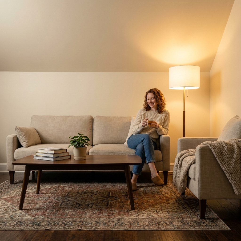
Should You Paint Your Ceiling?
Ceilings are easy to overlook, even though they do a quiet amount of work in how a room feels. In theater, we treated the overhead plane like part of the story. It could compress a scene into intimacy or open it into airiness with a single color shift and a lighting cue. In real homes, we do not...
Read more →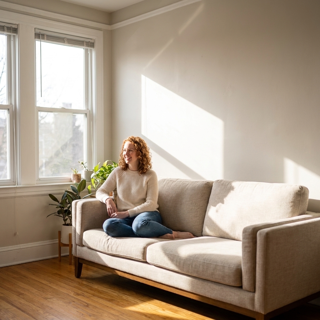
Choose Paint Colors by Natural Light
In theater, we never chose paint under the wrong lights. A backdrop that looked moody and romantic at rehearsal could turn sickly green once the stage lighting warmed up. Homes are the same, just with sunlight instead of spotlights. Your room’s natural light is the “lighting designer,” and it can...
Read more →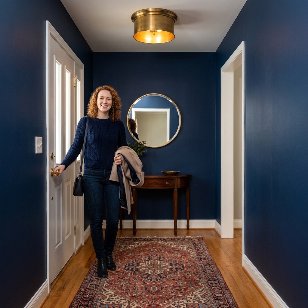
Welcoming Entryway Paint Colors
Your entryway is your opening scene. In theater, we called it the first reveal, the moment the audience knows what kind of story they are walking into. At home, paint can do that job faster than a console table ever could. The right color can make a narrow hall feel gracious, a dark foyer feel...
Read more →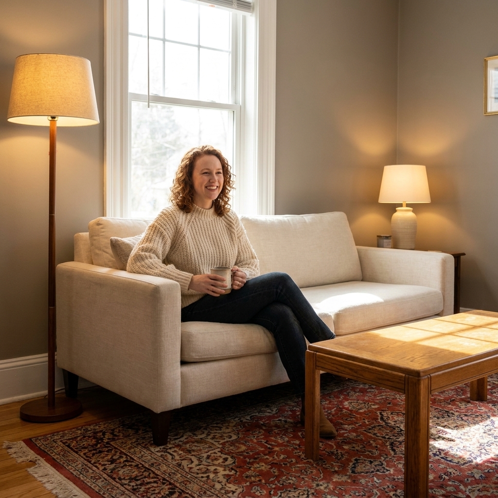
Color Psychology in Design: Choose Hues for the Mood You Want
When I was designing theater sets, color was never “just paint.” It was a cue. A mood shift. A silent character. In a living room or bedroom, it works the same way, just with fewer spotlights and more laundry baskets. Color psychology is not magic, and it is not one-size-fits-all. But it is useful....
Read more →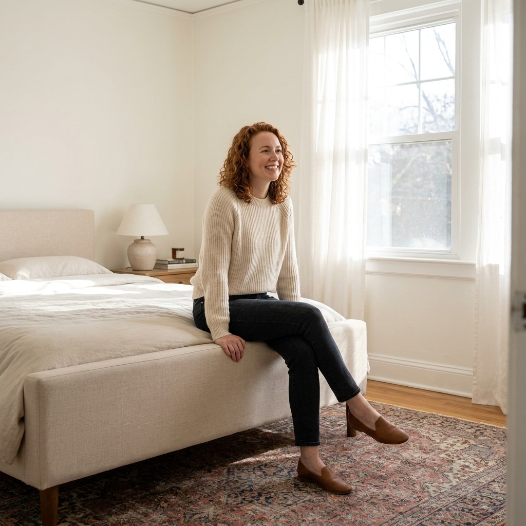
Paint Colors That Make a Small Bedroom Look Bigger
When a bedroom is short on square footage, paint becomes your most powerful optical tool. In theater, we used color to push a “wall” back or pull focus forward without moving a single flat. Your bedroom works the same way. The best paint colors for a small bedroom are the ones that bounce light ,...
Read more →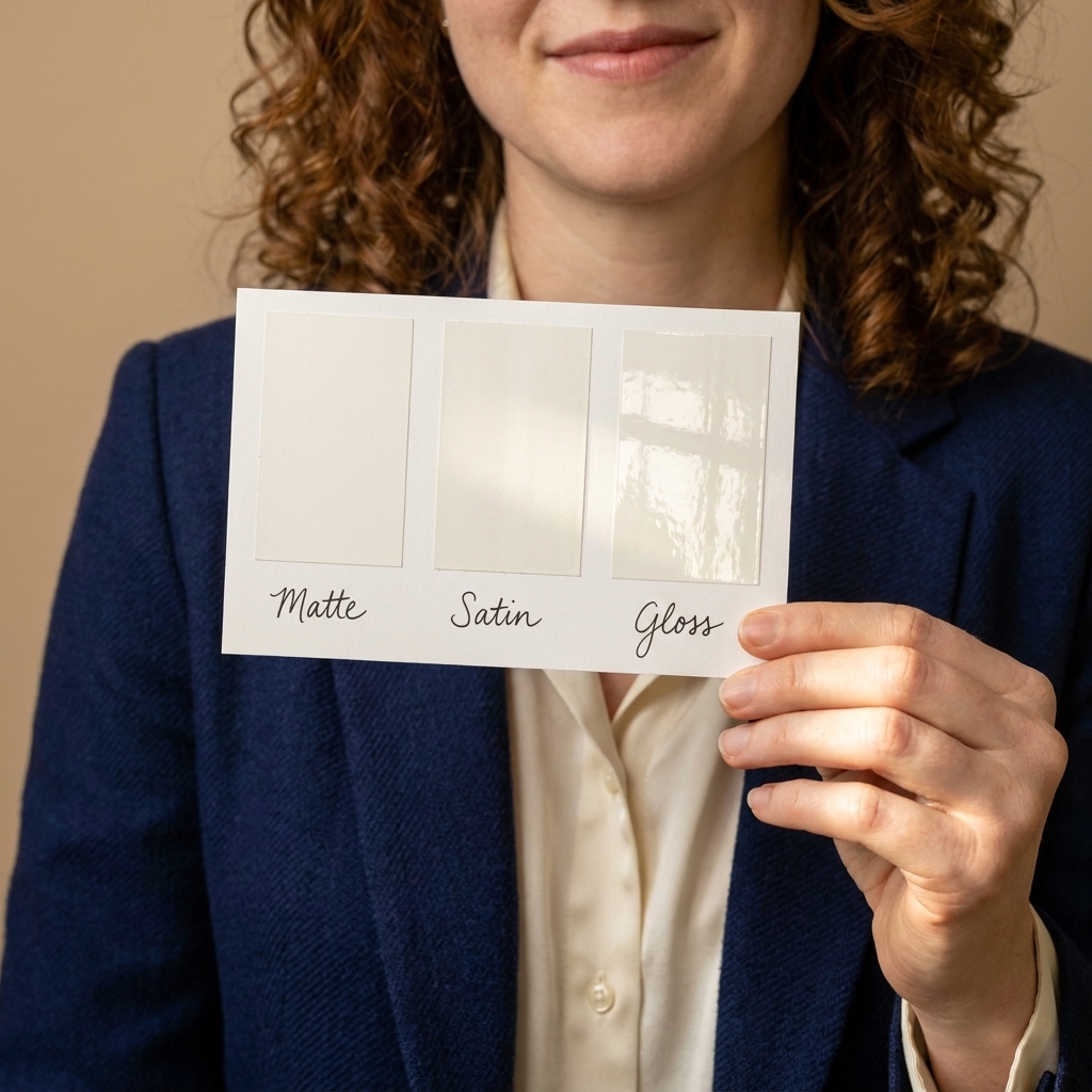
Matte vs. Satin vs. Gloss Paint Finishes
Paint color gets all the attention, but finish is what you feel every day. It decides whether your walls look velvety or shiny, whether scuffs wipe away easily, and whether that slightly wavy drywall disappears into the background or gets spotlighted at 3 p.m. when the sun hits just right. I am...
Read more →
Master the 60-30-10 Color Rule
In theater, color is often how you guide the audience’s feelings before a single actor speaks. In a home, it works in a similar way. The difference is you have to live in the scene every day, so the palette needs to feel steady, functional, and genuinely you. The 60-30-10 color rule is one of my...
Read more →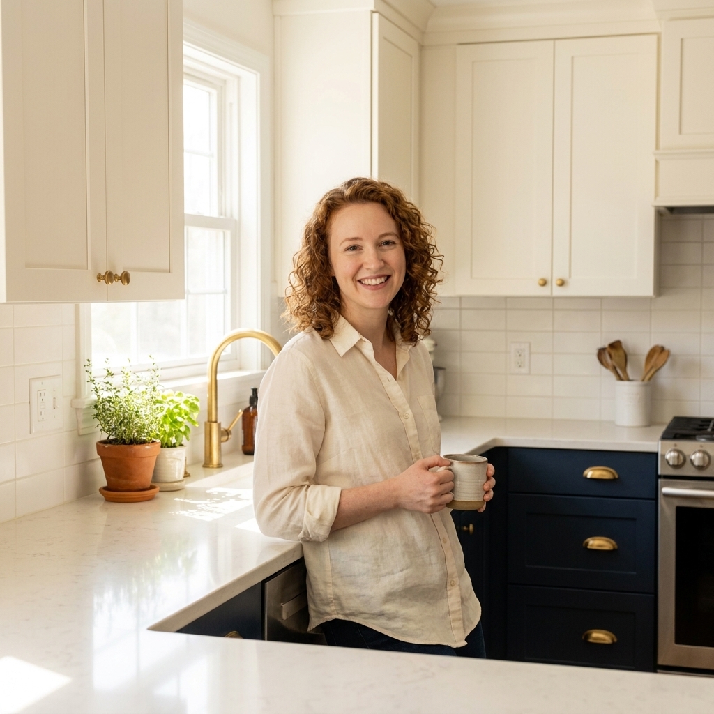
7 Two-Tone Kitchen Cabinet Color Combinations That Work
Two-tone kitchen cabinets are one of my favorite “set designer” tricks to borrow for real life. In theater, we used color blocking to control what the audience noticed first: height, depth, warmth, drama. In a kitchen, two tones can do the same thing, but with way more practicality. Lighter uppers...
Read more →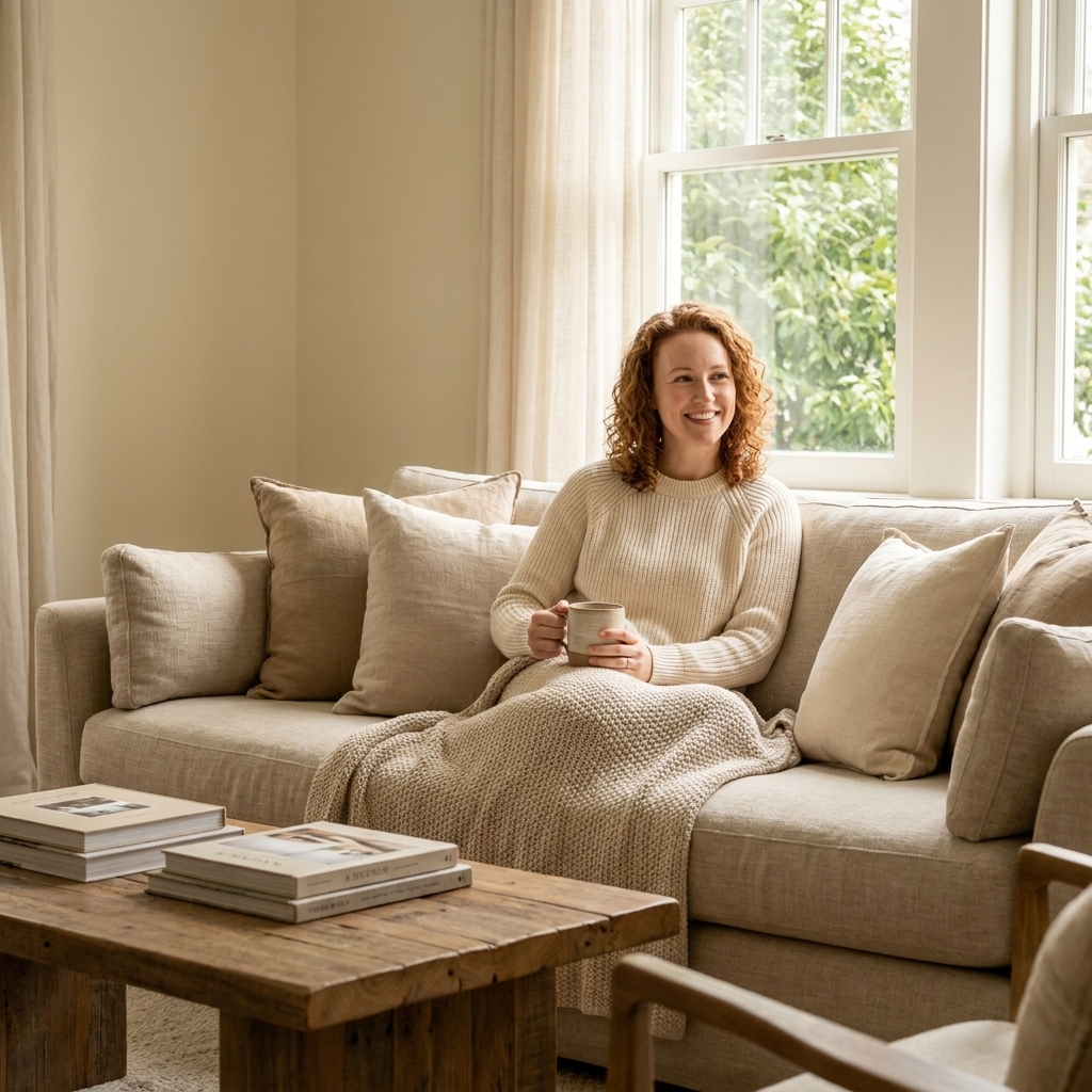
10 Cozy Living Room Color Palettes That Feel Instantly Inviting
If there is one thing my theater years taught me, it is this: color is a shortcut to emotion. A living room can be perfectly furnished and still feel a little “off” until the palette clicks. The good news is you do not need a designer budget to get that cozy, inviting feeling. You need harmony, a...
Read more →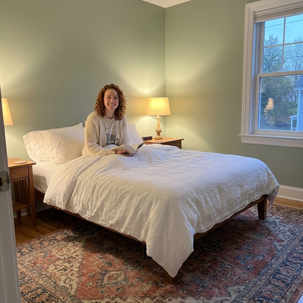
7 Calming Bedroom Color Palettes That Promote Better Sleep
In theater, color is never just “pretty.” It shapes mood, rhythm, and perception. A set painted one shade cooler can make a scene feel lonelier. A warmer wash of light can soften an entire story. Your bedroom works the same way, just with pajamas instead of props. If you are chasing better sleep,...
Read more →