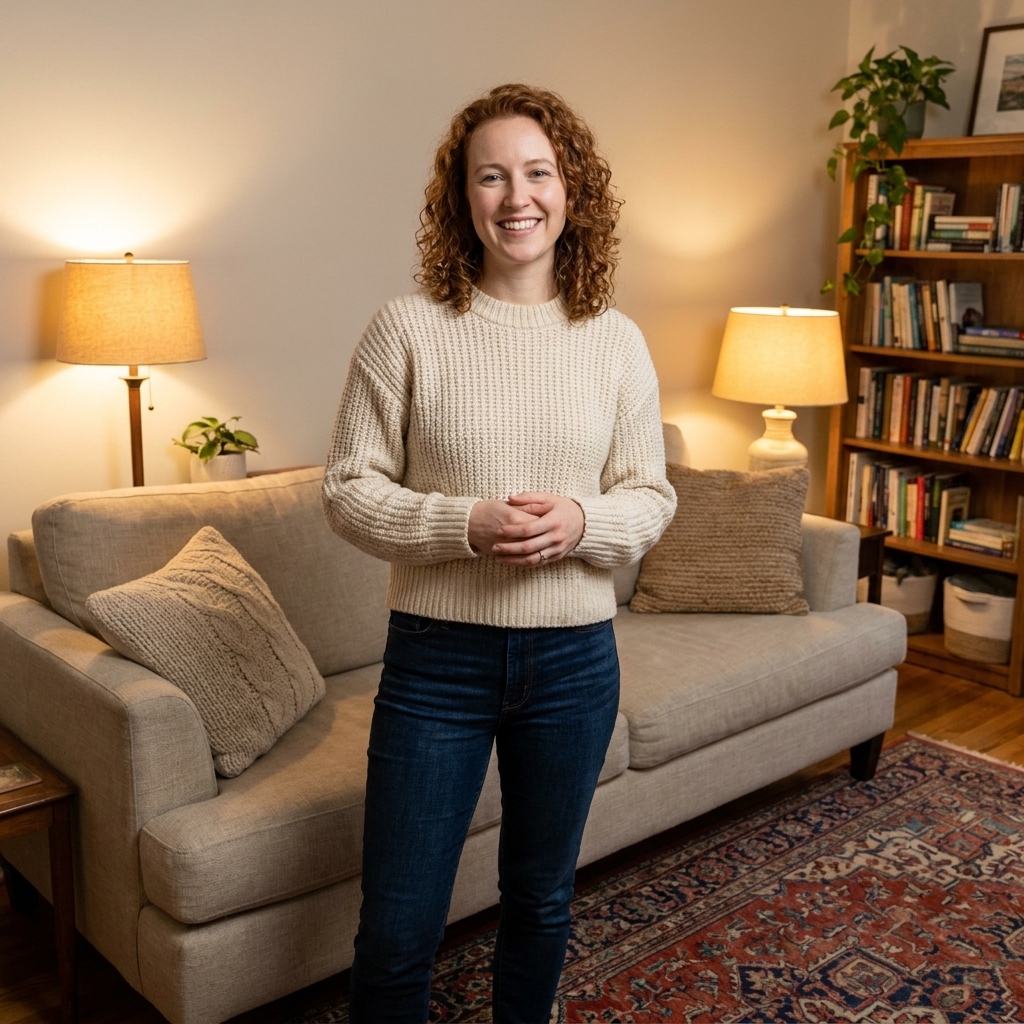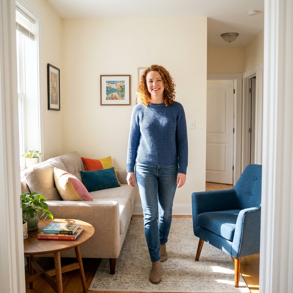
A step-by-step method for placing sofas, chairs, and tables in compact living rooms so you get clear walkways, cozy conversation zones, and a bigger-feeling ...
Havitza Home
10 Cozy Living Room Color Palettes That Feel Instantly Inviting
Discover 10 cozy living room color palettes with specific paint shade ideas, undertone tips, and furniture pairings to create a warm, welcoming space.

Clara Jenkins
Clara Jenkins is a former theater set designer turned interior styling expert with over a decade of experience transforming everyday spaces into beautiful sanctuaries. Through her work at havitza.com, she shares practical styling tips, accessible furniture layouts, and inspiring color palettes to help anyone create a home they truly love.
Published October 17, 2026
Updated October 17, 2026
If there is one thing my theater years taught me, it is this: color is a shortcut to emotion. A living room can be perfectly furnished and still feel a little “off” until the palette clicks. The good news is you do not need a designer budget to get that cozy, inviting feeling. You need harmony, a few reliable undertones, and lighting that makes your space feel like it is exhaling with you.
Below are 10 color palettes I keep seeing in real homes (and saving on my own mood boards), each with specific paint shades and practical furniture pairings so you can picture it in your space right now.
How to use these palettes
Before we jump in, here is my quick set-designer trick for making any palette feel intentional:
- Pick a lead color: Usually the wall color or the largest rug.
- Choose a supporting neutral: Upholstery, curtains, or a big chair in a calm tone.
- Add one “spark” color: Pillows, art, a throw, or a single accent chair.
- Repeat each color 2 to 3 times: That repetition is what reads as “designed,” not accidental.
Work with what is fixed first: Floors, a stone fireplace, kitchen cabinets in an open concept space, and large built-ins are not going anywhere. Use them as your starting point, then pick paint and textiles that share their undertones.
Let your light decide the undertone: North-facing rooms often read cooler and can make warm colors look a touch grayer. South-facing rooms pull warm and can make creams look richer (and some beiges look more yellow). Either way, test a sample on two walls and live with it for a full day.
Quick paint finish guidance: For most living room walls, matte or eggshell looks soft and forgiving. Save satin or semi-gloss for trim if you want wipeable edges and a little definition.
If you rent or you are not ready to paint, you can still borrow these palettes through a rug, curtains, and a few grounded accessories.
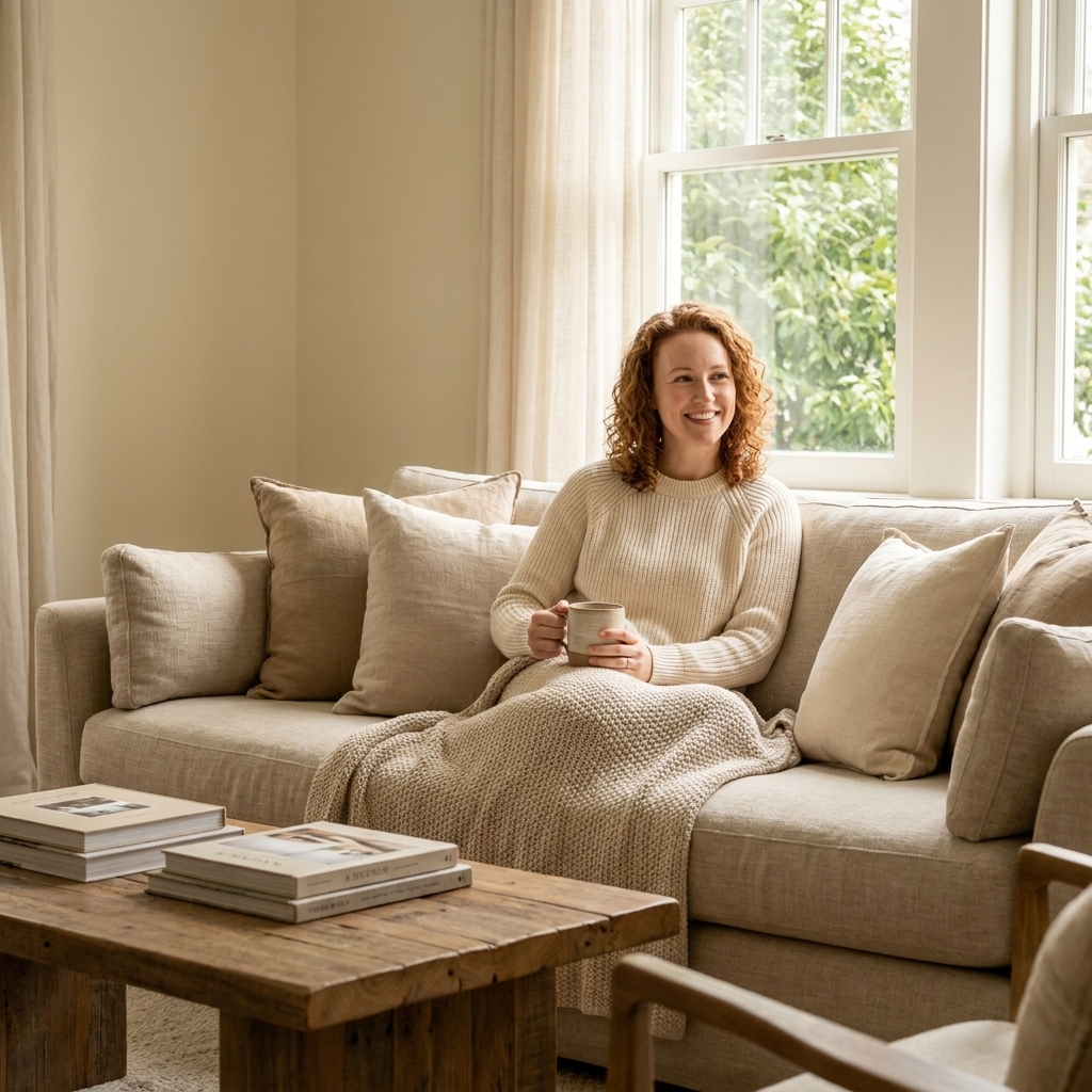
1) Warm White + Honey Oak
This is cozy minimalism at its best: bright enough for daytime, warm enough at night, and it makes vintage pieces look collected instead of cluttered.
Paint shades to try
- Benjamin Moore: White Dove (OC-17)
- Sherwin-Williams: Alabaster (SW 7008)
- Farrow & Ball: School House White (No. 291)
Furniture and finishes that pair well
- Sofa: Cream bouclé or oatmeal linen
- Wood: White oak, ash, or maple in a warm matte finish
- Contrast: A soft black coffee table, picture frames, or a black floor lamp
- Textiles: Nubby throws, chunky knits, and a vintage-inspired neutral rug
Clara tip: Use warm bulbs (around 2700K) and suddenly the “white” reads warmer and creamier, not like a waiting room.
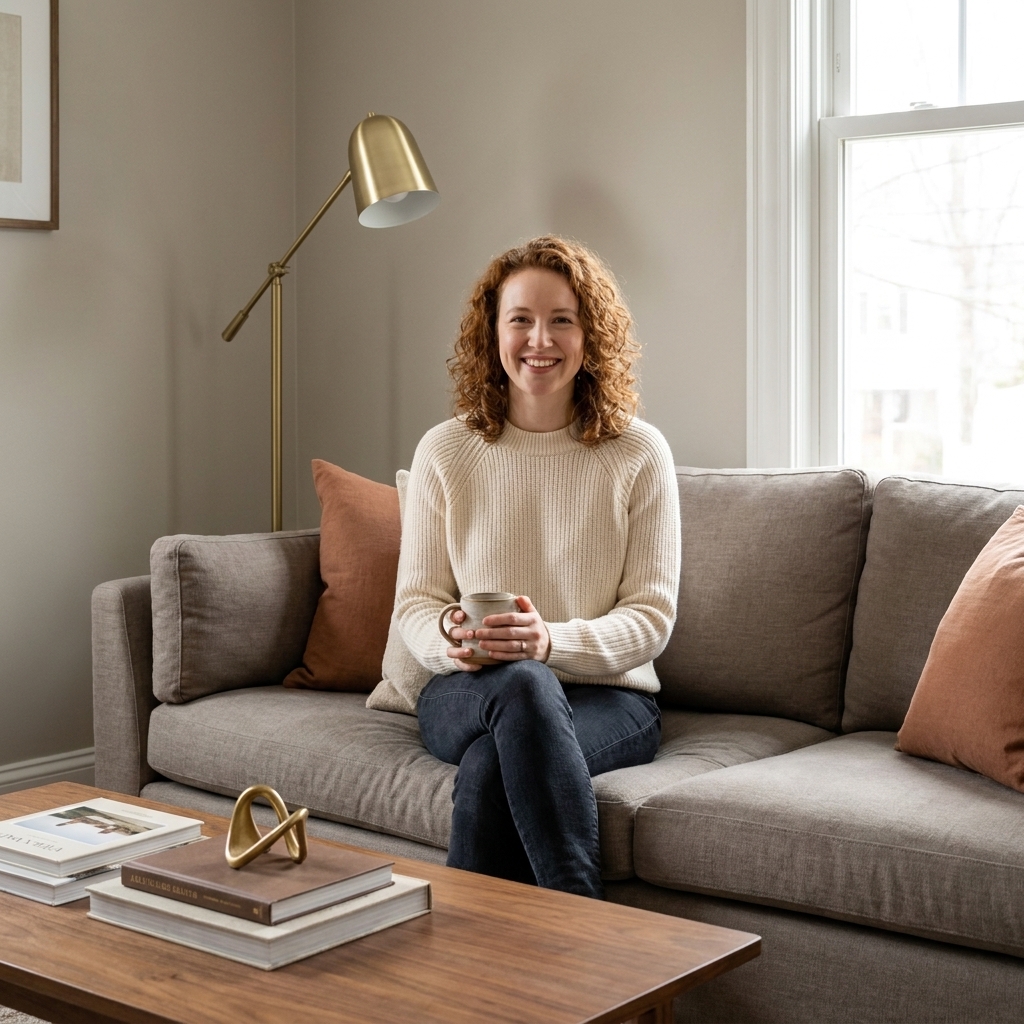
2) Greige + Clay + Brass
If you want a living room that feels calm but not bland, greige is the dependable base and clay brings the soul. This palette plays especially well with tactile fabrics and curved silhouettes.
Paint shades to try
- Benjamin Moore: Edgecomb Gray (HC-173)
- Sherwin-Williams: Agreeable Gray (SW 7029)
- Sherwin-Williams: Redend Point (SW 9081) for the clay accent
Furniture and finishes that pair well
- Sofa: Warm gray performance fabric or a slipcovered linen blend
- Accent: Clay velvet pillows, a terracotta lamp, or a rust-toned throw
- Metal: Brushed brass side tables or a brass picture light
- Wood: Walnut or medium oak to keep it grounded
3) Moody Green + Walnut
This palette is pure “curl up with a book” energy. Deep greens are dramatic, but when you soften them with creamy upholstery and walnut, the room feels like a library lounge rather than a cave.
Paint shades to try
- Benjamin Moore: Essex Green (HC-188)
- Sherwin-Williams: Ripe Olive (SW 6209)
- Farrow & Ball: Calke Green (No. 34)
Furniture and finishes that pair well
- Sofa: Cream or camel, ideally in a textured weave
- Wood: Walnut coffee table, dark-stained bookcase, or vintage credenza
- Accent colors: A little cognac leather, antique gold frames, and soft ivory curtains
- Rug: Vintage Persian-style with muted reds and ink blues (my weakness)
Clara tip: Dark paint changes all day. Test a sample in your light for 24 hours, then decide. If you are nervous, paint just the built-ins or the wall behind the sofa first. Green is surprisingly forgiving.
4) Dusty Blue + Linen
Dusty blues make a living room feel airy but still intimate, like a quiet seaside rental where you actually sleep well. The key is avoiding icy undertones and warming it back up with linen and creamy whites.
Paint shades to try
- Benjamin Moore: Smoke (2122-40)
- Sherwin-Williams: Silver Strand (SW 7057)
- Farrow & Ball: Light Blue (No. 22)
Furniture and finishes that pair well
- Sofa: Natural linen or a relaxed off-white slipcover
- Accent: Blue-gray pillows in mixed patterns, like stripes plus a small-scale floral
- Wood: Light oak or painted wood in warm white
- Texture: Jute rug or a flatwoven wool rug with soft blue threads
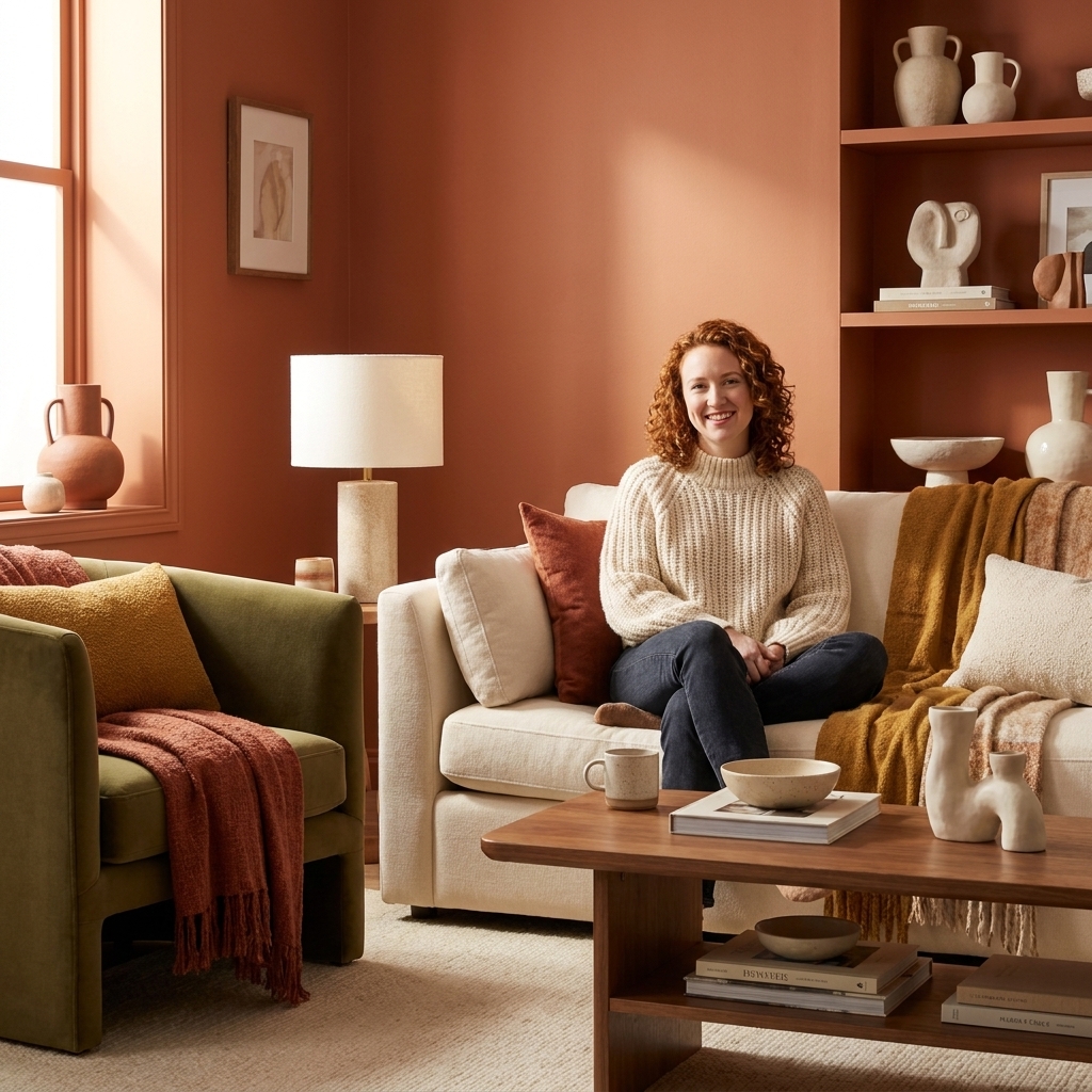
5) Terracotta + Olive
If you want cozy without going dark, terracotta is your friend. It reads warm and flattering in almost every light, especially paired with creamy neutrals and a whisper of olive.
Paint shades to try
- Benjamin Moore: Terra Cotta Tile (2090-30)
- Sherwin-Williams: Cavern Clay (SW 7701)
- Farrow & Ball: Red Earth (No. 64)
Furniture and finishes that pair well
- Sofa: Cream, oatmeal, or warm beige
- Accent: Olive green velvet chair or olive pillows
- Materials: Woven baskets, ceramic lamps, and matte black hardware
- Art: Abstract pieces with warm rust and soft pink undertones
6) Taupe + Soft Pink
This is the palette I recommend when someone says, “I want cozy, but I do not want brown-on-brown.” Mushroom taupe has depth without heaviness, and soft blush brings warmth that feels modern, not sugary.
Paint shades to try
- Benjamin Moore: Pashmina (AF-100)
- Sherwin-Williams: Accessible Beige (SW 7036)
- Farrow & Ball: Skimming Stone (No. 241)
Furniture and finishes that pair well
- Sofa: Taupe, stone, or warm gray
- Accent: Blush pillows, a dusty rose throw, or pink-toned artwork
- Metal: Aged brass floor lamp or curtain rod
- Rug: Vintage rug with faded rose and camel tones
Clara tip: Keep the pink whisper-level. Think one chair or two pillows, not a full matching set.
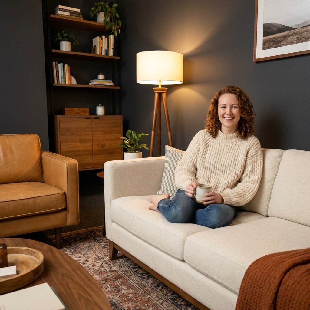
7) Charcoal + Camel
For anyone who loves contrast but still wants the room to feel welcoming, this palette is the sweet spot. Charcoal adds structure, camel adds warmth, and ivory keeps it from turning heavy.
Paint shades to try
- Benjamin Moore: Kendall Charcoal (HC-166)
- Sherwin-Williams: Peppercorn (SW 7674)
- Farrow & Ball: Down Pipe (No. 26)
Furniture and finishes that pair well
- Sofa: Ivory or light greige, especially in a performance fabric
- Leather: Camel leather chair or ottoman (instant cozy)
- Wood: Medium oak or walnut
- Styling: Black-and-white photography and one oversized plant for softness
Clara tip: With charcoal, a sample test is non-negotiable. Paint changes fast between morning and night, so give it a full 24 hours before you commit.
8) Sage + Warm Beige
Sage is the color equivalent of a deep breath. It is gentle, calming, and surprisingly flexible with both modern and traditional furniture. Matte black details keep it crisp.
Paint shades to try
- Benjamin Moore: Saybrook Sage (HC-114)
- Sherwin-Williams: Evergreen Fog (SW 9130)
- Farrow & Ball: Mizzle (No. 266)
Furniture and finishes that pair well
- Sofa: Warm beige, sand, or creamy white
- Accent: Matte black side table, black frames, or a black arc lamp
- Natural texture: Cane, rattan, seagrass, and linen curtains
- Rug: A soft neutral with a subtle pattern to keep it from feeling flat
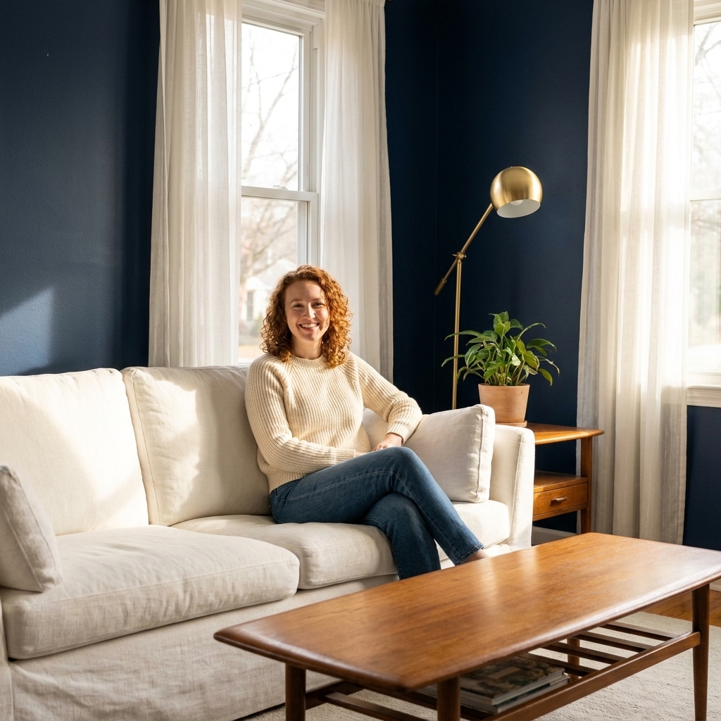
9) Navy + Warm Wood
Navy can feel classic and cozy at the same time, especially when it is balanced with crisp whites and warm wood tones. It is also one of the best backdrops for art.
Paint shades to try
- Benjamin Moore: Hale Navy (HC-154)
- Sherwin-Williams: Naval (SW 6244)
- Farrow & Ball: Stiffkey Blue (No. 281)
Furniture and finishes that pair well
- Sofa: White slipcover, light gray, or camel leather
- Wood: Oak floors, walnut tables, or a vintage teak credenza
- Accent: Striped pillows, brass lighting, and a natural fiber rug
- Window treatments: White or ivory curtains for a tailored look
Clara tip: Navy is gorgeous, but it is sneaky. Test it in your actual light for a full day, especially if your room faces north or you only get late-afternoon sun.
10) Buttercream Yellow + Wood
Yes, yellow is back, but the version we want is creamy and quiet, not highlighter. Buttercream makes a room feel sunny even on gloomy afternoons, and it flatters both vintage and modern pieces.
Paint shades to try
- Farrow & Ball: Dayroom Yellow (No. 233)
- Benjamin Moore: Weston Flax (HC-5)
- Sherwin-Williams: Napery (SW 6386)
Furniture and finishes that pair well
- Sofa: Soft white or light beige
- Wood: Weathered oak, pine, or antique wood with visible grain
- Accent: Muted blue pillows or a small dose of sage to keep it sophisticated
- Lighting: Warm lampshades in linen, not stark white
Clara tip: If your yellow looks sharp at night, swap to warmer bulbs first before you blame the paint.
Cozy color cheat sheet
- Match undertones: Warm with warm, cool with cool. Mixing undertones is where “something feels off” usually lives.
- Use 60-30-10 as a rule of thumb: 60% main (walls or rug), 30% secondary (sofa, curtains), 10% accent (pillows, art).
- Choose one grounding element: A dark wood table, a black lamp, or a deep-toned rug keeps cozy palettes from floating away.
- Layer lighting: One overhead light is not a mood. Aim for at least two lamps plus ambient light if you can.
FAQ
What is the most timeless cozy living room color?
A warm white with soft black accents and natural wood is the most reliable. It adapts to changing styles, and you can shift the vibe seasonally with textiles.
Should I paint walls or buy a rug first?
If you are choosing a patterned or vintage rug, I like to start with the rug because it contains multiple colors and undertones. If your rug will be simple and neutral, pick your wall color first.
How do I make a dark paint color feel cozy, not gloomy?
Pair it with creamy upholstery, warm wood, and layered lighting. Add a mirror or two to bounce light, and use warm bulbs (around 2700K) to avoid a cold, shadowy look.
What if my living room is open concept?
Keep one “whole-home neutral” running through the space (often the trim, main wall color, or flooring), then shift accents by zone. For example, sage in the living area can become more olive in the dining area through art and textiles.
My parting nudge
If you are stuck, pick the palette that matches the way you want to feel at 8 p.m. on a random Tuesday. That is the real job of a living room. Cozy is not a style, it is a sensation you build on purpose, one color and one lamp at a time.