Explore 10 curated living room palettes, from warm whites and greige to moody greens and terracotta, with paint shade picks, lighting tips, and easy furnitur...
Havitza Home
Master the 60-30-10 Color Rule
Learn how to use the 60-30-10 color rule with paint, upholstery, and accessories to create a balanced, pulled-together room that still feels personal.

Clara Jenkins
Clara Jenkins is a former theater set designer turned interior styling expert with over a decade of experience transforming everyday spaces into beautiful sanctuaries. Through her work at havitza.com, she shares practical styling tips, accessible furniture layouts, and inspiring color palettes to help anyone create a home they truly love.
Published October 17, 2026
Updated October 17, 2026
In theater, color is often how you guide the audience’s feelings before a single actor speaks. In a home, it works in a similar way. The difference is you have to live in the scene every day, so the palette needs to feel steady, functional, and genuinely you.
The 60-30-10 color rule is one of my favorite tools for getting there. It is simple enough for a first apartment, but strong enough to guide a full-home refresh. Think of it as a ratio for visual harmony, not a strict set of handcuffs.
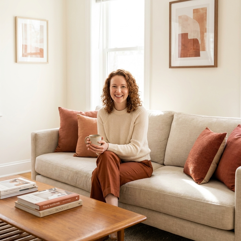
What the 60-30-10 rule means
The idea is straightforward:
- 60%: your dominant color. This sets the overall mood and covers the biggest visual surfaces.
- 30%: your secondary color. This supports the main color and adds depth.
- 10%: your accent color. This is the sparkle, contrast, and personality.
It is less about measuring with a calculator and more about making sure no single element fights for the starring role. In set design, we would call it controlling the focal points. In real life, it is what makes a room feel calm instead of cluttered.
Step 1: Choose your 60%
Your 60% is typically walls, plus any large visual field like a big area rug or large curtains. In most homes, wall color does the heavy lifting, so start there.
Great choices for the 60%
- Warm whites and creams for an airy, welcoming base
- Soft greiges and mushroom tones for a cozy, tailored feel
- Muted sages, dusty blues, or clay neutrals if you want color without chaos
My quick decision trick
If you are unsure, pick the color you want to see most when you walk in tired at the end of the day. Your 60% should feel like a deep breath.
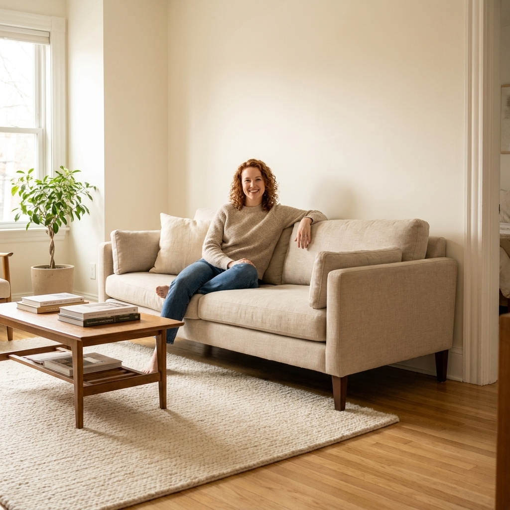
Step 2: Pick your 30%
Your 30% is where the room gets its shape. This is often:
- Upholstery, like a sofa, bed, or accent chairs
- Large textiles, like curtains or a substantial rug (if the walls are neutral)
- Case goods, like a wood console, built-ins, or a prominent headboard
The secondary color should be clearly different from the 60%, but not so loud that it becomes the new dominant.
Two reliable ways to choose the 30%
- Go darker than the 60% for grounding (example: creamy walls with camel leather or walnut wood tones).
- Go warmer or cooler than the 60% for contrast (example: warm beige walls with cooler slate blue upholstery).
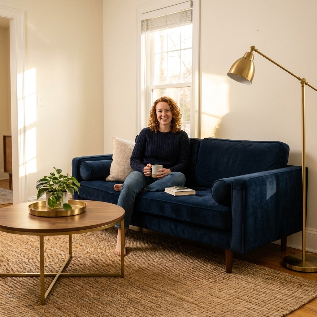
Step 3: Add your 10%
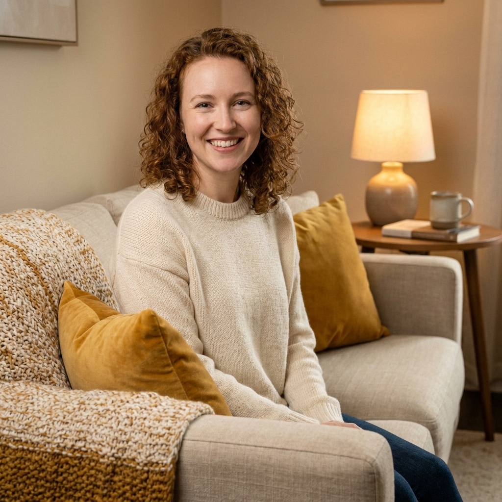
This is the fun part, but it works best when it is intentional. Your accent color is usually:
- Throw pillows and blankets
- Art and frames
- Decor objects and books
- Flowers, greenery, and ceramics
- Lampshades, candleholders, and small furniture (like an ottoman)
A good accent color shows up in at least 3 places around the room, so it feels like a choice and not an accident.
How bold can the 10% be?
Very bold, if the 60% and 30% are calm. This is where jewel tones, black, brass, or a punchy color like coral can shine without overwhelming the room.
What counts as color
One of the biggest misunderstandings is thinking this rule only applies to wall paint. In real rooms, color is carried by materials too.
- Wood tones count as color. Oak, walnut, and espresso read very differently.
- Metals count as color. Brass warms, chrome cools, matte black sharpens.
- Patterns count as multiple colors. A rug can be your 60% or your 30% depending on scale.
- Texture affects color. Boucle, velvet, and linen all reflect light differently, which changes how a shade feels.
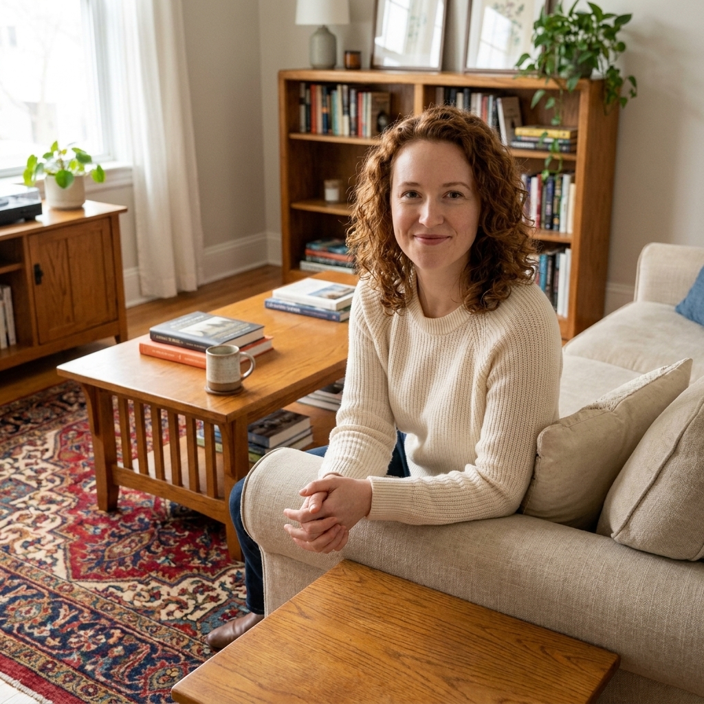
If you have a vintage rug you love (I always do), let it guide your whole ratio. Pull one background tone for the 60%, one mid-tone for the 30%, and one richer pop for the 10%.
Quick pattern shortcut: If a patterned rug reads mostly as one color from the doorway, treat that background as your 60%. Then treat the next most common rug color as your 30%, and pull one smaller motif color as your 10%.
Easy room formulas
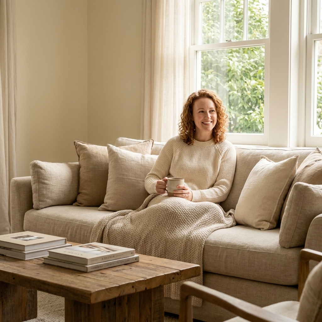
Living room
- 60%: walls and main rug background
- 30%: sofa and curtains
- 10%: pillows, art, and accessories
Styling tip: If your sofa is a color (navy, green, rust), keep the rug more subdued so the 30% stays supportive, not chaotic.
Bedroom
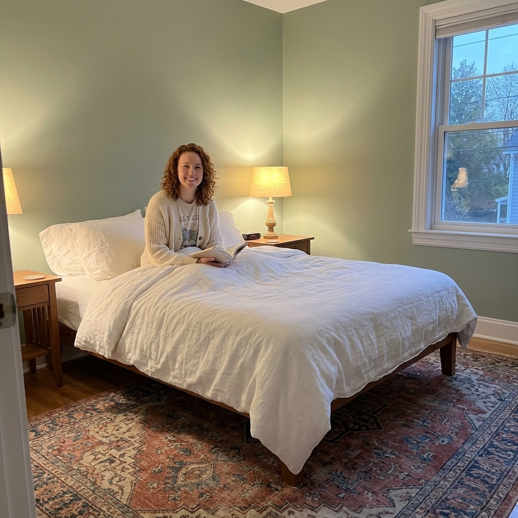
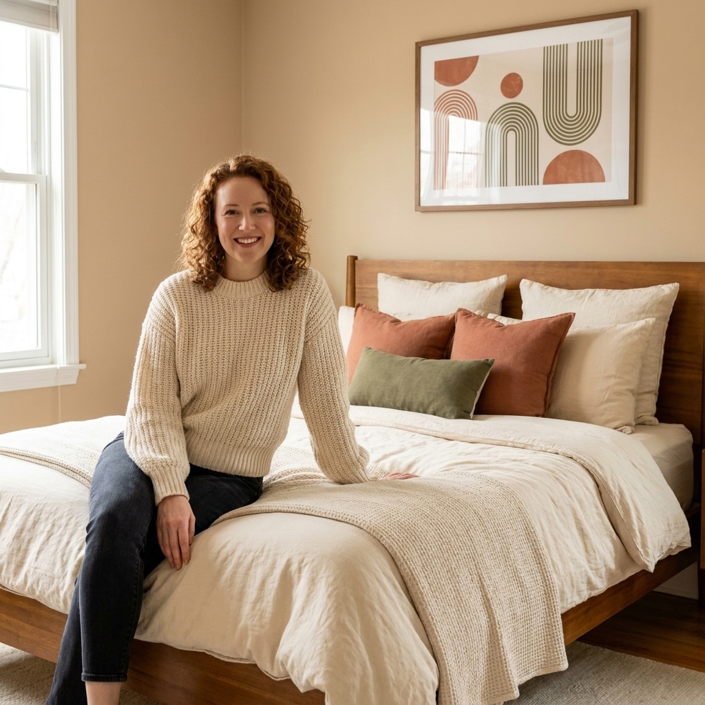
- 60%: walls plus duvet or large bedding field
- 30%: headboard, rug, and nightstands
- 10%: throw, pillows, art, and bedside lamps
In many homes, bedroom lighting reads warmer at night. Choose accent colors that still feel good under warm bulbs. Dusty rose, deep olive, and caramel tend to glow beautifully.
Kitchen and dining
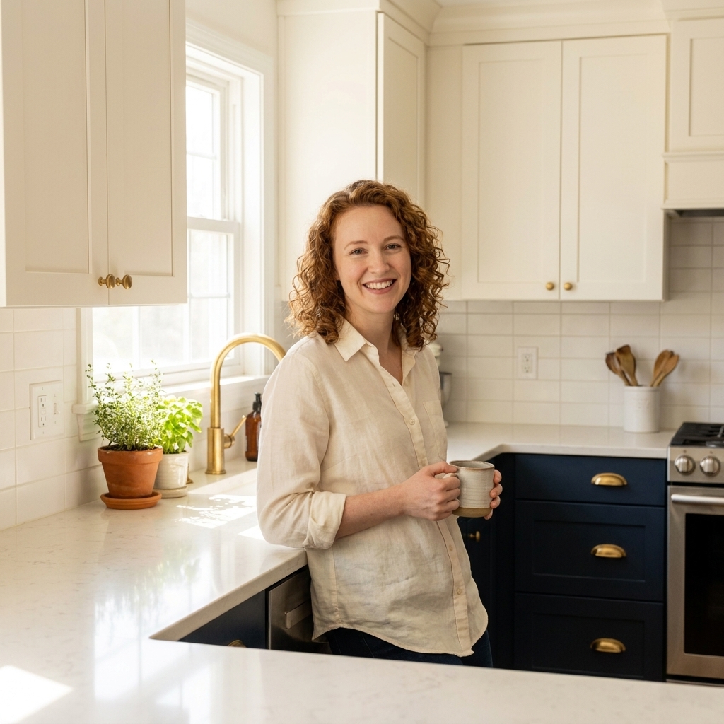
- 60%: cabinets or walls, plus counters as a major visual plane
- 30%: flooring, wood tones, and larger furniture (like dining chairs)
- 10%: bar stools, runner, small appliances, and decor
In kitchens, the 10% can be as simple as consistent hardware and lighting finishes, like aged brass or matte black repeated across the space.
Five 60-30-10 palettes
1) Warm neutral + walnut + terracotta
- 60%: warm white or light beige walls
- 30%: walnut wood tones, camel upholstery
- 10%: terracotta, rust, or paprika accents
Feels like: grounded, sunny, and inviting. Perfect if you love vintage rugs and tactile textiles.
2) Soft greige + charcoal + brass
- 60%: greige walls
- 30%: charcoal sofa or bedding
- 10%: brass lighting, frames, and decor
Feels like: tailored, modern, and calm. Great for small spaces that need polish.
3) Cream + sage + warm wood
- 60%: cream walls or main rug
- 30%: sage upholstery or curtains
- 10%: honey oak, tan leather, or warm wood accents
Feels like: fresh, natural, and quietly cheerful.
4) Pale sand + denim blue + cognac
- 60%: pale sand walls
- 30%: denim blue sofa, quilt, or drapery
- 10%: cognac leather, warm amber glass, or caramel accents
Feels like: relaxed, casual, and lived-in in the best way.
5) Misty blue-gray + ivory + black
- 60%: misty blue-gray walls
- 30%: ivory upholstery and textiles
- 10%: black accents in frames, lamps, or furniture legs
Feels like: crisp, coastal-leaning, and timeless without being stark.
If you already own a lot
Most of us are not starting with an empty room. If your space is already furnished, reverse-engineer the ratio:
- Identify the biggest visual mass you already have (often the sofa, bed, or rug). That is either your 60% or your 30%.
- Pull two supporting colors from what you already own, ideally from a rug or art piece you love.
- Edit the extras so your accent color is intentional. Keep what repeats the palette, relocate what does not.
If you have multiple accent colors you cannot part with, make one the true 10% and treat the others as small supporting notes. In practice, that means repeating one accent most often and letting the others show up once or twice.
Open layouts
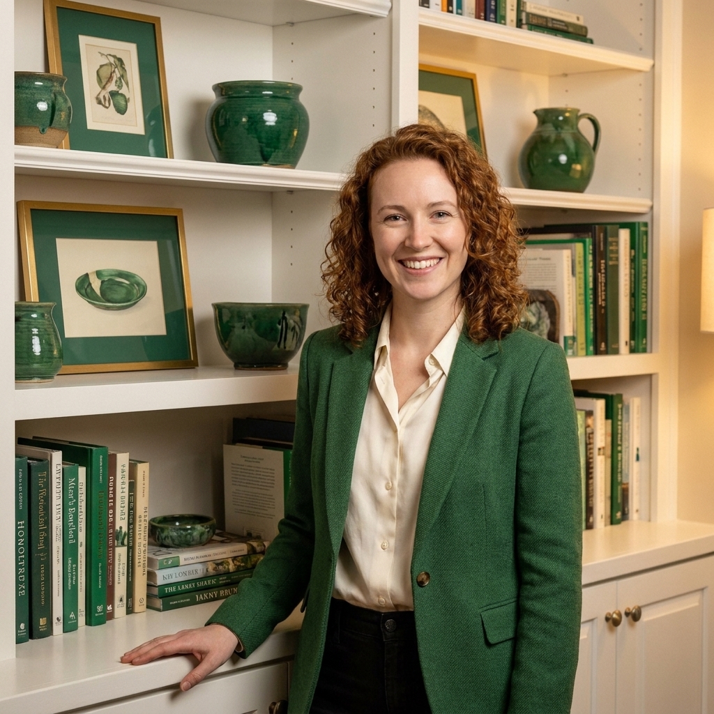
If you are working with an open-concept space, think in terms of one shared backbone and a few scene changes. Keep the 60% consistent across the whole area (often wall color and main flooring), repeat one or two 30% elements (like a wood tone or a sofa color), then let each zone choose its own 10% accent so the spaces feel connected but not identical.
Common mistakes
Mistake: The accent color takes over
Fix: Reduce accent-sized items in that color and consolidate it into three to five intentional moments. Swap some pieces to neutrals that match your 60%.
Mistake: Everything is the same tone
When the 60, 30, and 10 all sit at the same depth, the room can feel flat.
Fix: Add contrast by shifting one element darker or richer. An easy win is a deeper curtain, a darker wood tone, or black picture frames.
Mistake: Cool and warm undertones are fighting
Fix: Choose a lane as your starting point. If your walls are warm, echo that with warm whites, warm metals, and wood tones. If your walls are cool, repeat that with cooler grays, chrome, or crisp whites. You can mix undertones successfully, but it works best when it is clearly intentional, balanced, and repeated.
Mistake: Patterns create unplanned extra colors
Fix: Let one patterned item lead (usually the rug), then pull solids from it for the rest. If a pillow introduces a new color that is not repeated anywhere else, it will look random.
15-minute checklist
- Stand in the doorway and note the first color you see most. That is effectively your 60%.
- Name your second most-seen color. That is your 30%.
- Pick one accent and repeat it at least three times across the room.
- Choose one metal finish (or two max) and repeat it on lighting, frames, and hardware.
- Turn on lamps at night and make sure the palette still feels good under your bulbs.
FAQ
Does the 60-30-10 rule work in small rooms?
Yes, and it can make a small room feel calmer. Keep the 60% lighter to open the space, use the 30% to add definition, and keep the 10% punchy but minimal.
Can I use more than three colors?
You can, but I recommend grouping them. Your 60 might be two close neutrals (warm white and soft beige). Your 10 might include two accents that feel related (rust and blush) as long as one is clearly the star.
What if I want a colorful room?
Make the 60% a muted version of your favorite color (like dusty blue instead of bright cobalt). Then use a deeper shade of that same family for the 30%, and a contrasting pop for the 10%. Colorful rooms still need a hierarchy.
Do I have to follow the ratio exactly?
No. Treat it like a starting point. If you land closer to 50-35-15, but the room feels balanced and functional, you did it right.
A final note from my set designer brain
On stage, we used color to guide the eye. At home, you are guiding your mood and sense of ease, too. When your 60-30-10 feels right, the room stops asking for attention and starts giving you support.
If you want to try this today, start with one corner: the sofa, a pillow pair, and a lamp. Get that ratio feeling good there, then let it ripple outward across the room.