A warm, room-by-room guide to color psychology, plus specific shade directions and easy rules for picking paint that feels right in your home.
Havitza Home
7 Calming Bedroom Color Palettes That Promote Better Sleep
Seven soothing bedroom color palettes, plus practical tips for lighting, paint finish, sampling, textiles, and contrast so your room feels quieter at night and brighter in the morning.

Clara Jenkins
Clara Jenkins is a former theater set designer turned interior styling expert with over a decade of experience transforming everyday spaces into beautiful sanctuaries. Through her work at havitza.com, she shares practical styling tips, accessible furniture layouts, and inspiring color palettes to help anyone create a home they truly love.
Published October 17, 2026
Updated October 17, 2026
In theater, color is never just “pretty.” It shapes mood, rhythm, and perception. A set painted one shade cooler can make a scene feel lonelier. A warmer wash of light can soften an entire story. Your bedroom works the same way, just with pajamas instead of props.
If you are chasing better sleep, start with a palette that helps your nervous system register, “Nothing urgent is happening here.” In my experience, the most calming bedroom colors tend to be lower in contrast, slightly muted, and supported by warm, gentle lighting and tactile fabrics. Below are seven palettes I return to again and again because they can make a room feel quieter the moment you walk in.
How calming color works
Color psychology can get a little woo-woo online, so here is the grounded version I use in real rooms: when a palette reduces visual “noise,” many people find it easier to settle. That “quieter” feeling usually comes from contrast, undertones, and lighting as much as it comes from the hue itself.
- Muted over neon: Dusty, grayed-down tones tend to feel less stimulating than bright, high-chroma color.
- Low contrast where your eyes land: Big jumps from dark to light can feel energizing. For bedrooms, I like keeping the largest surfaces (walls, bedding, curtains, rug) in a similar value range, then adding definition with small accents (frames, hardware, a single darker pillow).
- Warm lighting changes everything: Even a perfect paint color can look icy under cool, blue bulbs.
- Undertones are the secret: Two “beiges” can behave wildly differently at night. Always test swatches in evening light.
As you read the palettes, imagine them as a cast. Wall color is your lead actor. Bedding and curtains are supporting roles. Lighting is direction. Texture is the soundtrack.
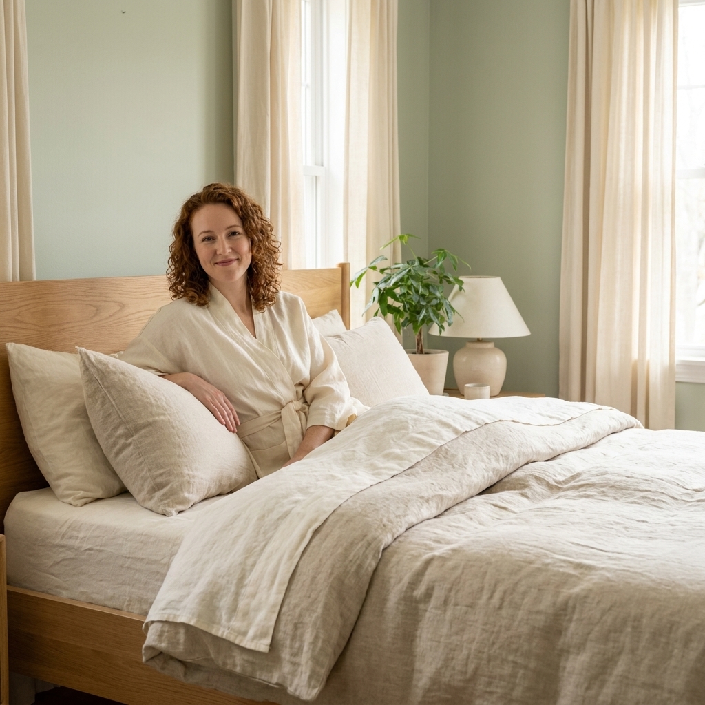
1) Soft sage + cream + warm oak
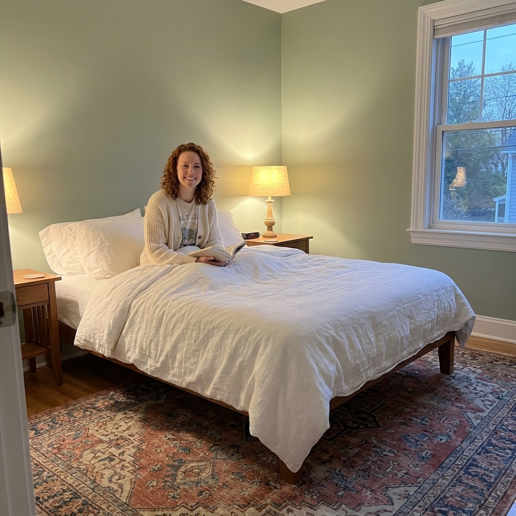
Why it helps: Many clients find green lands in a restful middle ground. A softened sage, especially one with a hint of gray, can read as nature without shouting “forest.” It pairs beautifully with creamy whites and warm woods, which helps the room stay cozy instead of drifting cold.
Use it like this
- Walls: Soft sage or eucalyptus green in a matte or eggshell finish.
- Trim and ceiling: Creamy off-white instead of stark bright white.
- Furniture: Warm oak, walnut, or cane details.
- Textiles: Oatmeal linen duvet, ivory knit throw, and a vintage rug with muted reds or toned-down terracotta.
Designer tip: If you are nervous about green, keep the walls light and bring sage in through a quilt, curtains, or a large linen headboard. You still get the calm without committing to four walls.
2) Dusty blue + linen + antique brass
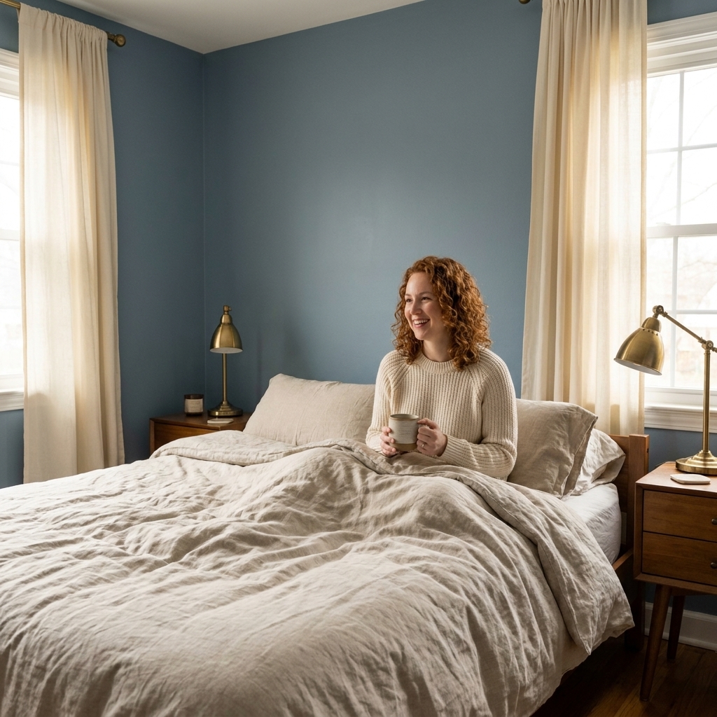
Why it helps: Dusty blues can feel like a deep exhale, especially when they are softened with gray. They are cooler than greens, but when you pair them with warm neutrals and brass, they often read cocooning instead of chilly. This palette is especially lovely for bedrooms that get strong afternoon sun.
Use it like this
- Walls: Powdery denim, smoky cornflower, or “blue-gray” that leans subdued.
- Bedding: Linen white, flax, or soft sand tones.
- Metals: Antique brass or warm champagne hardware.
- Art: Simple landscapes, charcoal sketches, or photography with lots of negative space.
Designer tip: Keep your whites creamy, not icy. Dusty blue plus bright white can start to feel coastal and energetic, which is a different vibe than sleep.
3) Warm greige + ivory + soft black
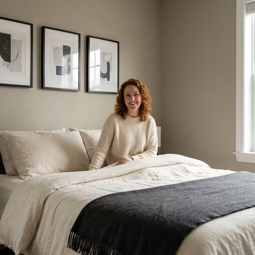
Why it helps: Greige is the peace treaty between gray and beige. Done warm, it creates a steady, grounded backdrop that does not demand attention. The key is adding a tiny bit of soft black so the room has definition without harsh contrast.
Use it like this
- Walls: Warm greige that looks slightly beige in the evening.
- Trim: Ivory or parchment white.
- Accents: A black picture frame, a charcoal ceramic lamp base, or a matte black curtain rod.
- Texture: Bouclé pillow, wool throw, and a low-pile vintage rug to keep everything quiet underfoot.
Designer tip: If your room already has cool-toned flooring, choose a greige with a whisper of pink or taupe undertone. It can counteract the cold without turning the room peachy.
4) Blush beige + clay + natural linen
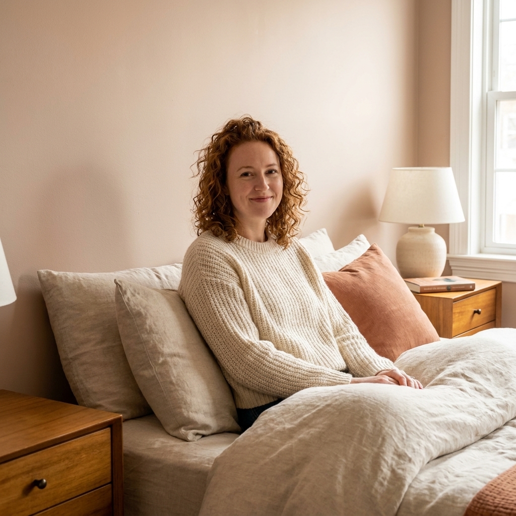
Why it helps: Not bubblegum pink. Think barely-there blush, the color of a seashell, paired with clay and sandy neutrals. This palette can be especially flattering in lamplight, which can make nighttime feel softer and more nurturing.
Use it like this
- Walls: Blush beige or a warm pink-taupe.
- Bedding: Natural linen, oatmeal, and creamy whites.
- Accent color: Clay or muted terracotta in small doses, like a pillow or a ceramic vase.
- Wood tones: Anything warm, from maple to walnut.
Designer tip: If you worry pink will feel “too much,” pick a paint described as rose-beige, pink-taupe, or blush sand. Those usually read neutral once the whole room is furnished.
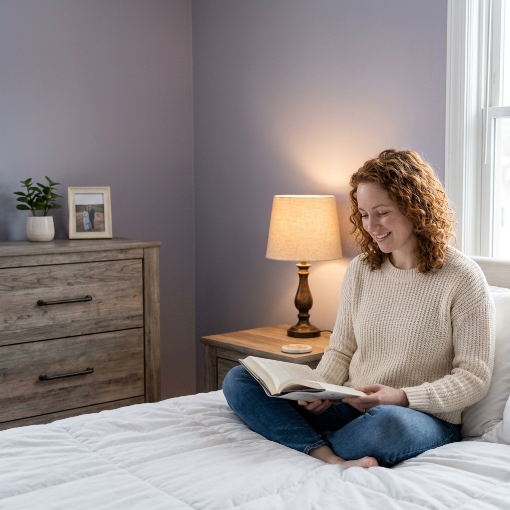
5) Lavender gray + soft white + silvered wood
Why it helps: A muted lavender-gray can feel like dusk. It is calming, slightly romantic, and surprisingly neutral when it is grayed down. This is a beautiful option if you dislike beige but still want a gentle, sleep-forward room.
Use it like this
- Walls: Lavender-gray or “heather” with a soft, smoky quality.
- Bedding: Soft white, dove gray, or pale mauve in small amounts.
- Furniture: Silvered wood, weathered oak, or painted pieces in warm white.
- Lighting: Warm bulbs and fabric shades to keep the walls from reading too cool.
Designer tip: Lavender-gray can shift dramatically from day to night. Tape up two large samples and check them under your bedside lamps before committing.
6) Creamy white + honey + buttery beige
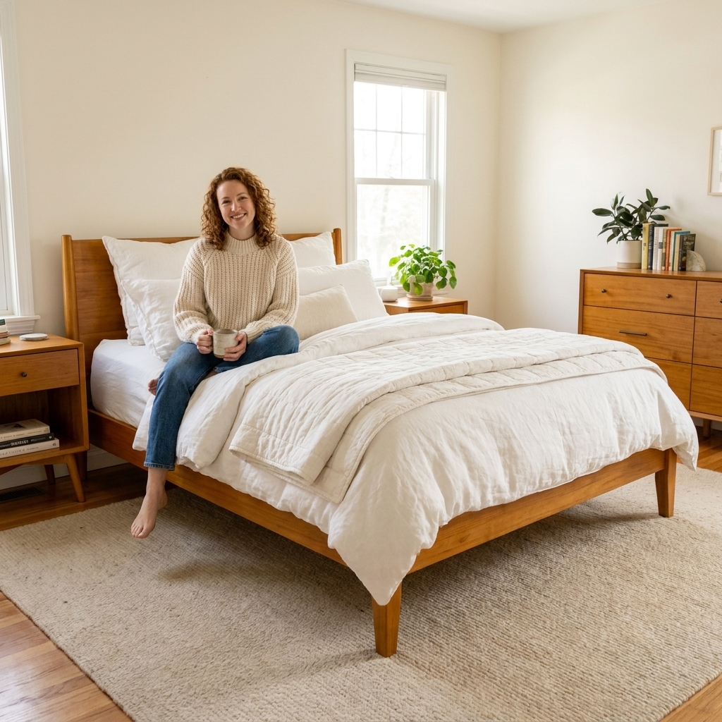
Why it helps: If you want your bedroom to feel like a warm cup of tea, this palette is it. Creamy whites reduce contrast, honeyed woods add glow, and buttery beige keeps the room from feeling sterile. It is simple, timeless, and very forgiving in small spaces.
Use it like this
- Walls: Creamy white with a warm undertone.
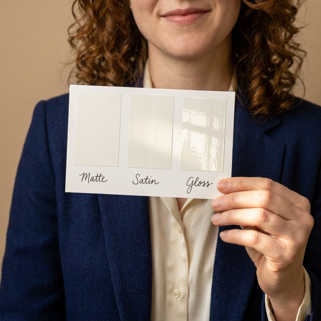
- Trim: Same color as the wall, just a different sheen, for a seamless, calm look.
- Wood: Honey oak, bamboo, or light walnut.
- Textiles: Layer whites in different textures: percale sheets, a quilted coverlet, and a chunky knit throw.
Designer tip: This palette lives or dies by lighting. A good starting point is warm bulbs in the 2200K to 3000K range, ideally on a dimmer. If you read in bed, layer in a dedicated bedside lamp that is bright enough for your eyes, then dim everything else down for wind-down.
7) Deep teal + camel + crisp off-white
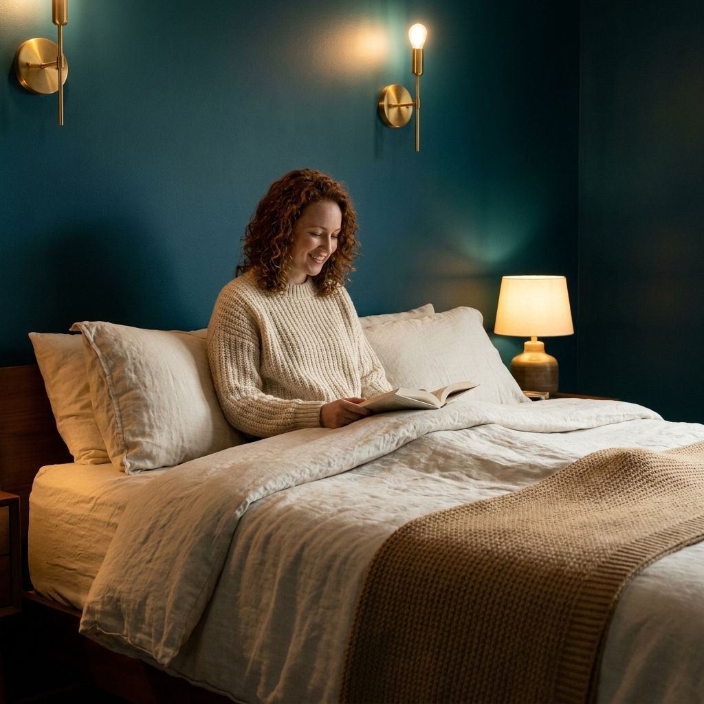
Why it helps: Some people sleep best in a room that feels like a cave, in the best way. Deep teal can create that enveloping effect without the heaviness of black. Paired with camel and off-white, it often feels sophisticated, grounded, and quietly luxurious.
Use it like this
- Walls: Deep teal on all walls, or as an accent wall behind the bed if you want to ease in.
- Bedding: Crisp off-white with one camel throw or leather pillow.
- Metals: Aged brass looks gorgeous here, but matte black can work if the room already has black hardware.
- Rug: Vintage-style rug with teal, rust, and cream to tie the palette together.
Designer tip: With darker paint, keep the ceiling lighter. It helps prevent the room from feeling visually shorter, especially in apartments with standard-height ceilings.
Make any palette sleep-friendly
The paint color is only one piece. If you want your bedroom to actually behave like a sanctuary, these are the quiet upgrades that matter:
Choose warm, dimmable light
- Use warm bulbs and add at least two light sources (bedside plus a floor lamp, or bedside plus a small table lamp across the room).
- Swap harsh overhead lighting for shaded lamps in the evening whenever possible.
Pick a low-glare finish
- Matte hides wall imperfections and reduces sheen, which many people experience as calmer.
- Eggshell is a practical middle ground if you want a bit more wipeability without a shiny look.
Mind your daylight
Natural light can shift a paint color more than you expect. In the Northern Hemisphere, north-facing rooms often get cooler, indirect light, while south- or west-facing rooms often get warmer, stronger light. Your exact results will vary with latitude, trees, buildings, and season, so test at multiple times of day.
Reduce high-contrast clutter
- Try matching your storage baskets, laundry hamper, and bedside containers to your palette so your eyes do not keep catching on random bright objects.
- Keep patterns large-scale or subtle. Tiny busy prints can feel visually loud at bedtime for some people.
Bring in texture, not more color
- Instead of adding a new accent hue, add a new feel: a nubby wool throw, a brushed cotton duvet, or velvet blackout curtains.
- Natural fibers and matte textures tend to reduce glare and visual sparkle, which reads calmer to many people.
Use color where you rest your eyes
If you only change one thing, focus on what you see from the bed. A calming wall behind the headboard, softer bedding tones, and warm lighting near your nightstand can shift the mood quickly, even if the rest of the home is a work in progress.
Sample paint the smart way
Paint a large piece of poster board (or two coats directly on removable board), then move it around the room. Check it in morning light, late afternoon light, and under your bedside lamps. The goal is not perfection at noon. It is a color that stays steady at night.
Work with what is fixed
If you have carpet, tile, or a wood floor you are not changing, let that be your undertone guide. A warm floor usually looks best with warm-leaning whites and greiges. A cool floor often behaves better with cleaner neutrals and paint that does not turn yellow in daylight.
Make room for your nervous system
One quiet truth: we do not all respond to color the same way. If a hue makes you feel antsy, sad, or overstimulated, trust that information. Test samples, live with them for a few evenings, and choose what feels steady in your body, not just what looks good online.
Quick FAQ
What bedroom color is best for sleep?
Most people find muted, low-contrast colors easiest to unwind with, especially soft greens, dusty blues, warm greiges, and creamy neutrals. The best choice is the one that stays gentle under your nighttime lighting and does not feel loud to you personally.
Should a bedroom be warm or cool toned?
Either can work, but I tend to lean slightly warm for bedrooms because warm tones pair naturally with cozy lamplight. If you love cool colors, balance them with warm whites, warm metals, and soft textures.
Is white too stark for a calming bedroom?
Bright white can feel stark, especially with cool bulbs. Creamy whites and soft off-whites tend to feel calmer and more flattering at night.
Do darker colors help you sleep?
They can. Deep teal, charcoal, and other rich tones may feel cocooning, which some sleepers love. The trick is adding enough warm lighting and lighter bedding so the room still feels welcoming, not gloomy.
How to choose a palette
If you feel stuck, pick one anchor you already love: a vintage rug, a duvet cover, a piece of art. Pull two neutrals and one muted color from that item, and you have a palette that feels personal from day one.
And remember, your bedroom does not have to be perfect to be restful. It just needs to feel like the day can end there, softly.