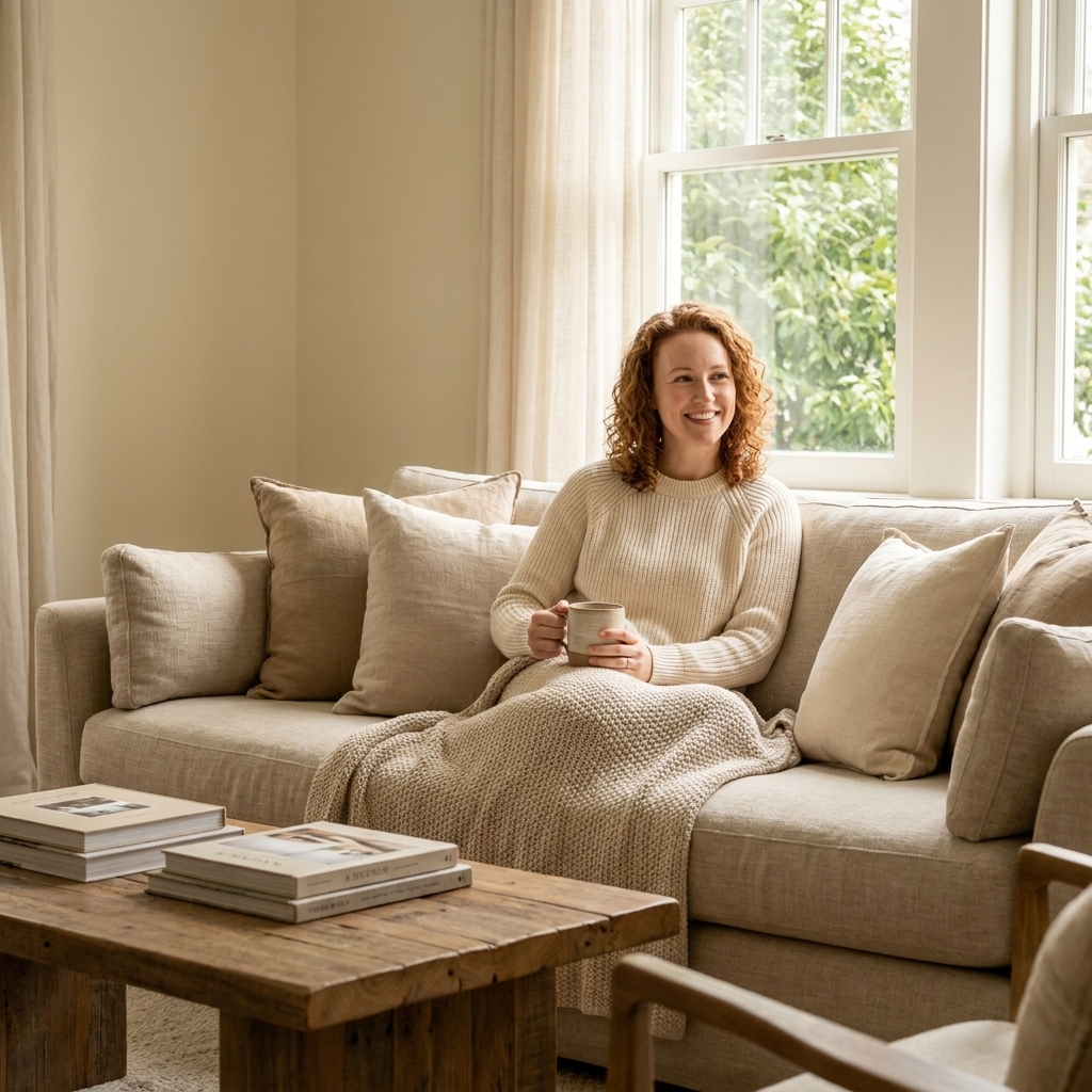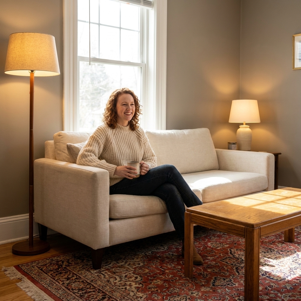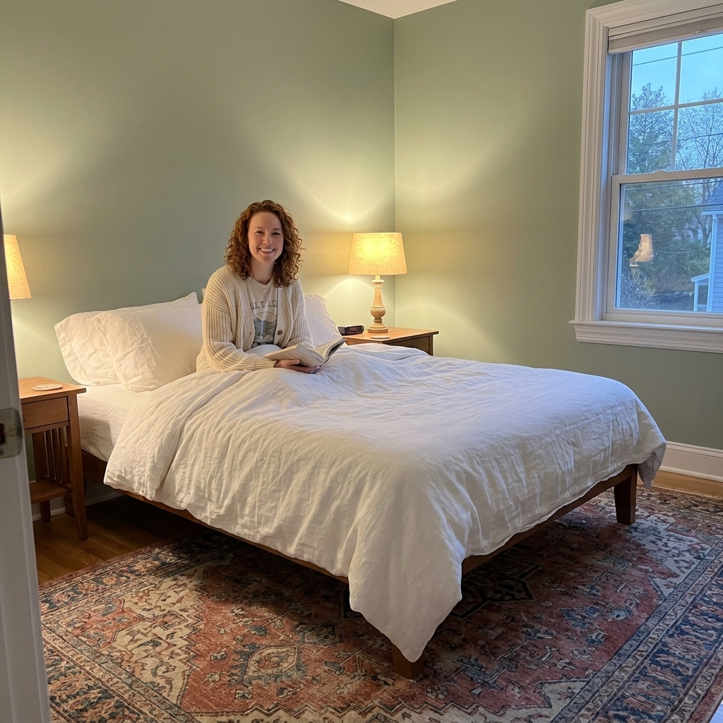
A room-by-room guide to paint sheen: what each finish looks like, how it wears, and where to use matte, eggshell, satin, and gloss for walls, trim, and ceili...
Havitza Home
Choose Paint Colors by Natural Light
North, south, east, and west light all change how paint looks. Learn what undertones to pick, what to avoid, and how to test swatches so your color stays true all day.

Clara Jenkins
Clara Jenkins is a former theater set designer turned interior styling expert with over a decade of experience transforming everyday spaces into beautiful sanctuaries. Through her work at havitza.com, she shares practical styling tips, accessible furniture layouts, and inspiring color palettes to help anyone create a home they truly love.
Published October 17, 2026
Updated October 17, 2026
In theater, we never chose paint under the wrong lights. A backdrop that looked moody and romantic at rehearsal could turn sickly green once the stage lighting warmed up. Homes are the same, just with sunlight instead of spotlights. Your room’s natural light is the “lighting designer,” and it can absolutely rewrite your paint color if you do not plan for it.
This guide will help you figure out what your light is doing (north, south, east, or west), how that shifts undertones, and which types of colors tend to sing instead of sulk. I will also show you how to test paint so you do not end up repainting on a Saturday you wanted to spend doing literally anything else.
One quick note before we start: the “personality” of each direction is described the way it behaves in most Northern Hemisphere homes (including much of the U.S. and Canada). If you are in the Southern Hemisphere, north and south essentially swap roles. Season, latitude, window size, and obstructions (trees, buildings, porch roofs) also change the intensity.
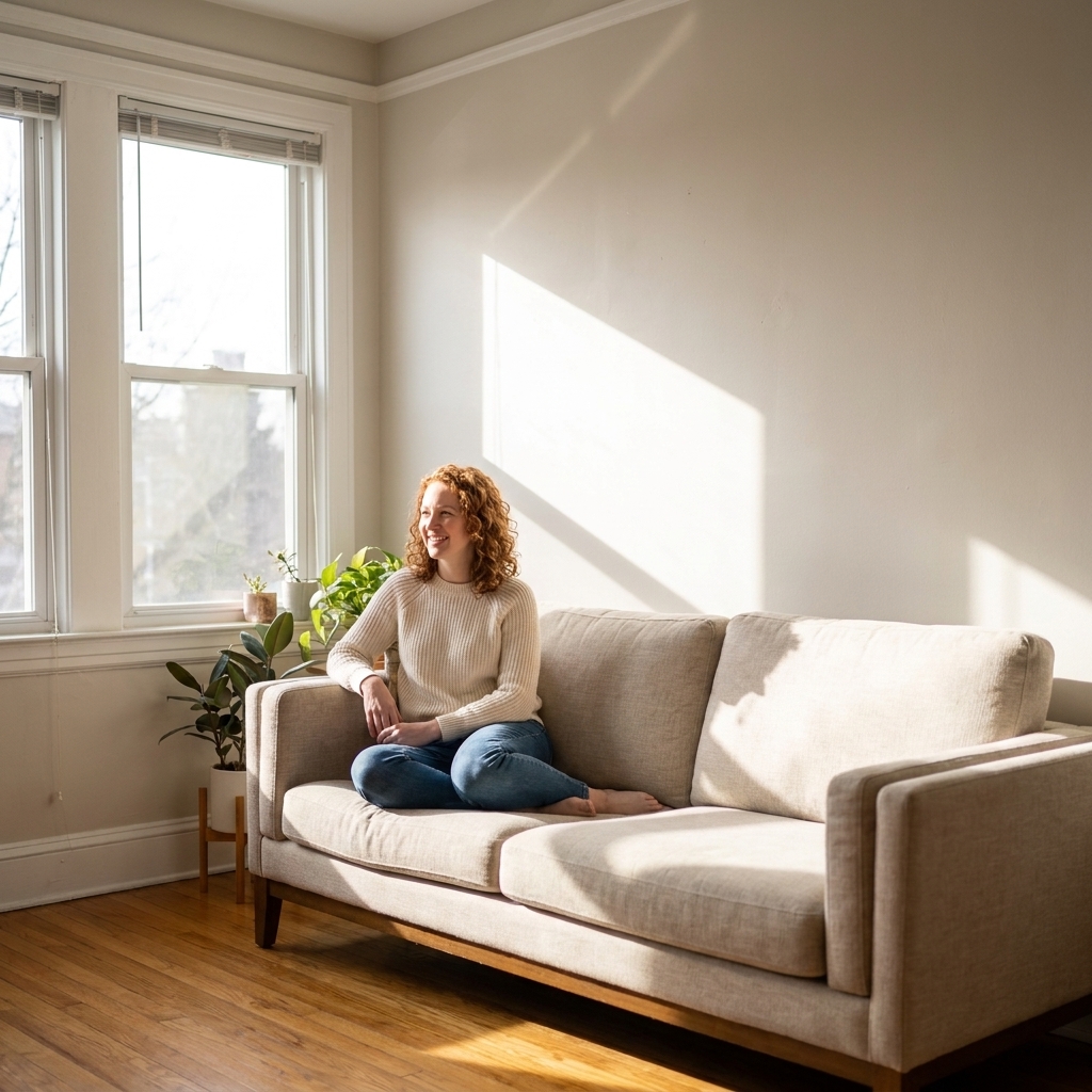
Step one: find your exposure
You can do this two ways, and I like using both because real life is messy (trees, nearby buildings, porches, deep overhangs).
Quick phone check
- Open your compass app (or a map app with a compass).
- Stand at the main window and face straight out through the glass.
- The direction you are facing is the window’s exposure: north, south, east, or west.
Small but important caveat: bay windows, corner windows, and rooms with glass on multiple walls can “read” like mixed exposure. In those cases, use the observation method below to see which light actually dominates.
Reality check: watch the light for one day
- Morning light only: often east-facing.
- Strong light most of the day: often south-facing (in the Northern Hemisphere).
- Afternoon and evening glow: often west-facing.
- Consistent but not sunny, more sky glow than sunbeams: often north-facing.
Important: “Facing” is about the windows, not the way the house faces from the street. Also, a room can have mixed exposure if it has windows on two sides. In that case, pick paint for the dominant wall you care about most (often the biggest wall, or the wall you see first when you enter). If you want to get extra nerdy, an app like Sun Seeker can help you visualize the sun’s path, but your eyes still win when there are obstructions.
Why light changes paint
Paint is not just a color. It is a color plus an undertone, and undertones react to light temperature.
- Cool light (bluish, grayish) can make colors look cooler, flatter, sometimes more muted.
- Warm light (golden, orange) can make colors look warmer, richer, sometimes more yellow or peach than you expected.
- Bright direct sun can wash out mid-tones and make pale colors look lighter than their swatch.
- Low light can make colors look deeper and sometimes muddier, especially complex neutrals.
Then there are the sneaky extras: hardwood floors (warm reflection), grass outside (green cast), red brick across the street (pink cast), and even your sofa fabric bouncing color back onto the wall.
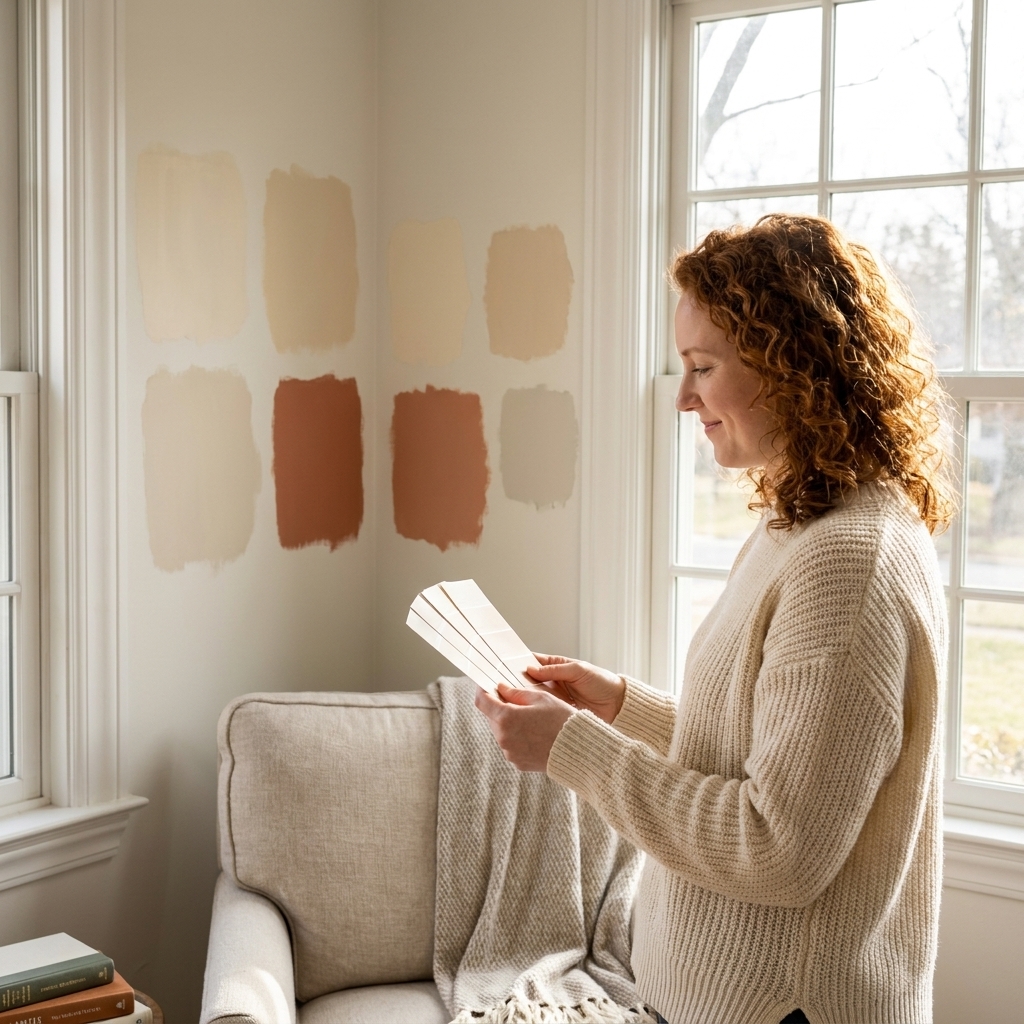
North-facing rooms
North light is typically the coolest and most consistent throughout the day. It tends to pull gray and blue forward, and it can make already-cool colors feel icy or a touch flat.
What usually works
- Warm whites (creamy, soft ivory) to counterbalance the cool cast.
- Warm greiges (a beige-gray blend) that stay cozy instead of stormy.
- Muted warm colors like clay, dusty terracotta, warm blush, or tobacco.
- Rich, warm-leaning deep tones like olive, aubergine, warm navy, or chocolate for a dramatic, enveloping vibe.
What to watch
- Cool grays can turn steel-blue and feel chilly.
- Bright whites can look stark, especially in a room with minimal sunlight.
- Pastel blues and minty greens can skew colder than you want.
My set-designer trick
If you want a neutral wall in a north-facing room, look for a neutral with a whisper of yellow, pink, or red undertone. Not enough to look “colored,” just enough to keep the room from feeling like it is holding its breath.
South-facing rooms
In many Northern Hemisphere homes, south light tends to be warm and abundant. It can make a room feel cheerful and open, but it also amplifies warmth in paint. Many colors look close to their “truest” here, although warm-leaning colors can tip into too-yellow territory, especially at certain times of day.
What usually works
- Crisp whites and cleaner off-whites, since the light already brings warmth.
- Balanced neutrals (true greige, soft taupe) that do not swing too golden.
- Cooler colors like blue-grays, sage greens, and some cooler beiges to calm the glow.
- Bold color if you want it. South light can handle saturated tones beautifully.
What to watch
- Very creamy whites may look more yellow than expected.
- Warm beiges can go orange or “peachy” in the afternoon.
- Some yellow-based greens can start to read chartreuse.
My set-designer trick
If you love a warm paint color but your south-facing room is already glowing, test one step cooler than your instinct. Under all that sunlight, it often lands where you wanted the original to land.

East-facing rooms
East light is my “morning coffee” light. Early on it is often bright and slightly warm, then it tends to fade into cooler, lower light later in the day. That means your paint may look lively at breakfast and a little subdued by dinner, depending on weather and what is outside your windows.
What usually works
- Soft warm neutrals that stay welcoming when the afternoon cools off.
- Gentle colors like muted blue, dusty green, or blush that will not feel too loud in morning sun.
- Light to mid-tone colors that can hold their own once the room quiets down later.
What to watch
- Very cool colors can feel chilly in the afternoon.
- Colors that rely on brightness (some pale pastels) can look washed out or gray once the sun moves on.
My set-designer trick
When you test samples in an east-facing room, check them twice: once in that flattering morning light, and once after 4 p.m. when the room is more honest. If it still feels good in the late-day lull, you are golden.
Best use cases
East-facing light is wonderful for bedrooms and kitchens. If you want a bedroom to feel calm at night, test your paint after the direct sun is gone.
West-facing rooms
West light is the drama kid of exposures. It can be a little flat in the morning and then suddenly turn everything into golden hour. That warm late-day light can make paint look richer, but it can also exaggerate warmth and make some colors feel brassy.
What usually works
- Balanced neutrals that do not lean too yellow.
- Cool-leaning shades (blue-gray, cooler greige, some sages) to counteract the afternoon glow.
- Earthy, grounded colors like olive, cinnamon, and warm clay if you want to lean into the sunset mood.
What to watch
- Creamy whites and warm beiges can look extra yellow after 3 p.m.
- Pink-based neutrals may look more peach or coral than intended in late light.
- Highly saturated warm colors can feel intense at night with lamps on.
A practical way to decide
Ask yourself when you use the room most. If it is a living room used in the evenings, prioritize how the paint looks at sunset and under lamplight, not at 10 a.m. when the space is doing its “before” impression.
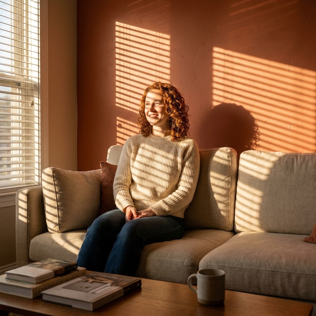
Color families by exposure
If you are standing in front of a paint rack feeling overwhelmed, start with these high-level rules. They will narrow your options fast.
Whites
- North: choose warm whites so the room does not feel clinical.
- South: you can go cleaner and crisper without it feeling cold.
- East: soft whites are lovely, avoid anything too stark.
- West: pick whites with balanced undertones so they do not yellow at golden hour.
Neutrals
- North: warm greige or taupe tends to look more inviting than cool gray.
- South: many neutrals work, but watch anything very warm.
- East: neutrals with a touch of warmth stay friendly after noon.
- West: cooler neutrals can prevent that late-day “butter” effect.
Blues and greens
- North: blue can feel extra cool, choose softer, slightly warmer blues or complex navy.
- South: blue and green often look gorgeous and clear.
- East: muted tones keep mornings bright but not blinding.
- West: cooler blue-greens can balance afternoon warmth.
Warm colors
- North: these are often a win, they add life.
- South: test carefully, they can go more intense than expected.
- East: warm colors can feel cheerful early, then calmer later.
- West: expect them to glow at night, sometimes beautifully, sometimes loudly.
Test paint like a pro
The biggest mistake I see is choosing paint based on a tiny swatch in a store with overhead lighting. The second biggest mistake is painting one little square on the wall and deciding in five minutes.
Do this instead
- Get sample pots (or peel-and-stick samples if you love a clean wall).
- Test on multiple walls, especially the wall that faces the window and the wall opposite it.
- Paint a large sample, at least 12 by 12 inches. Bigger is better because you will see the undertone more clearly.
- Check it four times: morning, midday, late afternoon, and at night with your lamps on.
- Place it near fixed finishes like flooring, tile, stone, or cabinetry you are not changing.
My favorite trick: movable sample boards
Paint poster board (two coats) and carry it around the room. This shows you how the color changes in different pockets of light, and you can set it next to the sofa, curtains, and wood tones without committing paint to every surface.
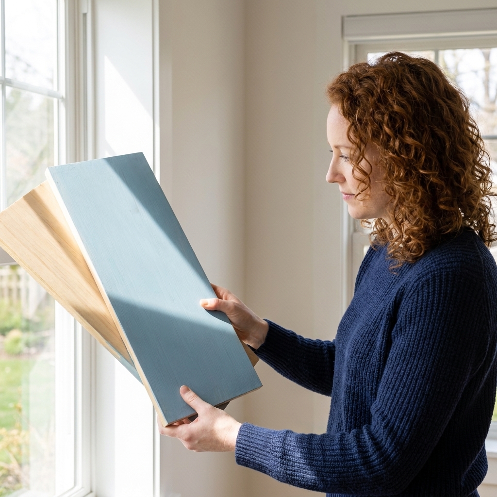
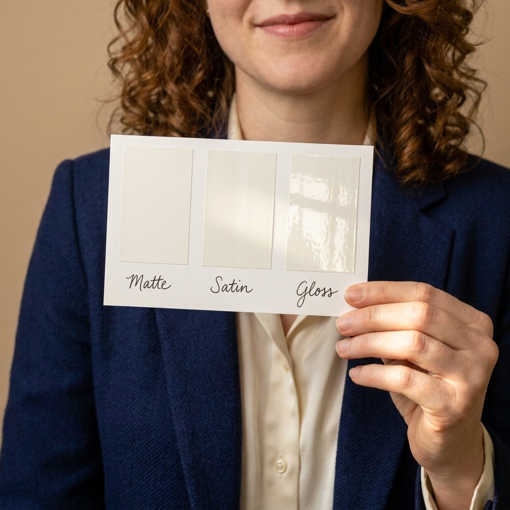
Sheen matters too
Color gets all the attention, but sheen changes the read.
- Higher sheen (eggshell, satin, semi-gloss) reflects more light, so walls can look brighter, highlights look sharper, and undertones can feel more obvious.
- Lower sheen (flat, matte) absorbs more light, which can make color look deeper and calmer, but also a bit heavier in a low-light room.
If your sample looks perfect in matte and suddenly “loud” in eggshell, that is not you being picky. That is physics.
Do not forget bulbs
Natural light picks the daytime mood. Your bulbs choose the evening mood. If you only test paint in daylight, you are making a decision with half the information.
Quick bulb guide
- 2700K to 3000K (warm white): cozy, flattering, makes warm undertones stronger.
- 3500K (neutral white): balanced, and many people like it for kitchens and workspaces.
- 4000K+ (cool white): crisp, can make rooms feel cooler and can exaggerate blue and gray undertones.
If you have a west-facing room that already gets warm at sunset and you also use very warm bulbs, your paint may skew much warmer at night than you planned. The fix can be as simple as shifting bulb temperature slightly more neutral.
Common problems
“My white looks yellow.”
- Likely cause: south or west light, warm bulbs, or warm floors reflecting.
- Try: a cleaner white or a white with a touch of gray to calm the warmth.
- Also check: nearby tile, stone, or cabinets. A creamy countertop can make an innocent white look guilty.
“My gray looks blue.”
- Likely cause: north light, or a gray with blue undertones you did not notice on the swatch.
- Try: a warmer greige or taupe-leaning neutral.
- Also check: cool-toned carpet, a blue rug, or a big navy sofa throwing color back onto the wall.
“My beige looks pink.”
- Likely cause: beige with a rosy undertone, plus warm late-day sun.
- Try: a beige with more neutral or slightly green undertone to balance.
- Also check: red brick outdoors, warm wood floors, or any strong terracotta nearby.
“My color looks muddy.”
- Likely cause: low natural light, heavy shadows, or too much complexity in the undertone.
- Try: either go lighter and cleaner, or go deeper and more intentional. Mid-tone murky neutrals are the usual culprit.
- Also check: whether your sheen is too flat for the room’s light level.
Room cheat sheet
Living room
If you entertain at night, choose paint that looks good under lamplight first. West-facing living rooms especially benefit from balanced neutrals or cool-leaning tones that will not turn overly golden by evening.
Bedroom
North-facing bedrooms love warm neutrals and soft, earthy colors for cozy calm. East-facing bedrooms can handle cooler hues if you like a crisp feel, but test them after dark so they do not turn cold at bedtime.
Kitchen
Kitchens have a lot of reflective surfaces, so undertones show up fast. In south light, consider cleaner whites and balanced greiges. In north light, a warm white can keep cabinets from looking dull.
Bathroom
Bathrooms often have smaller windows, so paint reads deeper. If your bathroom is north-facing, avoid icy blues unless you want a spa-cool look. Always test with the vanity lights on, since that is the light you will see most.
Quick FAQ
Can I use the same paint color in every room?
You can, but it will not look identical. If you want a cohesive whole-house color, pick something with balanced undertones and test it in the brightest room and the dimmest room. If you love it in both places, you are usually safe.
What if my room gets almost no direct sunlight?
Treat it like a north-facing space even if it technically is not. Go warmer, and consider using a slightly higher sheen (like eggshell instead of flat) if you want a bit more bounce. Also, layer warm lighting. It matters.
Do peel-and-stick samples look the same as paint?
They are very helpful for undertone and direction, but they can read slightly different than two coats of paint, especially with sheen. I use them to narrow options, then confirm with a real painted sample if I am on the fence.
Choose with confidence
If you remember nothing else, remember this: north light cools, south light warms, east light changes quickly, west light gets dramatic. Pick undertones that balance what the room is already doing, and test your finalists across the day and under your lamps.
Paint is one of the most affordable transformations we get in home design. When it is chosen with the light in mind, it can make an ordinary room feel like it finally exhaled.