A room-by-room guide to paint sheen: what each finish looks like, how it wears, and where to use matte, eggshell, satin, and gloss for walls, trim, and ceili...
Havitza Home
Color Psychology in Design: Choose Hues for the Mood You Want
Learn how popular paint colors influence mood and energy, then choose calming, focusing, or cozy hues room by room with practical, real home tips.

Clara Jenkins
Clara Jenkins is a former theater set designer turned interior styling expert with over a decade of experience transforming everyday spaces into beautiful sanctuaries. Through her work at havitza.com, she shares practical styling tips, accessible furniture layouts, and inspiring color palettes to help anyone create a home they truly love.
Published October 17, 2026
Updated October 17, 2026
When I was designing theater sets, color was never “just paint.” It was a cue. A mood shift. A silent character. In a living room or bedroom, it works the same way, just with fewer spotlights and more laundry baskets.
Color psychology is not magic, and it is not one-size-fits-all. But it is useful. Certain hues are often associated with calm, alertness, comfort, or focus, and many people report feeling those shifts in a space. The evidence is mixed and context-dependent, but as a design tool, it is still a good compass. The trick is pairing that general “color effect” with the reality of your room: light exposure, how you use the space, and what you want to feel when you walk in.
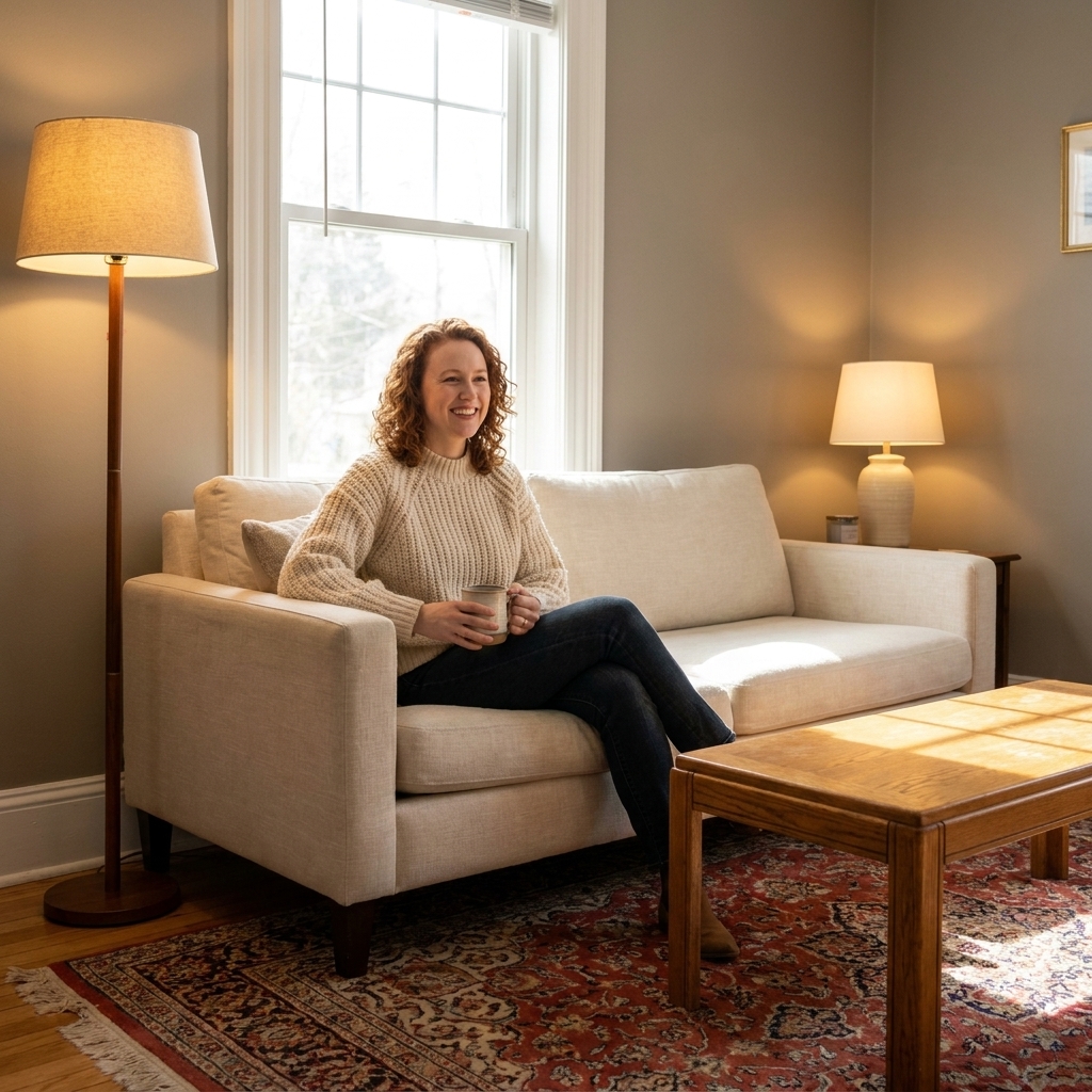
Below, I will walk you through what the big color families typically communicate, then we will apply it room by room so you can choose hues that support your life, not just your mood board.
How color changes a room
We experience color with our eyes, but we respond with our whole bodies. Color can visually change a room’s “temperature,” perceived size, and energy level. Here are the three effects I think about most when choosing paint.
1) Temperature: warm vs cool
- Warm colors (reds, oranges, yellows, warm beiges) tend to feel cozy, welcoming, and intimate.
- Cool colors (blues, greens, blue grays) often feel calmer, airier, and more spacious.
Warm does not always mean loud. A warm white can be soft and serene. Cool does not always mean chilly. A muted blue-green can feel like a deep exhale.
2) Value: light vs dark
- Lighter colors bounce more light and can make a room feel open, clean, and calm.
- Darker colors absorb light and can feel cocooning, dramatic, and restful when used intentionally.
Dark paint is not “too much” when the room needs it. If you want a bedroom that feels like a retreat, a deeper shade can do more than any throw pillow ever could.
3) Saturation: bright vs muted
- High saturation reads energized and playful.
- Muted, dusty, or gray-toned colors read sophisticated, soothing, and easier to live with day to day.
If you love a bright color but worry about fatigue, look for it in a softened version. Think “terracotta wash” rather than “traffic cone orange.”
What colors tend to communicate
There are patterns in color psychology, and those patterns are helpful. Use them as a starting point, then adjust for your personal taste and the light in your home.
Blue: calm, clarity, steady energy
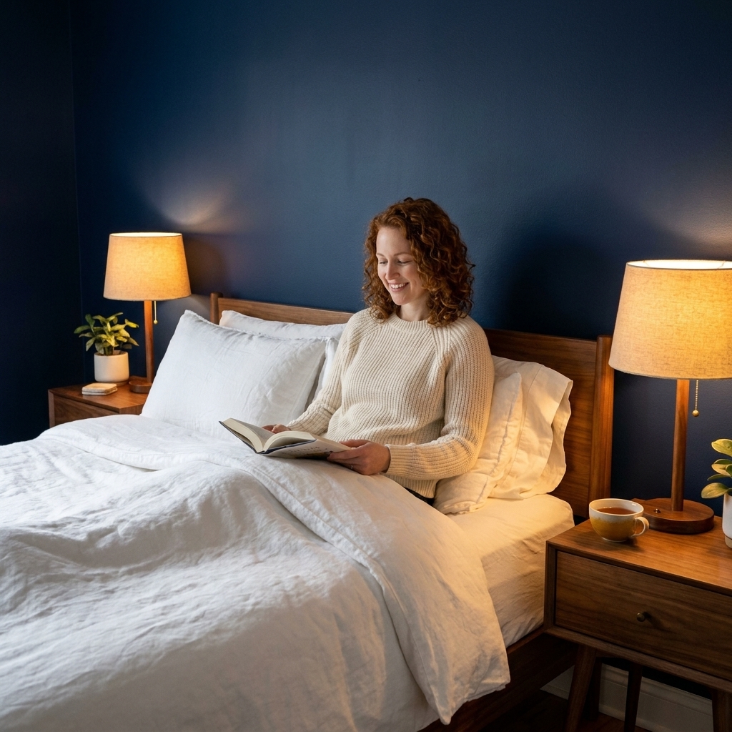
Blue is often associated with calm and trust. In interiors, it can lower the visual “volume” of a room. I love blue for bedrooms, bathrooms, and home offices where you want a steady, non-jittery focus.
- Best in: bedrooms, bathrooms, offices, nurseries
- Try it as: soft blue gray, dusty denim, deep navy for a cocoon effect
- Watch out for: icy blues in north-facing rooms can feel stark
Green: balance, renewal, rest for the eyes
Green sits around the middle of the visible spectrum, which is one reason it often reads as naturally balanced. In real homes, greens tend to play well with wood, plants, and natural textures. If you want calm but not sleepy, green is my go-to.
- Best in: living rooms, kitchens, bedrooms, offices
- Try it as: sage, olive, eucalyptus, deep forest green
- Watch out for: green undertones can swing muddy under warm bulbs, so always test at night
Yellow: optimism, warmth, morning energy
Yellow brings “sunlight” energy, even when the weather refuses. It can feel uplifting, friendly, and lively. The key is choosing the right intensity. Soft buttery yellows are easier to live with than sharp lemon tones.
- Best in: kitchens, breakfast nooks, hallways, darker rooms that need lift
- Try it as: creamy vanilla, buttery yellow, warm ochre accents
- Watch out for: very bright yellow can feel restless or glaring in full sun
Red and pink: vitality, appetite, connection
Red is powerful. It reads energetic and stimulating, and it is often said to be appetite-friendly. Pink can be playful or soothing depending on undertone. Dusty rose is one of my secret weapons for making a room feel human and welcoming.
- Best in: dining rooms, entryways, powder rooms, social corners
- Try it as: terracotta, brick, clay pink, muted rose
- Watch out for: bright true red on large walls can feel intense fast
Orange: sociable, creative, cozy
Orange is warmth with a little spice. In the right dose it feels convivial and creative. In the wrong dose it can feel like a sports drink. I prefer earthy oranges such as terracotta, cinnamon, and rust.
- Best in: dining areas, studios, playrooms, cozy reading nooks
- Try it as: burnt orange, terracotta, apricot beige
- Watch out for: highly saturated orange can dominate a space
Purple: introspective, luxe, imaginative
Purple can read creative and expressive. In interiors, it is easiest to use in muted versions like lavender gray or smoky plum. Done well, it feels like boutique hotel energy at home.
- Best in: bedrooms, dressing rooms, creative spaces, powder rooms
- Try it as: dusty lavender, mauve, deep aubergine accent wall
- Watch out for: strong violet undertones can look harsh under cool LEDs
White, cream, beige, and greige: calm backdrop, flexibility
Neutrals are not “no color.” They have undertones, and those undertones shape mood.
- Warm whites and creamy beiges feel welcoming and soft.
- Cool whites and blue grays feel crisp and modern.
- Greige (gray plus beige) is popular because it can read calm without feeling cold.
Neutrals also amplify everything else in the room, especially lighting. If you hate how your neutral looks, it is often not the color itself, it is the undertone meeting the bulb.
Black and charcoal: grounding, dramatic, refined
Dark neutrals create contrast and a sense of intention. A charcoal wall behind open shelving can make everything you own look curated. The mood is grounded and a little cinematic.
- Best in: offices, dining rooms, powder rooms, modern living rooms
- Try it as: soft black, charcoal, deep warm gray
- Watch out for: in rooms with limited natural light, add layered warm lighting so it feels rich, not gloomy
Room by room picks
Here is the practical part: matching emotion to function. Each room has a job. Your color choice should help it do that job better.
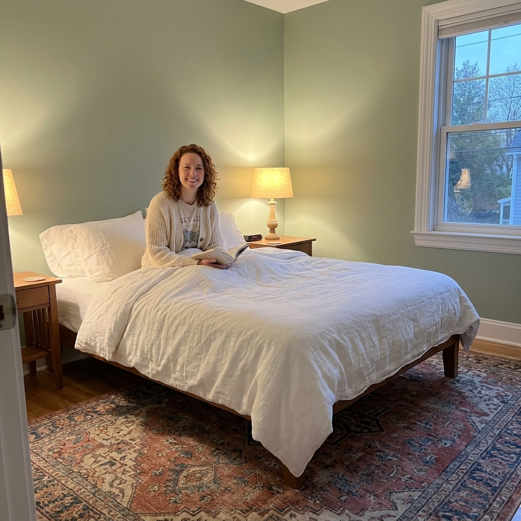
Bedroom: restful, safe, slightly cocooned
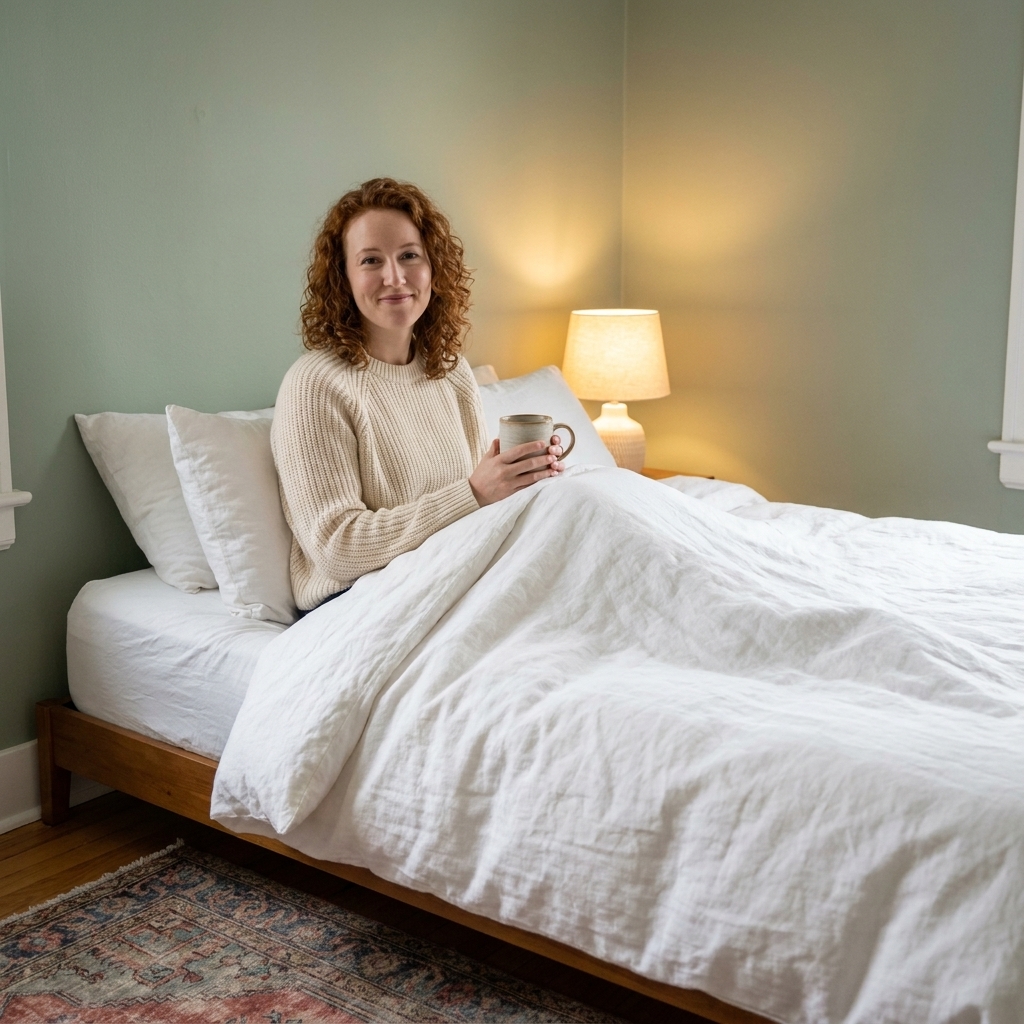
If you want your bedroom to feel like a sanctuary, choose hues that quiet the mind. Muted cool tones are classics, but do not sleep on warm, earthy shades if you crave coziness.
- Calming picks: dusty blue, blue gray, sage, warm taupe, soft clay
- For deeper sleep energy: navy, forest green, charcoal with warm lamps
- Tip: if you go dark, keep bedding lighter for a gentle contrast
Living room: connection, comfort, conversation
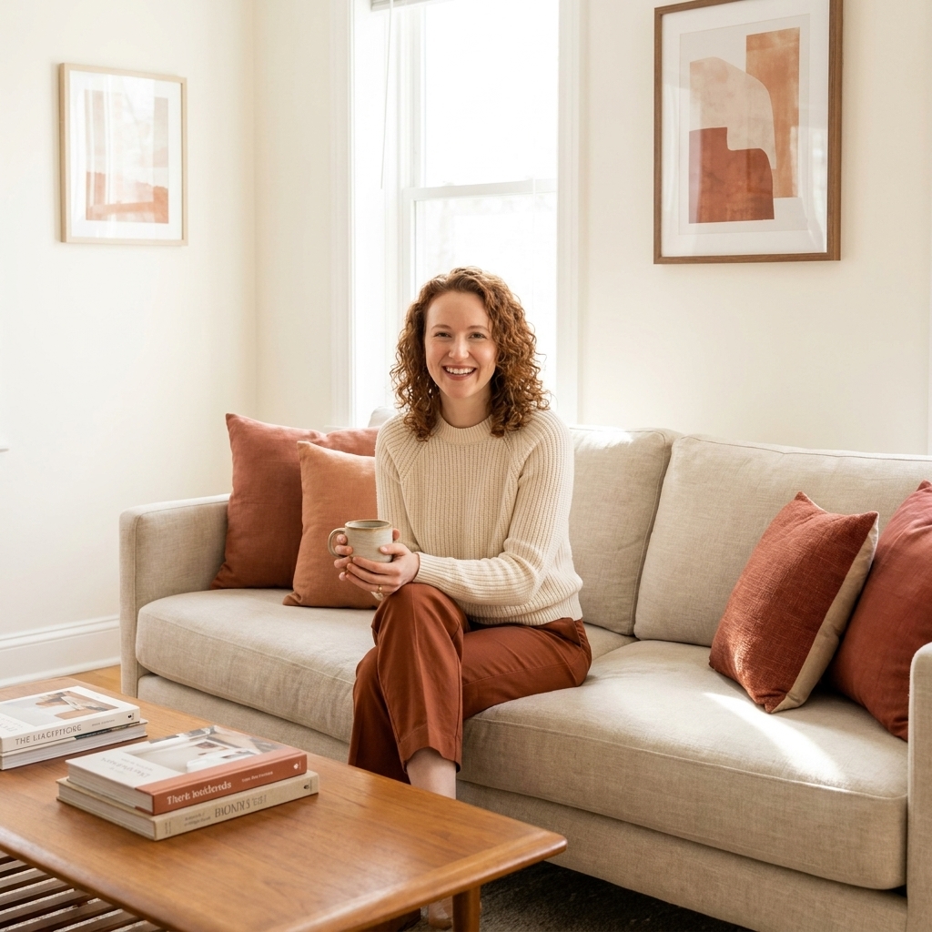
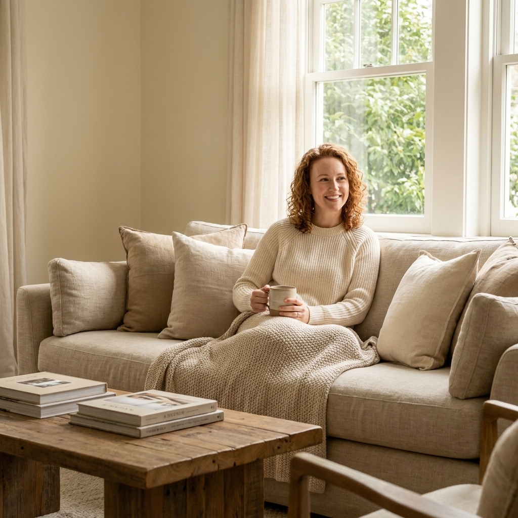
Living rooms are social spaces, even if “social” means you and your dog watching a show. Warm neutrals, grounded greens, and softened terracottas make a room feel welcoming.
- Cozy and inviting: warm white, beige, greige, camel, soft terracotta
- Balanced and fresh: olive, muted green, green gray
- Tip: if your living room feels scattered, choose a quieter wall color and let textiles bring pattern and personality
Kitchen: clean energy, everyday optimism
Kitchens thrive on clarity. You want it to feel fresh and workable, not fussy. Color can also help a kitchen feel warmer if it leans sterile.
- Bright and clean: warm white, creamy off-white, pale greige
- Fresh but calm: soft green, pale blue-green
- Warm and lively: buttery yellow, terracotta accents, warm wood tones
- Tip: if you have a lot of cool surfaces like stainless steel and gray countertops, a warm wall color brings the human back in
Home office: focus, confidence, low distraction
For focus, I like colors that feel steady rather than stimulating. The goal is “I can think here,” not “this wall is shouting at me.”
- Deep focus: navy, deep teal, charcoal, forest green
- Light focus: blue gray, muted green gray, warm white
- Tip: if you take video calls, choose a color that flatters skin tones such as warm greige, muted blue, or soft olive
Bathroom: spa-like calm, freshness, light
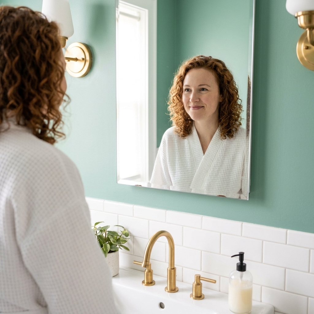
Bathrooms benefit from clean, soothing hues. Blues and greens are classics for a reason. They feel water-adjacent without being literal.
- Spa-like: pale blue, sea glass green, soft gray green
- Moody and luxe: deep teal, charcoal, inky navy with brass fixtures
- Tip: bathroom lighting can skew cool. Choose warmer bulbs if your paint starts looking harsh
Dining room: warmth, linger a little longer
Dining rooms are allowed to be a touch dramatic. Deeper, warmer colors can make meals feel more intimate and special, even if it is takeout on a Tuesday.
- Inviting classics: warm taupe, terracotta, muted red, deep green
- Elegant mood: charcoal, deep navy, aubergine in the right light
- Tip: pair richer wall colors with warm dimmable lighting so it feels like evening candlelight
Kids’ rooms and playrooms: cheerful, flexible, not overstimulating
Kids often love bright color, but constant high saturation can be a lot. I like a calmer base with playful punches through art, bedding, and rugs.
- Happy but soft: muted aqua, soft peach, gentle lavender gray, warm white
- Tip: choose one “fun” color and keep the rest simple. It looks intentional and grows with them
Entryway and hallway: first impression, flow, light bounce
These spaces set the tone. If you want your home to feel warm the second you step inside, this is where to do it.
- Welcoming: warm white, creamy beige, soft blush, light greige
- Bold and memorable: deep green, navy, or charcoal with good lighting
- Tip: in a narrow hallway, a light to medium value color keeps it airy, then add drama with a runner rug and sconces
Work with what cannot move
Before you fall in love with any swatch, look at the permanent things in the room. Floors, tile, countertops, cabinets, big stone fireplaces. These fixed finishes are the cast you cannot recast, so your paint color has to act like it belongs on the same stage.
- Warm fixed elements (honey oak, warm stone, cream tile) usually like warm whites, greige, olive, and earthy tones.
- Cool fixed elements (cool gray tile, bright white quartz, chrome) often look best with crisper whites, blue grays, and cleaner cool tones.
- Tip: If something looks “off,” it is usually undertone conflict, not a “bad color.”
Undertones matter
If you have ever painted a room “simple white” and watched it turn suspiciously pink at sunset, you have met undertones.
Most paints lean warm or cool beneath the surface. That undertone becomes obvious next to floors, countertops, and fixed finishes.
- Warm undertones: yellow, red, or peach base. These pair beautifully with honey oak, brass, and warm lighting.
- Cool undertones: blue, green, or violet base. These work well with crisp whites, chrome, and cooler stone.
- Neutral undertones: balanced base, but still shifts with light. Always test.
My theater trick: test paint in more than one corner. Light behaves differently across a room. What looks calm on the “audience side” might look weirdly green by the window.
Lighting changes everything
Paint is a collaboration between pigment and light.
- North-facing rooms often have cooler, flatter light. Warm up the paint choice or bring in warmer bulbs and textiles.
- South-facing rooms get strong, warm light. Many colors look brighter here, so you can often go more muted.
- East-facing rooms are bright in the morning and cooler later. Great for gentle, energizing colors.
- West-facing rooms glow in the afternoon and evening. Be cautious with warm colors that might intensify at sunset.
Also, check your bulbs. A warm, dimmable bulb can make a “too cool” room feel instantly more inviting without repainting.
Paint finish basics
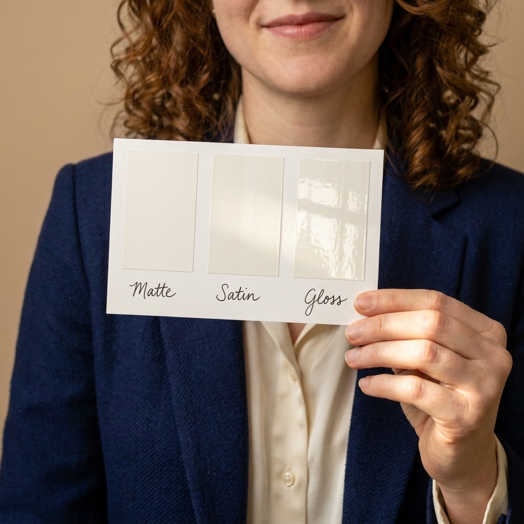
Finish is not as romantic as color, but it changes the whole read. It controls how light bounces, how forgiving your walls look, and how easily you can wipe off fingerprints.
- Flat or matte: velvety, hides wall imperfections, best for low-traffic bedrooms and ceilings.
- Eggshell: my go-to for most living spaces. Soft, practical, and easy to touch up.
- Satin: more washable, a little more sheen, great for hallways, kids’ rooms, and busy living rooms.
- Semi-gloss: durable and reflective, best for trim, doors, and sometimes bathrooms if you need extra wipeability.
A quick stagecraft note: more sheen means more spotlight. If your lighting is harsh, a flatter finish can make the same color feel calmer.
A simple choosing formula
If you feel overwhelmed, use this order of operations. It is the least stressful way I know to land on a color you will love.
Step 1: Choose the mood first
Pick one dominant goal: calm, energy, focus, or cozy. Write it down. Tape it to the wall if you must.
Step 2: Pick a color family
- Calm: blues, blue-greens, soft neutrals
- Energy: warm yellows, terracotta, lively accents
- Focus: mid to deep blues, greens, charcoals
- Cozy: warm neutrals, earthy reds, deeper values
Step 3: Decide intensity
Ask: do I want this to be a background or a statement? Background colors are usually lighter or more muted.
Step 4: Test big, not tiny
Paint a large sample (or use a peel-and-stick sample sheet) and look at it for a full day and night cycle. Stand back. Squint. Notice how it makes you feel when you walk past.
Step 5: Build a small supporting palette
Once walls are decided, echo the undertone in a rug, curtain, or pillow. That repetition is what makes a room feel finished.
Quick mood cheat sheet
- Want the room to feel calmer? Go cooler, lighter, and more muted. Add warm lighting so it stays cozy.
- Want the room to feel cozier? Go warmer and slightly deeper. Add texture like wool, linen, and vintage rugs.
- Want the room to feel bigger? Go lighter and low-contrast. Keep trim and ceiling bright.
- Want the room to feel more dramatic? Go darker or higher-contrast. Layer multiple light sources.
- Want more focus? Choose steady mid-tones like muted blue, olive, or charcoal. Reduce visual clutter.
Common mistakes and easy fixes
Choosing the right mood color but the wrong undertone
Fix: Compare your paint sample next to your floor and any large fixed finish. If it clashes, switch undertones, not the whole idea. You can still have “calm blue” in a warmer, grayer, or greener version.
Going too bright too fast
Fix: Keep vibrant color to one wall, the ceiling, a built-in, or a smaller room like a powder bath. Or choose a muted version of the same hue.
Forgetting the nighttime vibe
Fix: Evaluate samples with lamps on. If your “serene” paint turns icy at night, warm up your bulbs or shift the paint warmer.
Trying to make every room the same mood
Fix: Give each room a role. Cohesion comes from repeating undertones and materials, not painting your whole house one color.
FAQ
Is color psychology real, or just a trend?
There are consistent patterns in how people experience warm vs cool hues and bright vs muted intensity. But personal history matters, too. If your happiest childhood kitchen was painted yellow, yellow might feel settling to you. Use psychology as a compass, not a rulebook.
What is a low-risk calming paint color?
Muted blue-green and soft green-gray are widely liked, nature-adjacent choices that tend to read quiet in many homes. The best calming color, though, is the one that looks good in your light and does not fight your floors.
What colors help with focus?
Muted blues, deep teals, olives, and charcoals tend to support focus because they feel steady and reduce visual noise. Pair them with warm task lighting and a clutter-light desk setup.
Can I use dark colors in small rooms?
Yes. Dark colors can make a small room feel intentional and cozy, like a jewel box. The key is lighting and contrast. Add warm bulbs, a mirror, and a lighter element like trim, art, or bedding.
A parting note
In theater, we never asked color to do everything alone. We paired it with lighting, texture, and story. Do the same at home. Choose a hue that supports the mood you want, then back it up with warm lamps, tactile fabrics, and a rug that makes you want to kick your shoes off at the door.
If you want, tell me what room you are painting, which direction it faces, and what you want to feel in there. I can help you narrow the color family and undertone so you can stop second-guessing every swatch.