Explore seven sleep-friendly paint and decor palettes, with clear styling notes on undertones, trim, bedding, finishes, sampling, and warm lighting for a tru...
Havitza Home
Paint Colors That Make a Small Bedroom Look Bigger
Make your small bedroom feel airy and expanded with the right paint colors. Discover light-reflecting hues, smart dark accents, and simple paint tricks that visually open up tight spaces.

Clara Jenkins
Clara Jenkins is a former theater set designer turned interior styling expert with over a decade of experience transforming everyday spaces into beautiful sanctuaries. Through her work at havitza.com, she shares practical styling tips, accessible furniture layouts, and inspiring color palettes to help anyone create a home they truly love.
Published October 17, 2026
Updated October 17, 2026
When a bedroom is short on square footage, paint becomes your most powerful optical tool. In theater, we used color to push a “wall” back or pull focus forward without moving a single flat. Your bedroom works the same way. The best paint colors for a small bedroom are the ones that bounce light, soften hard edges, and keep contrast in check so your eye reads the room as one calm, continuous space.
Below, I’ll walk you through hues that reliably make a compact bedroom feel bigger, plus a few paint techniques that add breathing room, even if your furniture stays exactly where it is.
What makes a small room feel bigger
Before we get to specific shades, here are the three rules that matter most in tight rooms:
- Higher reflectance, gentler contrast: Lighter colors generally reflect more light, which brightens shadows and makes corners feel less boxed in.
- Fewer visual “stop lines”: When trim, ceiling, and walls are high contrast, your eye stops at every edge. When they’re closer in tone, the room reads as more open.
- Undertones matter: A “white” can look dreamy or dingy depending on whether it leans warm, cool, or green. The wrong undertone can make a small room feel gray, flat, and cramped.
A quick, useful metric: If you are comparing options, look at LRV (Light Reflectance Value). As a rule of thumb, LRV 70+ reads light in most bedrooms, and LRV 80+ reads bright. Undertone still decides whether that brightness feels clean or muddy in your specific light.
Best light colors for small bedrooms
These are the hues I reach for most when someone says, “I want it to feel bigger, brighter, calmer.”
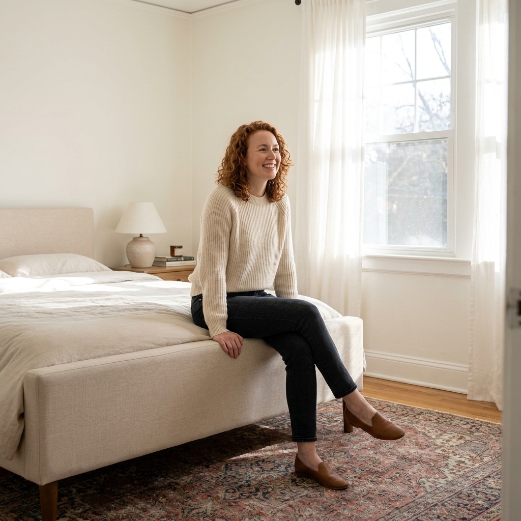
1) Soft warm whites (creamy, not yellow)
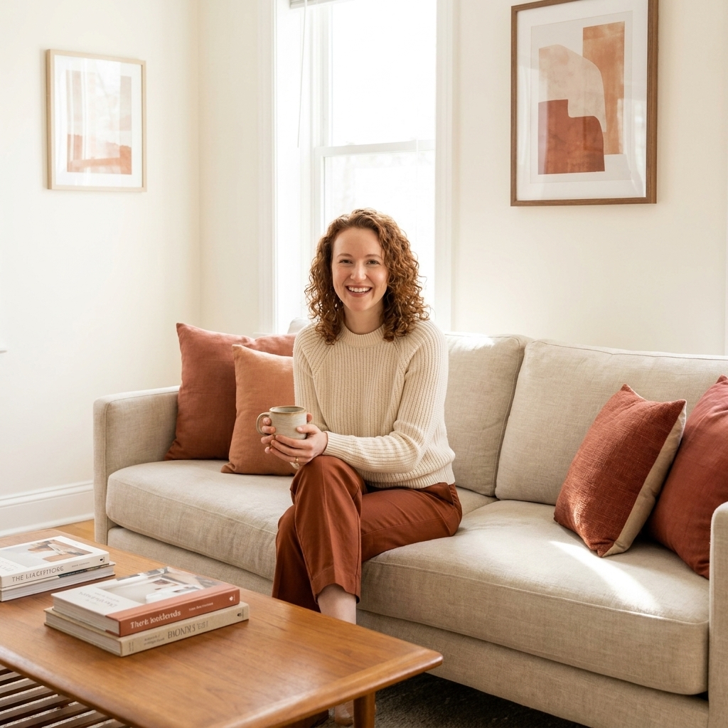
A warm white is one of the safest ways to make a small bedroom feel airy while still cozy. It reflects light beautifully but does not feel stark, which is important in a room meant for rest.
- Best for: North-facing rooms, low natural light, beige carpets, warm wood furniture
- Look for: Whites with subtle cream or ivory undertones, often in the LRV 80+ range
- Avoid: Very bright blue-white if your light bulbs run warm, since it can read icy
Real-world picks: Benjamin Moore White Dove, Sherwin-Williams Alabaster, Farrow & Ball School House White.
Styling note: Pair with warm lighting (2700K to 3000K) and a tactile headboard or linen bedding so the room feels intentional, not “rental blank.”
2) Airy greige (between beige and gray)
Greige is a small-bedroom workhorse because it behaves like a neutral backdrop without the flatness some grays create. In the right undertone, it helps walls recede gently, which can make the room feel wider.
- Best for: Rooms with mixed finishes (black hardware, wood dresser, white trim)
- Look for: Light greige with a warm undertone so it stays inviting at night, often LRV 65 to 80
- Avoid: Heavy cool gray in a room with little sunlight
Real-world picks: Sherwin-Williams Agreeable Gray (light greige), Benjamin Moore Classic Gray, Behr Silver Drop.
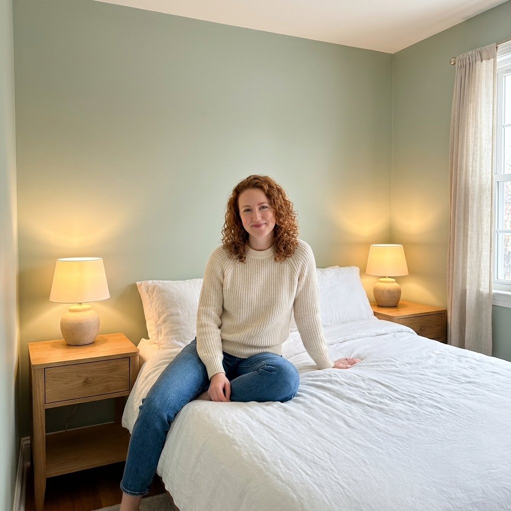
3) Pale sage and soft green-gray
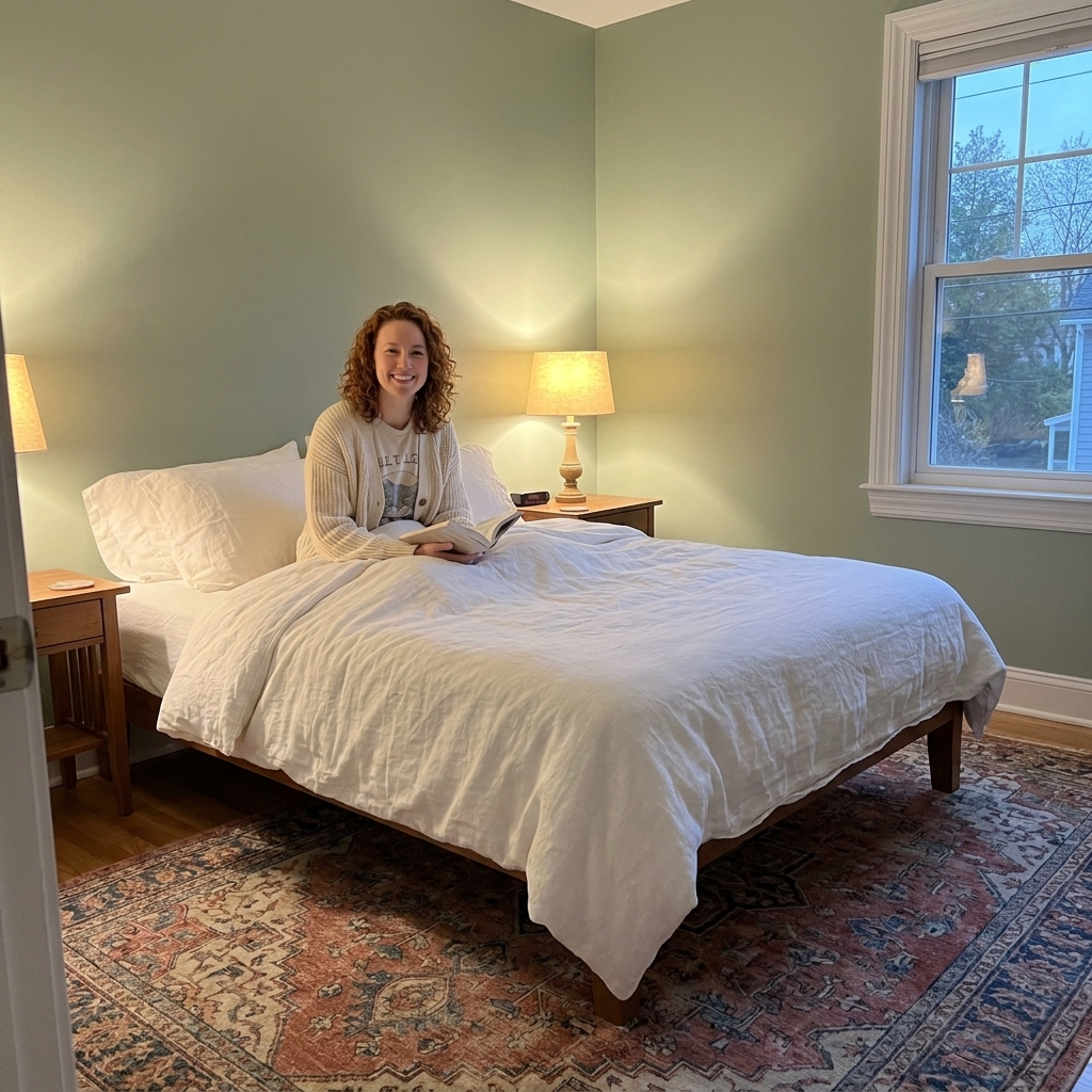
This is my quiet-magic category. A muted sage can brighten a small bedroom while adding depth and calm. Green undertones also play nicely with plants and natural textures, so the room feels grounded instead of sterile.
- Best for: Bedrooms that need softness, stress relief, and a little personality
- Look for: Desaturated greens that read almost neutral, often LRV 55 to 75
- Avoid: Bright or highly saturated greens, which can feel closer and more energetic
Real-world picks: Sherwin-Williams Sea Salt, Benjamin Moore Healing Aloe, Farrow & Ball Mizzle.
Light blues and soft lavenders
Cool colors can visually recede, which helps in small spaces, but they tend to look best when softened and balanced with warm textures.
4) Misty blue-gray
A very light blue-gray can make a small bedroom feel like it has more air in it. It’s especially effective if your room gets strong daylight and you want that crisp, clean breath of space.
- Best for: South-facing rooms, bright windows, white bedding
- Make it cozy with: A vintage rug, warm wood tones, woven shades, brass accents
Real-world picks: Benjamin Moore Palladian Blue, Sherwin-Williams Misty, Farrow & Ball Light Blue.
5) Barely-there lavender or lilac-gray
This sounds bold, but hear me out. A whisper of lavender can lift a small bedroom in a way plain white sometimes cannot. It reflects light gently and can soften that boxed-in feeling, especially with warm bulbs at night.
- Best for: Rooms that feel a bit dull in neutral-only palettes
- Keep it grown-up with: Cream bedding, walnut tones, soft black accents
Real-world picks: Benjamin Moore First Light, Sherwin-Williams Silver Peony.
Yes, dark paint can work
Here’s the counterintuitive truth from years of building sets and styling apartments: dark can add a sense of depth in a small space when it’s used to blur edges and avoid high-contrast outlines. Dark paint absorbs light, which can make boundaries harder to read. When boundaries fade, a room can feel deeper.
One important caveat: if your bedroom is already dim, cluttered, or outlined in bright white trim, dark paint can swing the other way and feel tighter. The fix is usually not “no dark,” it’s better lighting and lower contrast.
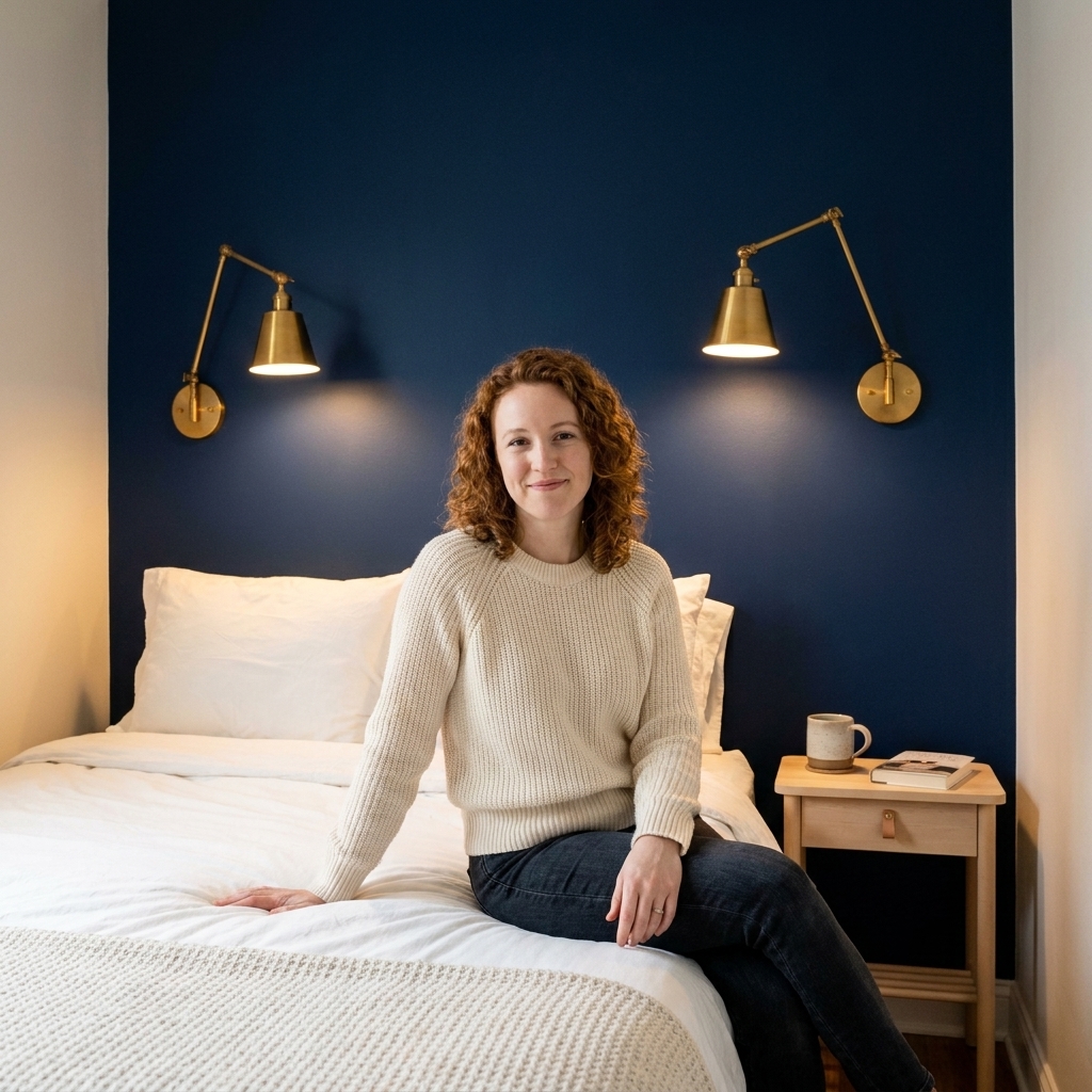
6) Deep navy (moody, with depth)
Navy is one of my favorite small-room, big-payoff colors. It adds depth like a night sky. The trick is to keep the rest of the room lighter, choose a finish that suits your walls, and warm up the lighting.
- Best for: A single accent wall behind the bed, or full-room color drenching (walls + trim)
- Works beautifully with: Crisp white bedding, brass, warm oak, creamy curtains
Finish tip for dark colors: Matte hides wall texture and feels velvety, but it can scuff. Eggshell is easier to clean while still looking soft.
7) Charcoal or soft black (strategic and sophisticated)
A soft black on one wall can create the impression of a strong vanishing point, especially behind the bed, where you want depth and drama without visual clutter. It’s not a guaranteed trick, but when the rest of the palette is calm and lighting is warm, it can be stunning.
- Best for: A bed wall you want to visually push back
- Avoid: Pairing with bright white trim everywhere, which can outline the room like a box
Paint techniques that open space
Color matters, but where you put it matters just as much. These are the techniques I use most in compact rooms.
Color drenching (walls and trim)
Painting the walls and trim the same color reduces visual breaks. Your eye stops less, and the room feels more continuous and spacious.
- Best colors for color drenching: warm white, pale greige, sage-gray, dusty blue, navy
- Finish tip: Use a slightly different sheen (like eggshell on walls, satin on trim) so it reads as one color without looking flat
Tint the ceiling (soft, not stark)
In small bedrooms, a bright stark-white ceiling can feel like a hard lid. A ceiling tinted about 10 to 25 percent toward the wall color often feels higher and calmer because the transition is softer.
- Works especially well with: warm whites, greiges, very pale colors
Keep trim and doors low-contrast
If your goal is “bigger,” keep trim close to the wall color. High-contrast white trim against darker walls is pretty, but it can visually chop up a tiny room.
Quick win: If repainting trim feels like a lot, at least paint the door the same color as the walls. Doors are big visual interruptions.
Use a subtle horizontal band
A low-contrast band around the room can make it feel wider, similar to how a horizon line expands a stage. Keep it tonal so it reads sophisticated, not busy.
- How to do it: Choose a wall color, then use a slightly lighter or darker tone in the same family for a band that runs at about 40 to 55 inches from the floor.
How to choose the right light color
Two paint swatches can look identical in the store and completely different in your room. Here’s how to choose with confidence.
Match undertone to fixed finishes
- Warm woods, brass, beige carpet: warm whites, creamy greige, soft sage
- Gray flooring, chrome, cool stone: clean whites, blue-grays, cooler greiges
- Lots of greenery and natural textures: sage-gray, warm whites, light sand tones
Test vertically, in more than one spot
Paint large samples (at least 12x12 inches) or use peel-and-stick samples. Place one near the window and one on the darkest wall. A small bedroom often has uneven light, so you want a color that behaves well in corners.
Think about bulbs and brightness
Kelvin (warm vs cool) matters, but so does brightness. A small bedroom with low natural light usually benefits from more lumens, not just warmer bulbs. If your room feels cave-like at night, consider adding layered light: a ceiling fixture (or plug-in pendant), bedside lamps, and one softer ambient source.
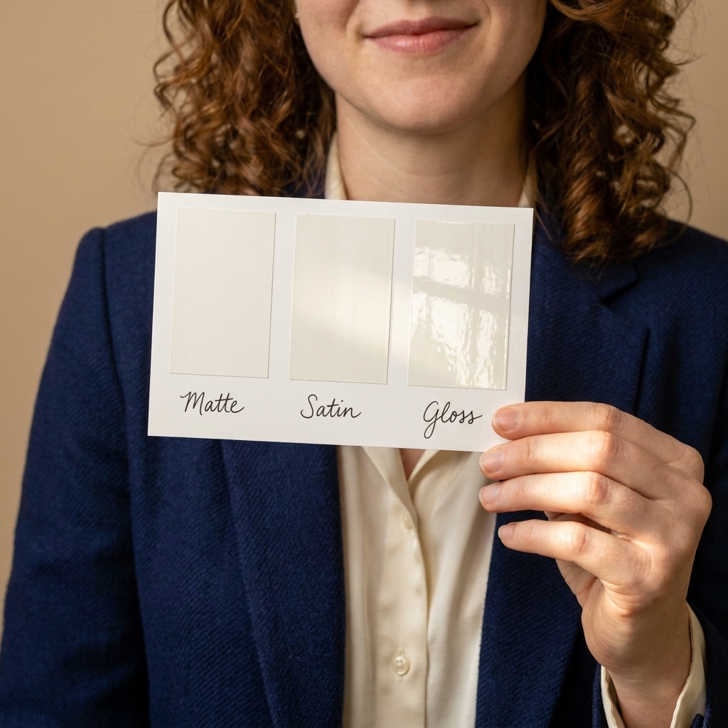
Consider sheen like part of the color
In small rooms, sheen can help reflect light, but too much can highlight wall texture.
- Walls: eggshell is usually the sweet spot
- Ceilings: flat or matte for a soft, airy look
- Trim and doors: satin for durability and a gentle glow
Color pairings that feel bigger
If you want the room to feel expanded, aim for a simple palette where most elements sit close together in value, with one or two deeper anchors.
- Warm white walls + oatmeal textiles + black accents: clean, calm, and modern
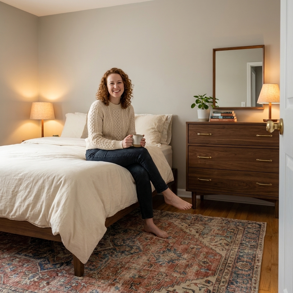
- Pale greige walls + cream bedding + walnut wood: cozy and elevated
- Soft sage walls + low-contrast trim + vintage rug: fresh and lived-in
- Misty blue-gray walls + crisp white bedding + brass lighting: airy, not cold
- Navy bed wall + warm white remaining walls + natural linen: depth without shrinking the room
Mistakes that make rooms feel smaller
- Too much contrast everywhere: Dark walls, bright trim, bold bedding, busy art. Each hard contrast line acts like a visual stop sign.
- Icy white in warm light: A cool, blue-leaning white can read dull or gray, sometimes slightly greenish, depending on the paint’s undertone and your bulbs.
- Overly saturated color on all walls: Bright, intense colors tend to advance visually, which can close in the room.
- Ignoring the ceiling: A ceiling that’s much brighter or much darker than the room can emphasize height issues.
Quick FAQ
Should I paint a small bedroom white?
You can, and it often works, but “white” is not one color. Choose a white with an undertone that suits your light. If you want more softness, try warm white or light greige instead of a stark gallery white.
What’s the best paint color for a small bedroom with low light?
Typically a warm white or a warm greige, plus adequate lamp light at night. In low light, cool grays can go flat. A warm undertone keeps the room from feeling shadowy.
Will dark paint make my small bedroom feel tiny?
Not always. Dark paint can add depth, especially on the bed wall or with color drenching, but it tends to work best with warm, layered lighting and a simple palette. If the room is dim and high-contrast, dark can feel heavier.
What paint trick makes the biggest difference fast?
Color drenching, or at least painting the door and trim closer to the wall color. Softening the outlines is one of the fastest ways to make a small room feel less choppy.
One final styling note
Paint sets the stage, but texture sells the illusion. In a small bedroom, I love pairing an airy wall color with one grounding, tactile piece, like a vintage rug, a nubby throw, or linen curtains. When the room feels layered and calm, it automatically feels more spacious because your eye relaxes instead of scanning for what feels off.
If you tell me your room’s light (north, south, east, west) and your biggest fixed item (flooring, bed frame, or carpet), I can suggest a tighter shortlist of color directions that will behave beautifully in your specific space.