A warm, practical guide to the 60-30-10 color rule, plus room-by-room examples, easy palettes, and common mistakes to avoid.
Havitza Home
Master the 60-30-10 Color Rule
Use the 60-30-10 rule to add accent colors with confidence. Learn how to pick a palette, place color through textiles and art, and avoid common clashing mistakes.

Clara Jenkins
Clara Jenkins is a former theater set designer turned interior styling expert with over a decade of experience transforming everyday spaces into beautiful sanctuaries. Through her work at havitza.com, she shares practical styling tips, accessible furniture layouts, and inspiring color palettes to help anyone create a home they truly love.
Published October 17, 2026
Updated October 17, 2026
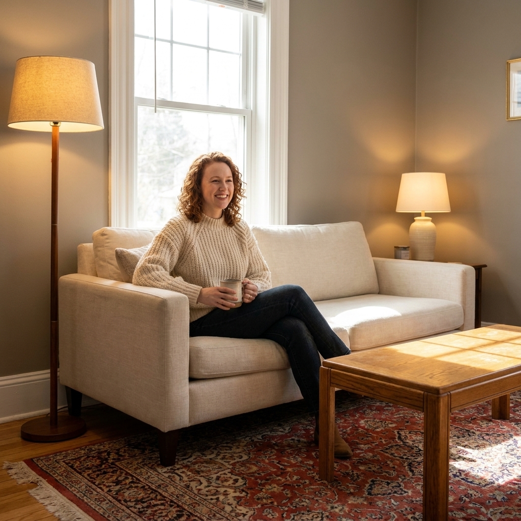
When a room is mostly neutral, adding color can feel like stepping onto a stage without rehearsing. One wrong pillow and suddenly the whole scene feels off. The good news is that designers have a wonderfully simple cue sheet for color, and it works whether your style is airy and modern or cozy and vintage-rug obsessed (hello, it is me).
The 60-30-10 rule is a commonly used interior design guideline that helps you build a balanced palette. It gives your eye a clear “lead actor,” a strong supporting tone, and a smaller accent that brings the sparkle. Once you understand the roles, you can introduce vibrant textiles, art, and decor without that accidental clash.
What the 60-30-10 rule means
Think of your room like a theater set. The audience needs to understand the mood instantly. Color ratios help your space read clearly the moment you walk in.
- 60% is your dominant color. This is the backdrop: walls, a large rug, a big sofa, or the overall “field” of the room.
- 30% is your secondary color. It supports the main color and adds depth, often showing up in curtains, upholstery, accent chairs, or a large piece of furniture.
- 10% is your accent color. This is the pop: pillows, art, vases, books, lampshades, flowers, and the little moments that make a room feel personal.
This rule is not math homework. It is a balance tool. If your space is open concept or unusually small, treat the whole visual area you are styling as your “room,” then distribute color with intention.
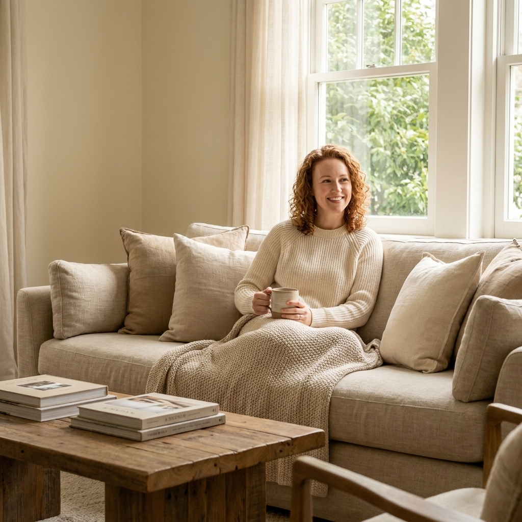
A quick, real-world way to estimate: if your walls are warm white, your sofa is oatmeal, and your rug is light neutral, those big surfaces often add up to most of your 60%. Then your wood coffee table, drapes, and an accent chair can easily become your 30%. After that, pillows, a throw, and a piece of art are plenty to cover your 10% without turning the room into confetti.
Start with neutrals, build the palette
If your room already leans neutral, you are in a great place. Neutrals are forgiving and they love company. Here is the simplest way to build your 60-30-10 palette without second guessing yourself.
Step 1: Name your 60%
Your 60% is usually already decided. If you have:
- Warm neutrals (cream, ivory, beige, camel): these often pair beautifully with warm accents like terracotta, olive, mustard, rust, or inky navy.
- Cool neutrals (bright white, cool gray, charcoal): these often pair well with crisp accents like cobalt, emerald, true black, icy blues, or magenta.
Quick check: look at your biggest surface in daylight. If it feels buttery, it is warm. If it feels steely or blue-leaning, it is cool. And yes, you can absolutely mix warm and cool on purpose, you just want it to look repeated and intentional, not like two different rooms moved in together.
Step 2: Choose a 30% that adds weight
Your secondary color should feel like it belongs with your dominant neutral, but with more presence. In many homes, the 30% is where wood tone and upholstery do a lot of heavy lifting.
- Warm white walls (60%) + camel leather chair or honey oak media console (30%)
- Soft gray walls (60%) + charcoal sofa or deep walnut bookcase (30%)
If you struggle here, pick a secondary color that is one to two steps darker than your dominant. That little contrast creates structure.
Step 3: Pick a 10% accent that feels intentional
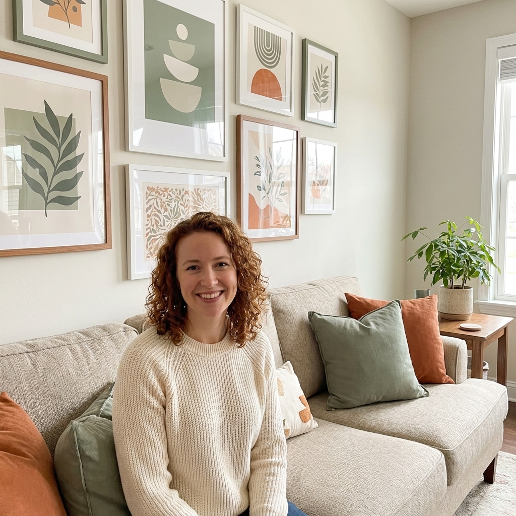
Accent colors tend to look best when they show up in a few spots around the room. One is a statement. A couple is a plan. A helpful trick is aiming for three touchpoints, like a pillow, a piece of art, and a small ceramic piece across the room.
How to add accents without clashing
Clashing usually happens for one of three reasons: undertones are fighting, saturation levels are mismatched, or accents are scattered with no repetition. Here is how to fix each one.
Match undertones first
Undertone is the quiet tint beneath a color. It is why two “whites” can look totally different. The same goes for blues, greens, and even blacks.
- If your neutrals are warm, accents with warm undertones often feel easiest (rusty reds, olive greens, creamy yellows, warm teal).
- If your neutrals are cool, accents with cool undertones often feel cleaner (true cobalt, blue-based greens, crisp berry tones).
My favorite quick test: hold your accent item next to something you already own and love in the room, like your rug or sofa. If it looks “dirty” or oddly neon, undertones are probably disagreeing.
Keep saturation consistent
Picture a room where everything is soft and muted, then one super neon pillow shows up. The pillow is not “wrong,” it is just speaking a different volume.
- Muted room: accents like dusty rose, sage, clay, smoky navy.
- Bright room: accents like tomato red, sunflower yellow, emerald, cobalt.
If you want one bold piece in a calm room, do it, but make it look deliberate by repeating that boldness once or twice more.
Use the three touchpoints trick
One accent item can look accidental. Three looks styled. Spread your accent color across different heights:
- Low: rug detail, floor pouf, plant pot
- Mid: pillows, throws, side chair
- High: art, lamp shade, curtain banding
Palettes that tend to work
If you want a starting point that feels polished but not fussy, these combinations tend to work in many homes. Use the first as 60%, the second as 30%, and the third as your 10% accent.
- Warm white + camel + olive green
- Greige + charcoal + brass and ochre
- Soft beige + navy + terracotta
- Light gray + natural oak + cobalt blue
- Cream + sage + black accents
- White + black + one juicy color (cherry red, emerald, or fuchsia)
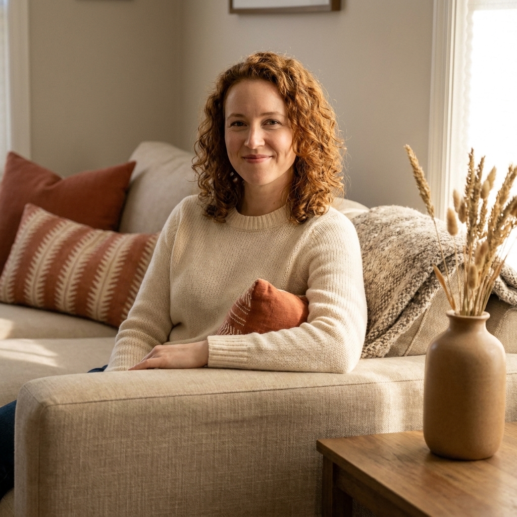
Notice how many of these rely on a wood tone or a deep neutral as the 30%. That middle layer is what keeps accent color from feeling like confetti.
Patterns and tonal rooms
If you live for pattern or you want a mostly one-color room, the 60-30-10 guideline still works. You just have to define what is doing the heavy lifting.
How to count a multicolor rug
A patterned rug can act like your whole color script. Here is the easiest way to treat it:
- Background color of the rug: often counts toward your 60% because it reads as the “field.”
- Secondary color in the rug: a strong candidate for your 30% if you echo it in something bigger, like curtains or an accent chair.
- One smaller rug color: a perfect 10% accent you can repeat in pillows, art, and decor.
Example: a vintage rug with a warm ivory base, faded navy, and little rust notes. Your 60% can be ivory walls and that rug base, your 30% can be navy through a chair or drapery, and your 10% can be rust in pillows and a vase.
60-30-10 can be about value, too
You can do this guideline with light, medium, and dark instead of three totally different hues. Think: creamy walls (60), medium-toned wood and taupe upholstery (30), then matte black hardware or deep espresso accents (10). It is still contrast, just quieter.
Where to put the 10%
The accent color is the jewelry. It should feel sprinkled, not poured. Here are placements that make your 10% look intentional and high impact.
Textiles: the easiest audition
- Pillows: mix solids and patterns, and repeat your accent in at least one patterned pillow.
- Throws: choose texture first (knit, linen, mohair), then color.
- Rugs: if you love vintage rugs, let the rug carry multiple accent notes, then echo just one or two elsewhere.
- Curtains: a subtle accent stripe or trim can count as part of your 10% without overwhelming the room.
Art: the shortcut to a cohesive palette
If you are nervous about clashing, start with one piece of art you love. Pull your accent color directly from it. Art is basically a palette already solved.
Decor: small items, big payoff
- Vases and ceramics
- Books with strong spine colors
- Candles and holders
- Lampshades
- Flowers and greenery
Tip from my set design days: cluster small decor in groups of three and vary height. It reads composed, not cluttered.
Common mistakes and fixes
Mistake 1: Too many accents, not enough calm
If you have five different “accent colors,” none of them gets to shine.
Fix: pick one main accent (your 10%), and let any other colors be tiny supporting notes, like a hint in artwork or one small object.
Mistake 2: Ignoring fixed colors
Flooring, countertops, and large upholstery pieces count, even if you did not choose them.
Fix: treat those fixed elements as part of your 60% or 30%, then build around them. A warm honey floor will usually nudge your palette warm, unless you intentionally balance it with cooler elements that repeat elsewhere.
Mistake 3: Forgetting black counts
Black picture frames, hardware, and lighting can quietly add up.
Fix: if you use black, repeat it a few times so it looks intentional. If you do not want black to be a “thing,” keep it minimal and consistent.
Mistake 4: Mixing metals with no plan
Mixed metals can be gorgeous. Random metals can look hectic.
Fix: choose one dominant metal, then add a second as an accent. For warm rooms, I love aged brass with tiny touches of black. For cooler rooms, chrome with soft brass can be striking.
Mini room recipes
Neutral living room
- 60%: warm white walls, light neutral rug, oatmeal sofa
- 30%: medium wood coffee table, woven chair, taupe curtains
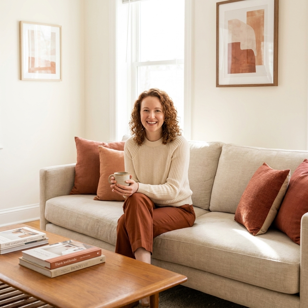
- 10%: rust pillows, one rust-toned abstract print, a terracotta vase
Calm bedroom
- 60%: soft beige walls and bedding
- 30%: walnut nightstands, linen headboard, warm gray throw
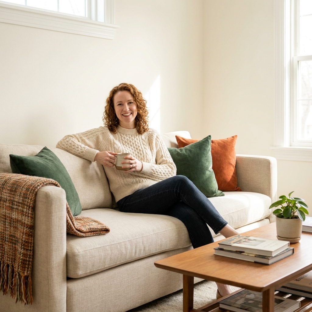
- 10%: deep forest green in pillows, a framed print, and a ceramic lamp base
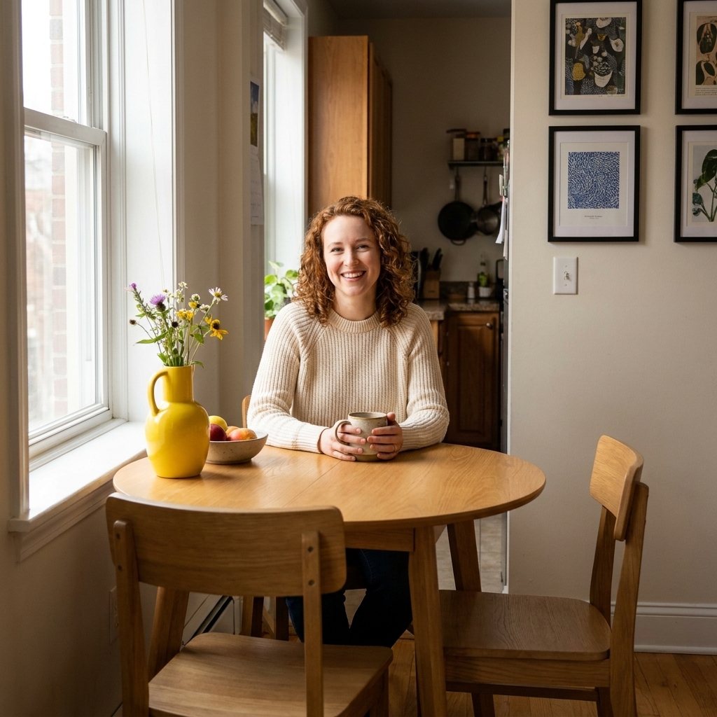
Small apartment dining nook
- 60%: white walls, light floor, simple rug
- 30%: black dining chairs or a darker wood table
- 10%: cobalt blue in a bowl, a vase, and two art prints nearby
FAQ
Do I have to follow 60-30-10 exactly?
No. Use it as a stabilizer. If your room feels too busy, you probably need more 60% calm. If your room feels flat, you might need a clearer 30% or a bolder 10%.
Can my accent color be more than one color?
Yes, with a small rule: keep them related. For example, navy and rust can both live in the 10% if your rug or art already includes both, and you repeat them intentionally.
What if I love patterns?
Patterns are welcome here. Treat a patterned rug or curtain as part of your 60% or 30% depending on scale, then pull one accent color from that pattern for the 10% so the room feels tied together.
How do I test an accent color before committing?
Bring in the accent through something returnable and soft first, like a pillow cover or throw. Live with it for a few days in morning and evening light. Color changes dramatically over the day, and your room should feel good in all its lighting moods.
A simple way to start
If you are standing in a neutral room and want a no-drama next step, do this:
- Pick one accent color you genuinely love.
- Add it in three touchpoints: a pillow or throw, one piece of art, and one small decor item.
- Step back and see if your room now has a clear “story.” If it does, you nailed it.
Design does not require expensive furniture. It requires a little harmony and a few confident choices. The 60-30-10 guideline simply gives your confidence a place to stand.