A room’s exposure can make the same paint look icy, muddy, or blazing warm. Here’s how to pick the right color for north, south, east, and west-facing ro...
Havitza Home
Choosing White Paint by Undertone
Learn how to spot warm, cool, and neutral undertones in white paint so your walls work with your floors, furniture, and lighting. Includes simple testing tips and room-by-room guidance.

Clara Jenkins
Clara Jenkins is a former theater set designer turned interior styling expert with over a decade of experience transforming everyday spaces into beautiful sanctuaries. Through her work at havitza.com, she shares practical styling tips, accessible furniture layouts, and inspiring color palettes to help anyone create a home they truly love.
Published October 17, 2026
Updated October 17, 2026
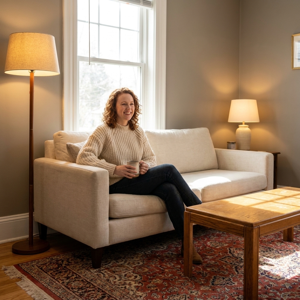
White paint looks simple until it’s on your walls and suddenly reads pink, blue, dingy, or stark. I learned this the hard way moving from theater sets to real homes: on stage, you control the light. In a living room with north-facing windows, honey oak floors, and a navy sofa, the “perfect white” can behave like a totally different color.
This guide will help you identify warm, cool, and neutral undertones in white paint so you can choose a white that feels intentional, calm, and connected to the finishes you already have.

Undertones in white paint
Most whites are not truly “just white.” They are tinted with tiny amounts of pigment that push the color warmer or cooler. That quiet tint is the undertone. It is why one white feels creamy and another feels icy, even if both look similar on a paint chip.
Two terms you’ll see often:
- Undertone: the subtle hue hiding in the white, like yellow, pink, green, or violet.
- Temperature: the overall feeling, warm (cozy) vs cool (crisp) vs neutral (balanced).
Here’s the part that surprises people: undertones show up more strongly when a white is next to other finishes, especially flooring, countertops, tile, and large upholstered pieces.
Warm, cool, and neutral whites
Warm whites
Warm whites have undertones like yellow, cream, red, or pink. They tend to feel inviting and forgiving, especially in homes with lots of natural materials.
- Often looks best with: warm wood floors (oak, maple, pine), beige stone, brass, rattan, terracotta, warm leathers.
- Watch for: warm whites can turn too buttery or pink in certain lighting, especially at night under warm bulbs.
Cool whites
Cool whites have undertones like blue, gray, or violet. They can feel modern, clean, and airy, and they play nicely with cooler finishes.
- Often looks best with: gray tile, white marble with cool veining, chrome, black metal, cool toned woods, crisp modern cabinetry.
- Watch for: cool whites can read stark or slightly bluish in north-facing rooms or shadowy hallways.
Neutral whites
Neutral whites aim for balance, but they still have undertones. They just sit closer to the middle. Think of them as your most versatile “bridge” whites.
- Often looks best with: mixed-finish homes (some warm woods, some cool metals), open floor plans, transitional styles.
- Watch for: “neutral” does not mean “always safe.” In the wrong environment, neutral whites can still lean green, gray, or beige.
5 fast ways to spot undertones
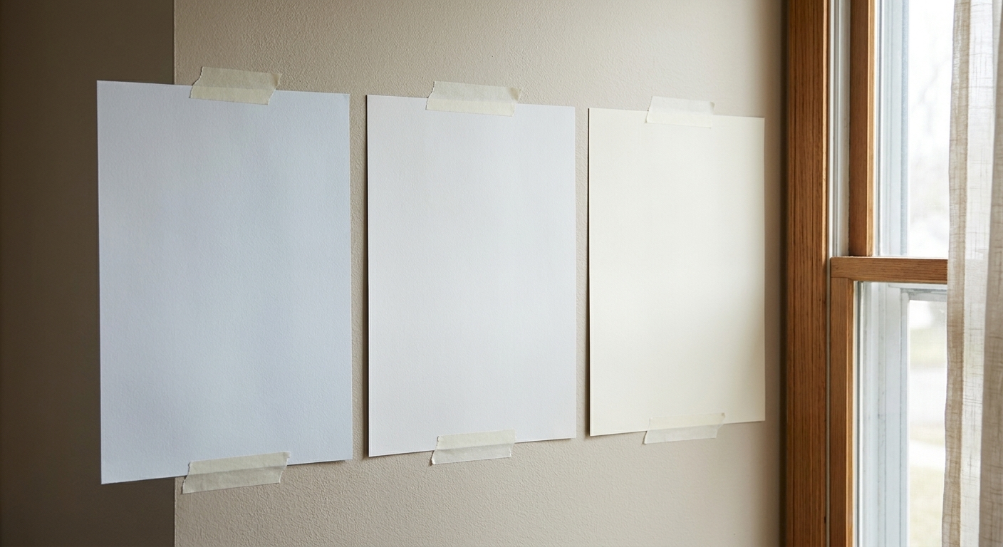
1) Compare it to true white paper
Hold a clean piece of bright white printer paper against the paint chip or sample. The paper acts like a truth-teller. If the paint suddenly looks creamy, it has warmth. If it looks icy or slightly blue-gray, it leans cool.
2) Use a “known” reference white
If you have trim already painted, or a white cabinet you love, use that as your anchor. Tape your sample next to it. Undertones jump out when whites are compared side by side.
3) Look at it in shade and sun
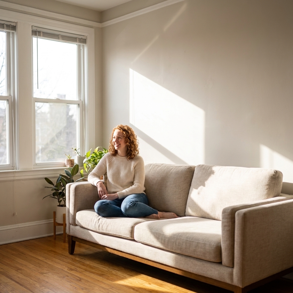
Undertones can hide in bright sun and show up in shadow. View your sample in multiple spots: near windows, in interior corners, and on walls that face different directions.
4) Check it against fixed finishes
Bring the sample to the things you are not changing: flooring, countertops, tile, brick, stone, large rugs. White paint is a background color, so it must harmonize with your non-negotiables.
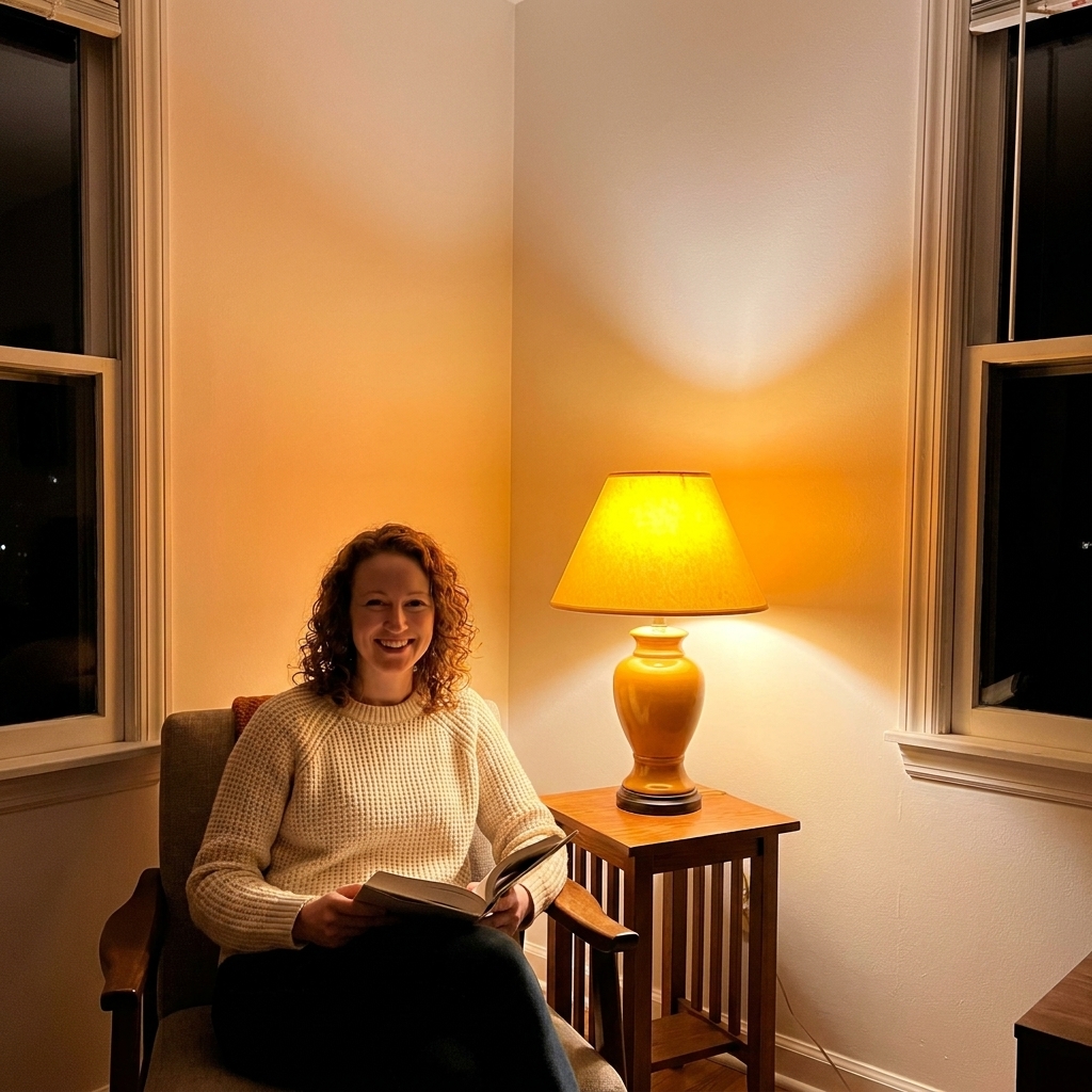
5) Evaluate it at night
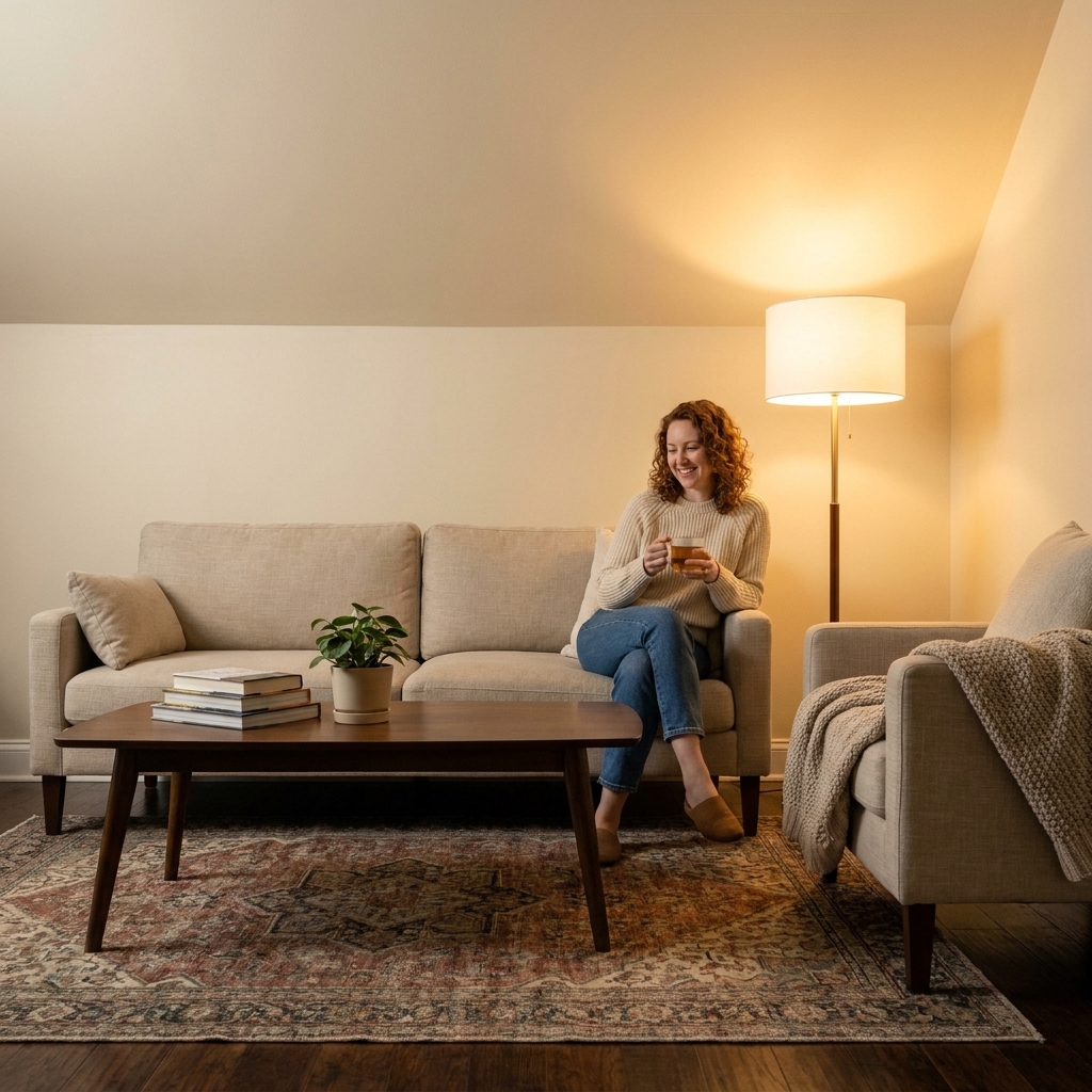
Paint choices fail more often at night than in daytime. Warm bulbs can pull pink or yellow from a white. Cool-color bulbs (often 4000K+) can make a soft white feel sterile. Turn on your lamps, overheads, and under-cabinet lights. That is the reality you live in.
Lighting and color shifts
In theater, we’d change the entire mood of a set with a gel and a dimmer. Your home does the same thing, just more quietly.
Natural light direction
- North-facing: typically cooler, bluer light (in many Northern Hemisphere homes). Warm whites often feel more comfortable here, while cool whites can feel extra chilly.
- South-facing: typically warm, bright light most of the day. Many whites work here, but very warm whites can look more golden.
- East-facing: warm morning light, cooler afternoons. Whites can feel different before and after lunch.
- West-facing: cooler mornings, warm late-day glow. Warm undertones can intensify at sunset.
Bulb temperature (Kelvin)
You don’t need to memorize numbers, but it helps to know the basics:
- 2700K to 3000K: warm, cozy light that can pull yellow or pink undertones forward.
- 3500K: a middle-ground white light that can feel more neutral than 3000K without going as cool as 4000K.
- 4000K+: cooler light that can emphasize blue, gray, or green undertones.
One more note from the stage: bulb quality matters. Higher-fidelity light (often described by higher CRI or better color rendering) tends to show paint colors more honestly than cheap, spiky LEDs.
Before you match finishes
Now for the practical part. Once you understand undertones, the goal is simple: choose a white that behaves well next to the things that are staying put.
Two quick concepts that help:
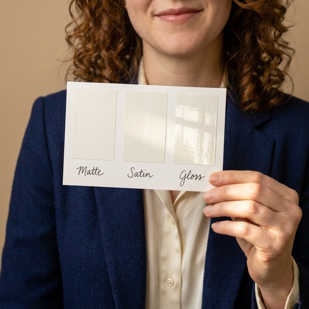
- Sheen: higher sheen (satin, semi-gloss) reflects more light and can make a color read brighter and sometimes a touch harsher. Flatter finishes (matte, eggshell) can look softer and more forgiving on walls.
- LRV (Light Reflectance Value): a higher LRV white reflects more light and can feel brighter. In darker rooms, two “white” paints can look surprisingly different if one has a lower LRV or heavier gray-beige tint.
Match white paint to floors
If you remember one rule, make it this: your floor is a giant color swatch. It will influence your wall color constantly.
Honey oak, maple, pine, or other golden woods
These floors already bring warmth. A warm white can feel seamless and cozy, but it can also amplify the yellow. If your goal is to calm the gold down, try a neutral white that is not overly creamy. If your goal is to lean into warmth, choose a soft warm white and commit to it.
Red-toned woods
Be careful with pinky or peachy whites, which can make red undertones feel louder. Neutral whites, or warm whites with a gentle beige base, are often the best partners.
Cool brown or espresso floors
These can handle a wide range, but stark cool whites can feel high-contrast and a bit severe. Many people prefer a neutral or slightly warm white to keep the room from feeling like a chessboard.
Gray LVP or cool gray tile
Cool floors usually look best with cool or neutral whites. Warm creamy whites can read “off” next to cool gray because the contrast highlights the creaminess.
Natural stone and travertine
Stone often has complex undertones: beige, gold, gray, even green. Pull a white that echoes the stone’s overall temperature. When in doubt, test several whites directly against the stone in the same lighting.

Match white paint to decor
Furniture is your supporting cast. White paint should make it look better, not fight it.
Lots of warm neutrals
Warm or neutral whites usually feel most natural. Cool whites can make warm neutrals look slightly dull or muddy by comparison.
Lots of cool neutrals
Cool or crisp neutral whites keep the look intentional and modern. Very creamy whites can read dingy next to bright, cool finishes.
Colorful rooms
Choose a white that supports your dominant color temperature. Navy and emerald often love a cleaner, slightly cooler white. Terracotta and rust tend to sing next to warm whites. Blush can make some whites look greenish, so testing is essential.
Vintage rugs and antique wood
This is my happy place. Many vintage rugs have warm bases and slightly muted colors. A soft warm white or balanced neutral white often feels most timeless with antiques, because it mimics the gentle warmth of aged materials.

Common undertones in whites
When people say “this white looks weird,” it is usually one of these undertones showing up:
- Yellow or cream: cozy, classic, can skew buttery in warm light.
- Pink or peach: flattering and soft, can feel dated if it gets too rosy.
- Green: can come from certain gray-greige whites, and it can also be boosted by reflections (trees outside, green tile, nearby paint colors). It may look slightly sickly next to pink-beige tile or certain warm stones.
- Blue: crisp and clean, can feel cold in low light.
- Violet: subtle, can counteract yellowing in some spaces, but can also read cool and shadowy.
How to sample white paint
Go bigger than you think
Tiny chips lie. For white paint, I love large peel-and-stick samples or poster boards painted with two coats. Aim for at least 12x12 inches, bigger if possible.
Move your sample around
Tape the board to different walls for a full day. Check it in morning, afternoon, and night.
Put it near your trim
Trim is often a brighter or glossier white. If your wall white is too close, the whole room can look flat. If it clashes, the undertones become painfully obvious.
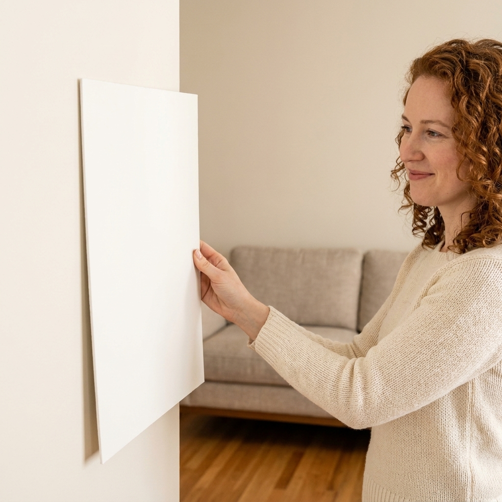
Test in context
Lean the sample against the sofa. Hold it next to the countertop. Set it behind your curtain fabric. White paint’s job is to harmonize with what you already have.
Do not trust screens
Online swatches and photos are useful for narrowing options, but they are not reliable for final decisions. Screens vary, camera settings vary, and white balance can completely change what you think you are seeing.

Room-by-room tips
Living rooms
If your living room is used most at night, prioritize how the white looks under lamp light. Many homes feel best with a neutral or gently warm white here, because it keeps skin tones and textiles feeling comfortable.
Kitchens
Kitchens are a countertop-and-cabinet story. If you have a cool marble-look surface, a cool or neutral white often looks crisp. If you have warm stone or butcher block, a warm or neutral white keeps things cohesive. Also check your under-cabinet lighting, which can dramatically shift undertones.
Bedrooms
Bedrooms love softness. A slightly warm or balanced neutral white tends to feel restful and forgiving, especially with warm bedside lamps.
Bathrooms
Bathrooms can go either way. Cool whites feel clean and spa-like, especially with chrome and gray tile. Warm whites can make a bathroom feel less clinical, particularly with brass and warmer stone. Always test with the vanity lights on, because those bulbs can swing warm and change everything.
Hallways and stairwells
These are often light-challenged. A white that is too cool can look gray and gloomy. A slightly warmer white can add life without looking “colored.”
Quick decision path
- If your fixed finishes are mostly warm (golden woods, beige stone, brass), start with warm or neutral whites.
- If your fixed finishes are mostly cool (gray tile, cool marble, chrome), start with cool or neutral whites.
- If your home is a mix, choose a neutral white and fine-tune with lighting and textiles.
- If your room feels dark, avoid whites that go too cool or too gray.
- If your room feels overly yellow, avoid very creamy whites and test balanced neutrals instead.
FAQ
Why does my white paint look yellow at night?
Warm bulbs (often 2700K to 3000K) can pull yellow and cream undertones forward. Try a slightly more neutral white, or consider using a slightly cooler bulb temperature in that room if the lighting feels too amber.
Why does my white look gray or dirty in the hallway?
Low natural light and shadows emphasize gray undertones. Hallways also get less reflected daylight. Test warmer whites or neutrals with less gray in them, and make sure your bulb brightness is sufficient.
Can I use one white paint throughout my whole house?
Yes, and it can look beautifully cohesive. Just sample it in multiple rooms first. The same white will shift room to room based on light direction and surrounding finishes. If it behaves well everywhere, go for it.
Should walls and trim be the same white?
They can be, especially in modern or minimal homes. If you want a bit more dimension, use the same white in a different sheen for trim, or choose a trim white that is slightly brighter. Always test the combo together so undertones do not clash.
Final reminder
On a stage, we never judged a set color under the work lights alone. We judged it under the exact lighting the audience would see. Treat your home the same way. Sample big. Check morning to night. Put the white next to your floors and fabrics. When you find the right undertone, white stops feeling stressful and starts feeling like what it’s meant to be: a calm, beautiful backdrop for your life.