A room-by-room guide to paint sheen: what each finish looks like, how it wears, and where to use matte, eggshell, satin, and gloss for walls, trim, and ceili...
Havitza Home
Modern Accent Walls That Won’t Look Dated
Create a modern accent wall that feels current for years: choose the right wall, pick a timeless contrast (paint, paneling, limewash, or wallpaper), test it in real light, and style it with proportion, lighting, and art that makes sense.

Clara Jenkins
Clara Jenkins is a former theater set designer turned interior styling expert with over a decade of experience transforming everyday spaces into beautiful sanctuaries. Through her work at havitza.com, she shares practical styling tips, accessible furniture layouts, and inspiring color palettes to help anyone create a home they truly love.
Published October 17, 2026
Updated October 17, 2026
Accent walls get a bad rap because we all remember at least one: a too-bright color behind the TV, a random wall that made the room feel lopsided, or a “feature” that became the only thing you could see.
The fix is not skipping the accent wall altogether. It is designing it like a set piece: you choose the scene (the right wall), define the mood (color or texture), then dress it with lighting and styling that supports the story of the room. When those pieces click, an accent wall reads modern, intentional, and surprisingly timeless.
Step 1: Choose the right wall
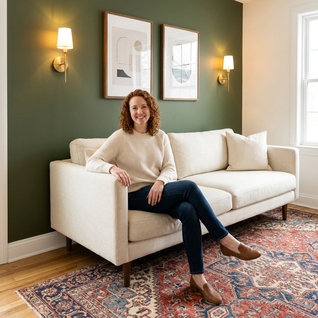
If you choose the wrong wall, even the prettiest paint color will feel like a random rectangle. The best modern accent walls are the ones that make architectural sense.
The best candidates
- The natural focal point wall: the wall you look at first when you enter the room.
- A wall with an anchor: fireplace, bed headboard, built-ins, dining buffet, or a sofa wall that is long and uninterrupted.
- A wall with symmetry: centered window, centered bed, or evenly spaced doors that will look even sharper with contrast.
Walls to avoid
- The “leftover” wall you chose only because it was empty.
- A wall chopped up by too many doors, unless you are intentionally doing color drenching (more on that below).
- Half-walls behind a TV unless you are also dealing with cable management and glare. TVs love to expose bad lighting and uneven paint sheens.
A theater trick for picking the wall
Stand in the doorway and take a photo straight ahead. Then take one from the most-used seat in the room. If the same wall shows up as the “background” in both shots, that is your accent wall. You are choosing the wall that will appear in your real life, not just on moving day.
Step 2: Pick an accent wall style
Modern does not mean loud. It means edited. The most contemporary accent walls use either a grounded color, a quiet texture, or a clean geometric decision that relates to the room’s architecture.
Option A: Deep, softened paint
Skip neon brights and ultra-saturated “statement” colors. Choose a deeper shade with a touch of gray, brown, or black in it. Those undertones keep it grown-up and flexible.
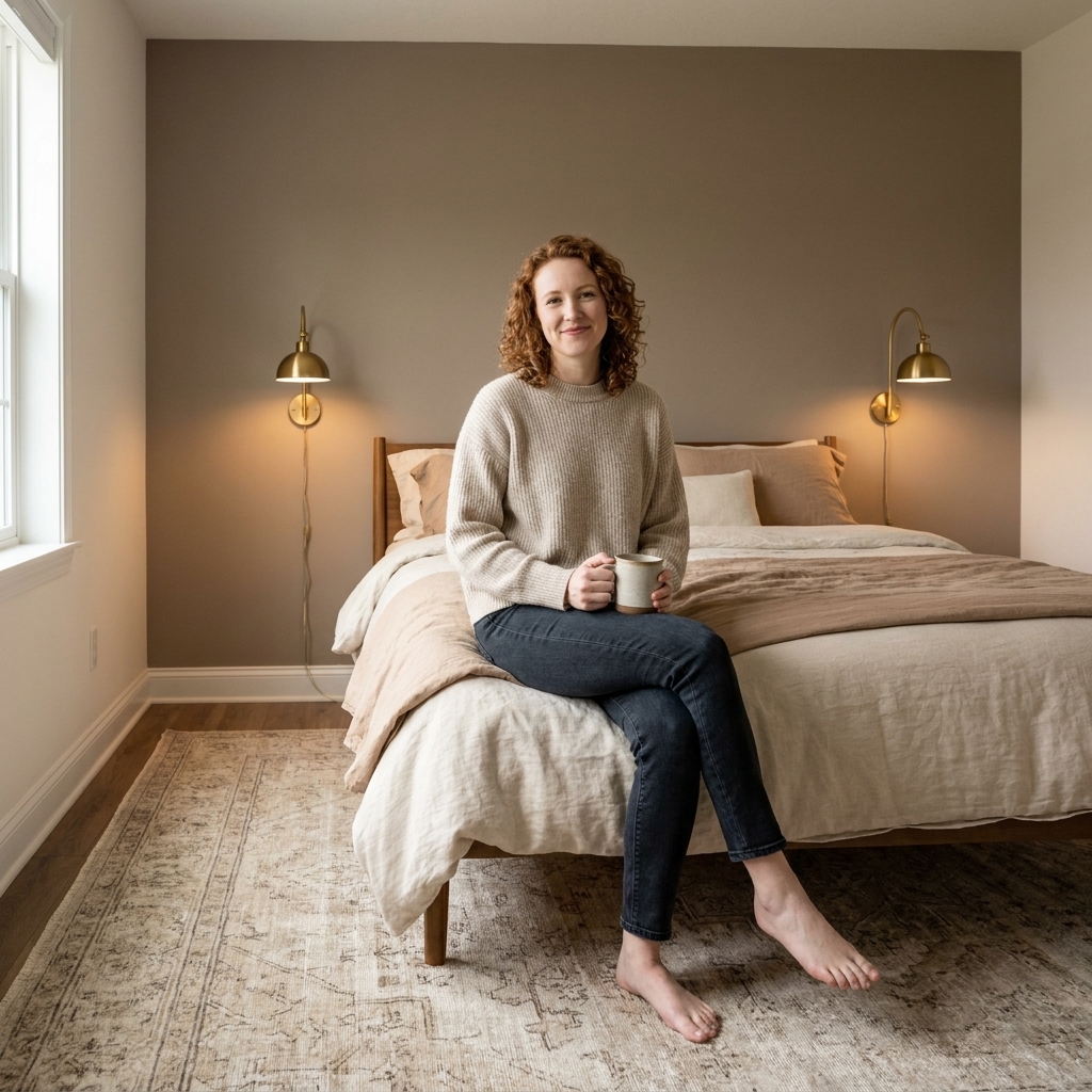
- Modern neutrals: warm greige, mushroom taupe, soft clay, putty, café au lait.
- Moody classics: inky navy, deep olive, charcoal, espresso brown.
- Fresh but not trendy: dusty teal, muted terracotta, softened aubergine.
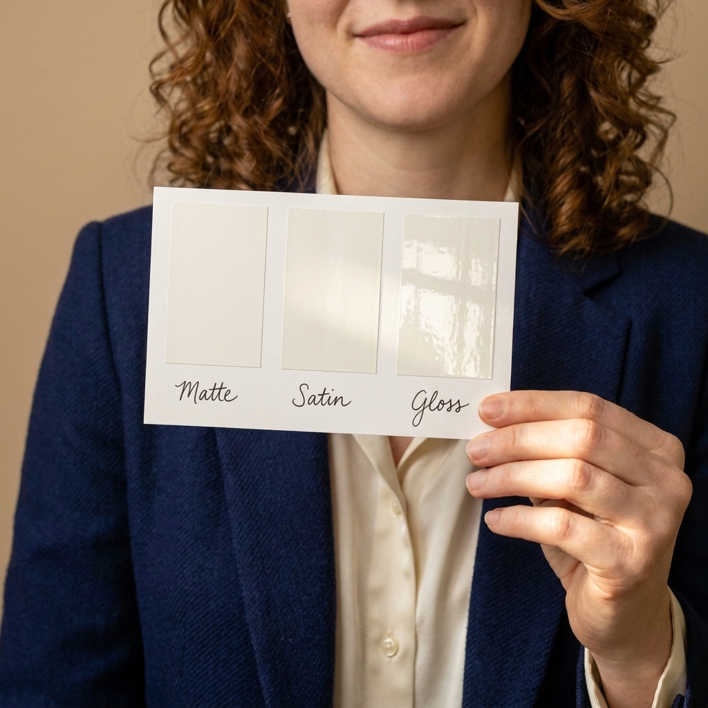
Finish tip: Matte or eggshell usually reads the most modern. If you are painting a high-traffic space (hallway, kids’ room, entry), consider eggshell for easier wipe-downs. High-gloss can be stunning, but it highlights every drywall wobble and patch job.
Option B: Limewash or mineral paint
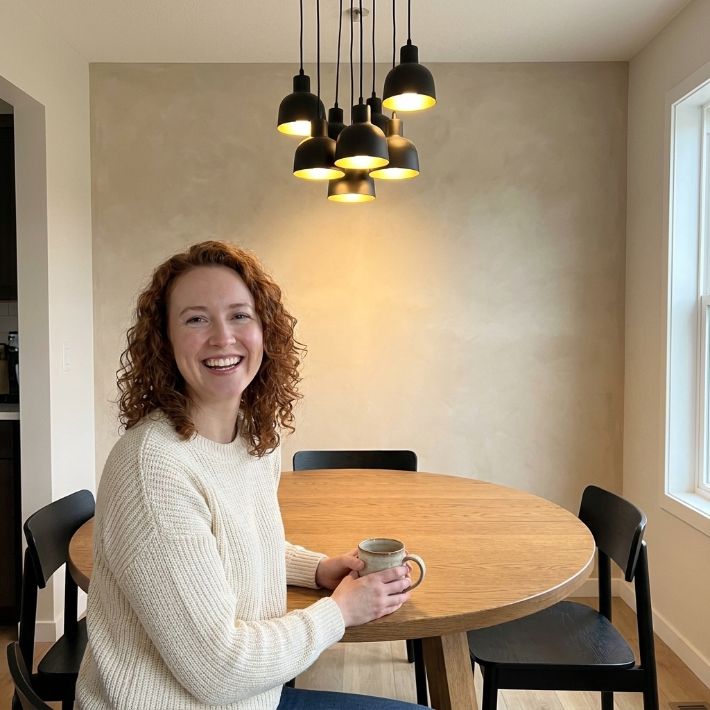
If you want depth without a “painted rectangle” vibe, limewash is your friend. It creates a velvety, clouded variation that feels architectural, not crafty.
- Best in bedrooms, dining rooms, and living rooms with warm lighting.
- Choose a grounded shade: chalky white, sand, stone, warm gray, or muted olive.
- Plan for a slightly imperfect finish. That is the point.
Option C: Modern paneling
Paneling looks current when the lines are clean and the scale is right. Think vertical slats, thin battens, or simple box molding. Avoid overly ornate shapes unless your home is already traditional.
- Vertical slats add height and look sleek behind a bed.
- Thin battens can make a plain wall feel designed without stealing the show.
- Paint it the same color as the wall for a modern, subtle effect.
Option D: Wallpaper with quiet pattern
Wallpaper becomes dated fastest when the pattern screams a specific year. A modern approach is to use texture or a low-contrast motif.
- Grasscloth or faux grasscloth for warmth and depth.
- Muted geometrics with lots of negative space.
- Organic murals in soft tones, especially in dining rooms and powder rooms.
Renter-friendly options
If you want the look without the long-term commitment, go removable: peel-and-stick wallpaper, a large-scale fabric wall hanging, or a temporary picture ledge and oversized art. Even a bold paint color can be renter-friendly if your lease allows repainting before move-out.
Step 3: Choose an intentional contrast
Here is the guideline that keeps accent walls from looking like an afterthought: your accent wall color should repeat somewhere else in the room, at least once (twice is even better). That small echo is what makes the wall feel connected, not random.
A simple formula
- Start with what you cannot easily change: flooring, large sofa, countertops, or a big rug.
- Pull your accent from that palette: choose a color already present in the undertones or pattern.
- Go a few shades deeper than the dominant wall color as a modern starting point, then adjust for your lighting.
Three pairings that age well
- Warm white + deep olive: cozy, grounded, great with vintage rugs and brass lighting.
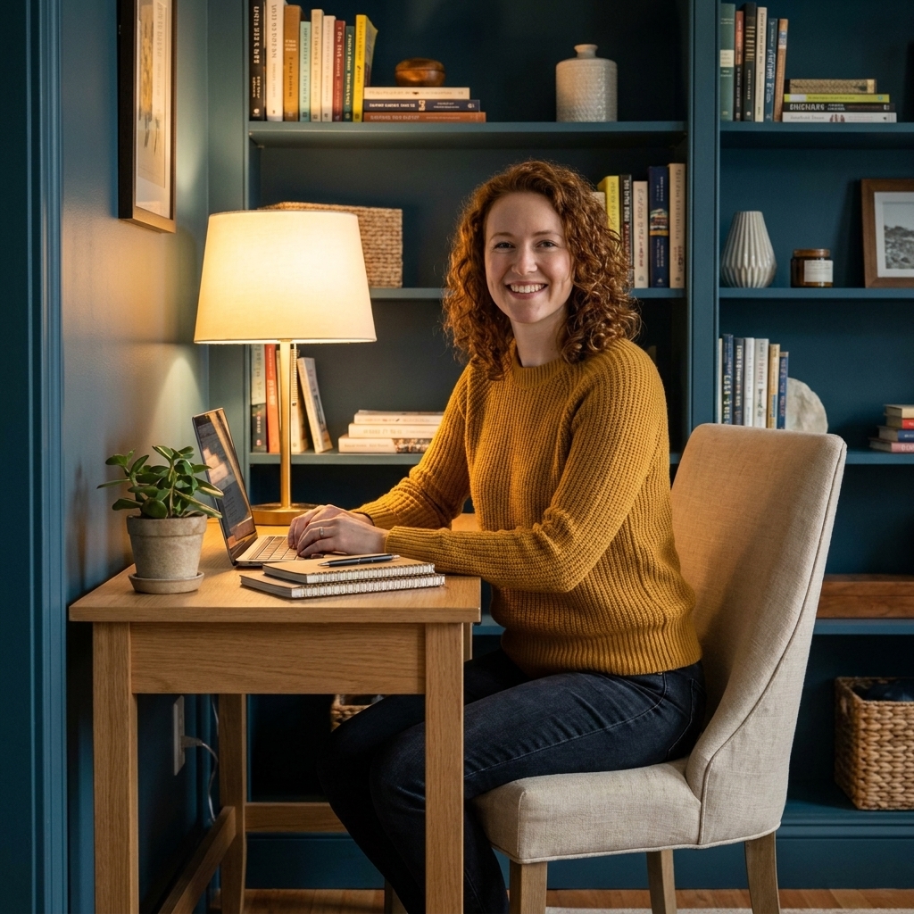
- Soft greige + charcoal: crisp, architectural, ideal for offices and living rooms.
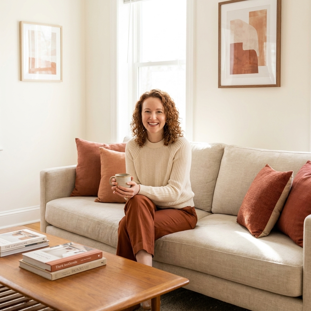
- Sand beige + muted terracotta: warm, flattering, and quietly statement-making.
Undertones matter more than the color name
If your main walls are warm, your accent will usually look best when it leans warm too. If your walls lean cool, stay cool. Mixing undertones is how you end up with a wall that looks “off” no matter how many times you repaint it.
Quick test: Hold a plain white sheet of printer paper up to your existing wall color. If the wall looks creamy, you are in warm territory. If it looks icy or slightly blue-gray, you are in cool territory.
Test the color in real light
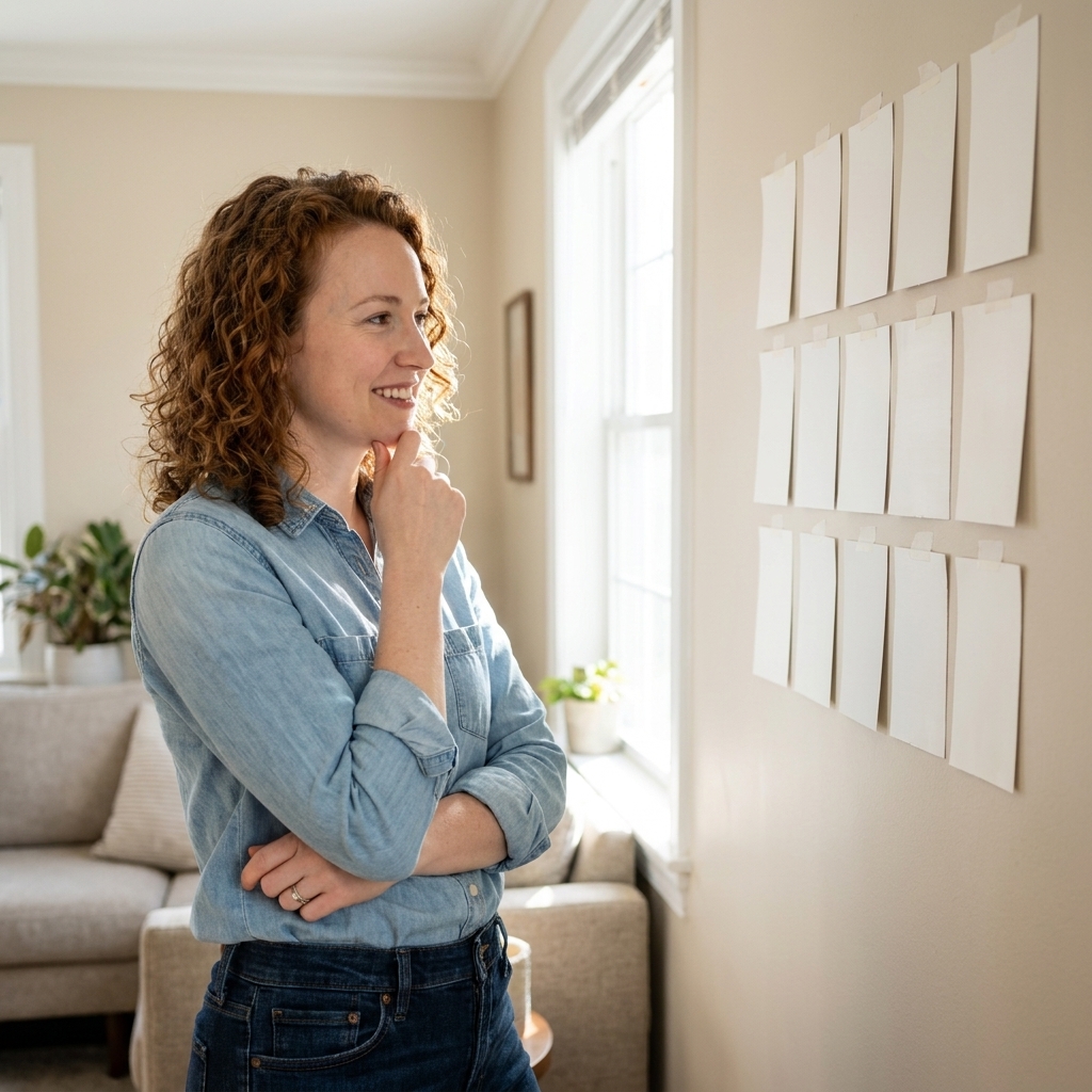
Before you commit, test the color where you will actually see it. Paint a large swatch (or use a peel-and-stick sample) and look at it in the morning, afternoon, and at night with your lamps on. Many “perfect” accent colors fail because they were chosen under one lighting condition only.
Step 4: Plan the edges
Most outdated accent walls fail at the transitions. Modern rooms feel clean because the details are consistent.
Decide how you will handle trim
- Trim stays the same color: the simplest, most timeless option.
- Color drenching (wall + trim + door in the same color): very modern and very cozy. Best for bedrooms, offices, and dining rooms.
- Accent color on the wall only: fine, but make sure the line at the ceiling is sharp and the corners are perfectly cut in.
Make tricky walls look intentional
- Sloped ceilings: consider painting the slope and the accent wall the same color so it reads as one shape.
- Nooks: painting the inside of a nook can look more modern than painting a random full wall.
- Open plan: instead of one loud wall, use a deeper tone on the wall that visually “zones” a space, like the dining area.
Step 5: Execute cleanly
A modern accent wall looks expensive when the finish is smooth and the lines are crisp. You do not need the most expensive paint, but you do need patience.
If you’re painting
- Patch and sand first. Dark colors spotlight dents and nail holes.
- Prime when needed: raw drywall patches, dramatic color changes, or glossy previous paint.
- Use the right roller nap: 1/4" to 3/8" for very smooth walls, 3/8" is a common go-to for most smooth interiors, and 1/2" can help on lightly textured walls. Too thick equals texture you did not ask for.
- Do two solid coats and do not “stretch” the paint thin.
- Remove painter’s tape at the right time: pull it slowly while the paint is still slightly tacky for the cleanest edge.
If you’re adding paneling or slats
- Plan spacing on paper first so you do not end with a tiny sliver at one side.
- Use a level constantly. Modern lines only look modern when they are actually straight.
- Fill holes, caulk seams, and sand before painting. The magic is in the prep.
Step 6: Style it to stay modern
This is the part people skip, and it is the part that keeps the wall from feeling like a trend. The styling should support the wall, not compete with it.
Use the 60 percent rule
Whatever you hang on the accent wall should take up roughly 60% of the width of the furniture below it.
- Over a sofa: aim for one large piece or a tight grouping, not scattered minis.
- Over a bed: a wide art piece, a pair, or a long picture ledge feels modern and calm.
Choose fewer, larger pieces
Lots of small frames can read busy fast. A modern accent wall usually looks best with one of these:
- One oversized artwork
- Two matching verticals
- A single sculptural mirror
- Picture ledge with 2 to 4 layered frames
Warm lighting helps
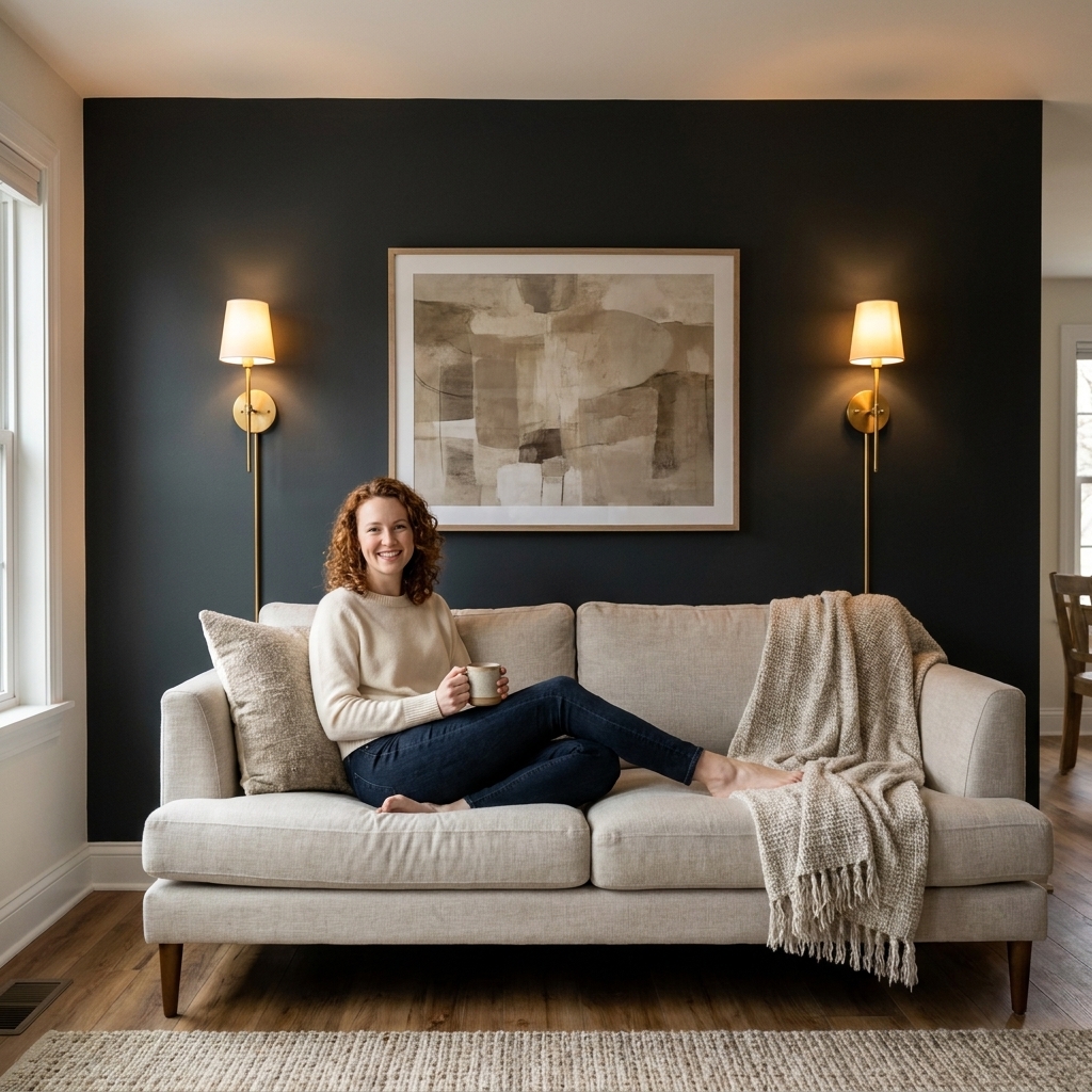
Accent walls look richer under warm, layered light. For instant designed energy, add a pair of plug-in sconces or a floor lamp that washes the wall.
- Use warm bulbs (around 2700K to 3000K) for cozy spaces.
- Aim light across texture (limewash, grasscloth, slats) to highlight depth.
Ideas by room
Living room
- Paint the fireplace wall a deep, softened tone and keep trim consistent.
- Use built-ins as the accent by painting them a shade darker than the walls.
- If the TV is involved, choose matte or eggshell paint and plan cable management first.
Bedroom
- Behind the bed is the easiest choice. Add symmetry with sconces or matching nightstands.
- Vertical slats in the same color as the wall look modern and cozy.
- Try color drenching in a muted moody tone for a boutique-hotel feel.
Dining room
- Limewash or a warm matte paint makes candlelight look incredible.
- Wallpaper works beautifully here because dining rooms are often used in shorter, special bursts.
Entryway
- Make a small entry feel intentional with a darker accent behind a slim console table.
- Add one statement mirror and a warm lamp. Done.
Common mistakes
- Choosing a wall with no reason. Start with focal point and function.
- Too much contrast with no repeat in the room. Echo the color in textiles or decor.
- Using trendy patterns at full volume. Quiet texture ages better than bold novelty prints.
- Messy edges and bumpy walls. Prep is what makes it look high-end.
- Over-decorating the accent wall. Let it breathe.
Quick checklist
- I chose the wall I see most often and it has a natural anchor.
- The accent color or texture relates to my rug, flooring, or main furniture.
- I tested the color in morning light, afternoon light, and at night.
- I know how I am handling trim and transitions.
- I have a styling plan (one big piece, a pair, or a ledge), not a random gallery scatter.
- I have warm lighting to make the wall look rich at night.