A room’s exposure can make the same paint look icy, muddy, or blazing warm. Here’s how to pick the right color for north, south, east, and west-facing ro...
Havitza Home
Welcoming Entryway Paint Colors
Set the tone the moment you step inside. These bold, neutral, and moody entryway paint colors make hallways and foyers feel warm, intentional, and unforgettable.

Clara Jenkins
Clara Jenkins is a former theater set designer turned interior styling expert with over a decade of experience transforming everyday spaces into beautiful sanctuaries. Through her work at havitza.com, she shares practical styling tips, accessible furniture layouts, and inspiring color palettes to help anyone create a home they truly love.
Published October 17, 2026
Updated October 17, 2026
Your entryway is your opening scene. In theater, we called it the first reveal, the moment the audience knows what kind of story they are walking into. At home, paint can do that job faster than a console table ever could. The right color can make a narrow hall feel gracious, a dark foyer feel intentional, and a basic builder-grade entrance feel like it belongs to someone with point of view.
Below are my favorite welcoming entryway paint colors, grouped into bold, neutral, and moody families, plus quick tips for choosing sheen, handling tricky light, and pairing your walls with floors and trim.
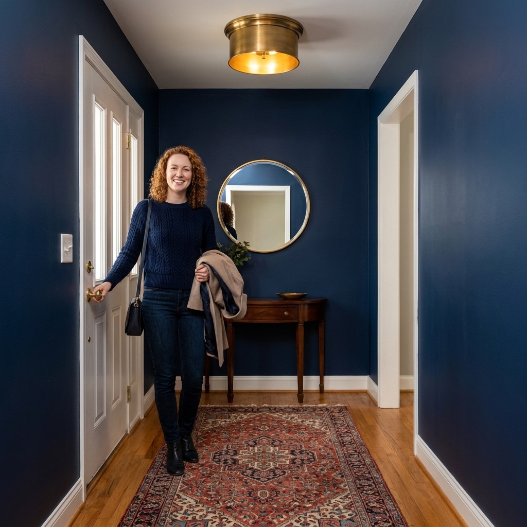
How to pick the right entryway color
Start with the light you actually have
Entryways are notorious for mixed lighting. You might have daylight spilling in from the door, a warm overhead fixture, and cooler light bouncing from adjacent rooms. Before committing, paint large swatches on two walls and check them in the morning, afternoon, and at night.
- North-facing or shaded entries: Lean warmer. Think creamy whites, warm greiges, soft clays.
- South-facing bright entries: You can go deeper or cooler without it feeling gloomy. Navy, olive, charcoal, or crisp white work well.
- No-window foyers: Treat it like a jewel box. Saturated color plus cozy bulbs looks rich, not sad.
Sample without making a mess
Entryways are high-traffic, so I like testing on a painted poster board you can move around, or using peel-and-stick samples. Either way, go big. A tiny swatch lies. A large sample tells the truth, especially near trim and flooring.
Match undertones to what you cannot change
Your entryway is usually full of fixed elements: tile, stone, brick, wood floors, a staircase, even a big front door. Before choosing paint, decide what those surfaces are doing.
- Warm woods (oak, honey maple) and warm tile: Creamy whites, warm greiges, clay tones, olive.
- Cool stone (gray slate) and cooler floors: Blue-grays, crisp whites, deeper navies, charcoal.
- Mixed materials: A balanced greige or a smoky blue-gray is often the easiest bridge.
Choose a finish that forgives scuffs
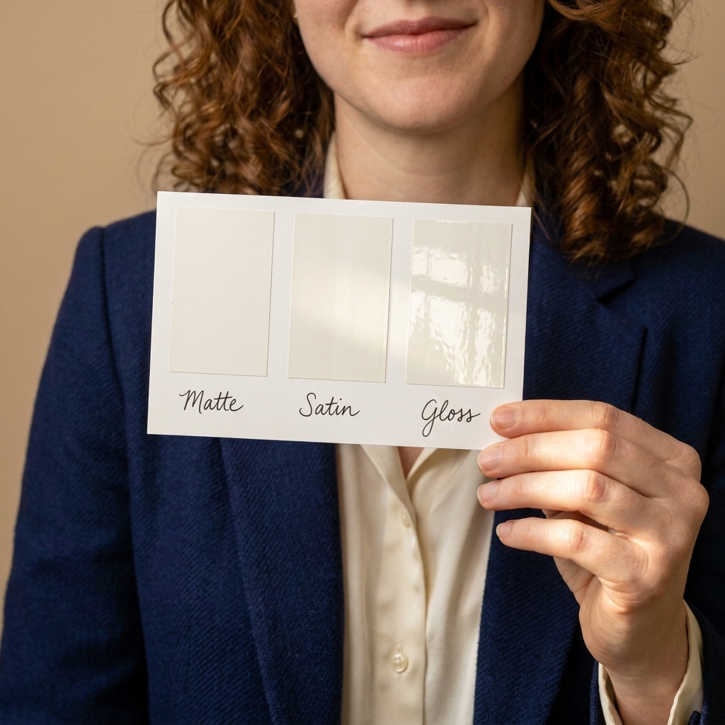
Entryways take a beating, so pick a finish that wipes clean. I like eggshell for most walls. If you have kids, pets, or lots of bags brushing past the wall, satin is your friend. Save flat for ceilings and very low-traffic areas.
For the details most people forget: trim and doors usually look best in semi-gloss (or a durable satin enamel if you prefer a softer look). It holds up to fingerprints and makes the architecture feel crisp.
Decide if you want blend or statement
There are two great strategies:
- Blend: Use a color that flows into the adjacent space so the home feels calm and cohesive.
- Statement: Go bolder in the entryway to create contrast, then soften as you move deeper into the home.
Bold entryway paint colors
Bold does not have to mean loud. In an entryway, a saturated color can feel grounded and welcoming, especially when you pair it with softer lighting and tactile textiles like a woven runner or a vintage rug.
Deep navy
Why it works: Navy reads classic and tailored, like a great blazer. It can help disguise everyday wear, looks gorgeous with brass, and makes art pop.
Try: Benjamin Moore Hale Navy, Sherwin-Williams Naval, Farrow & Ball Hague Blue (very deep and dramatic).
Pairs well with: White trim, walnut or oak, natural fiber baskets, a warm-toned runner.
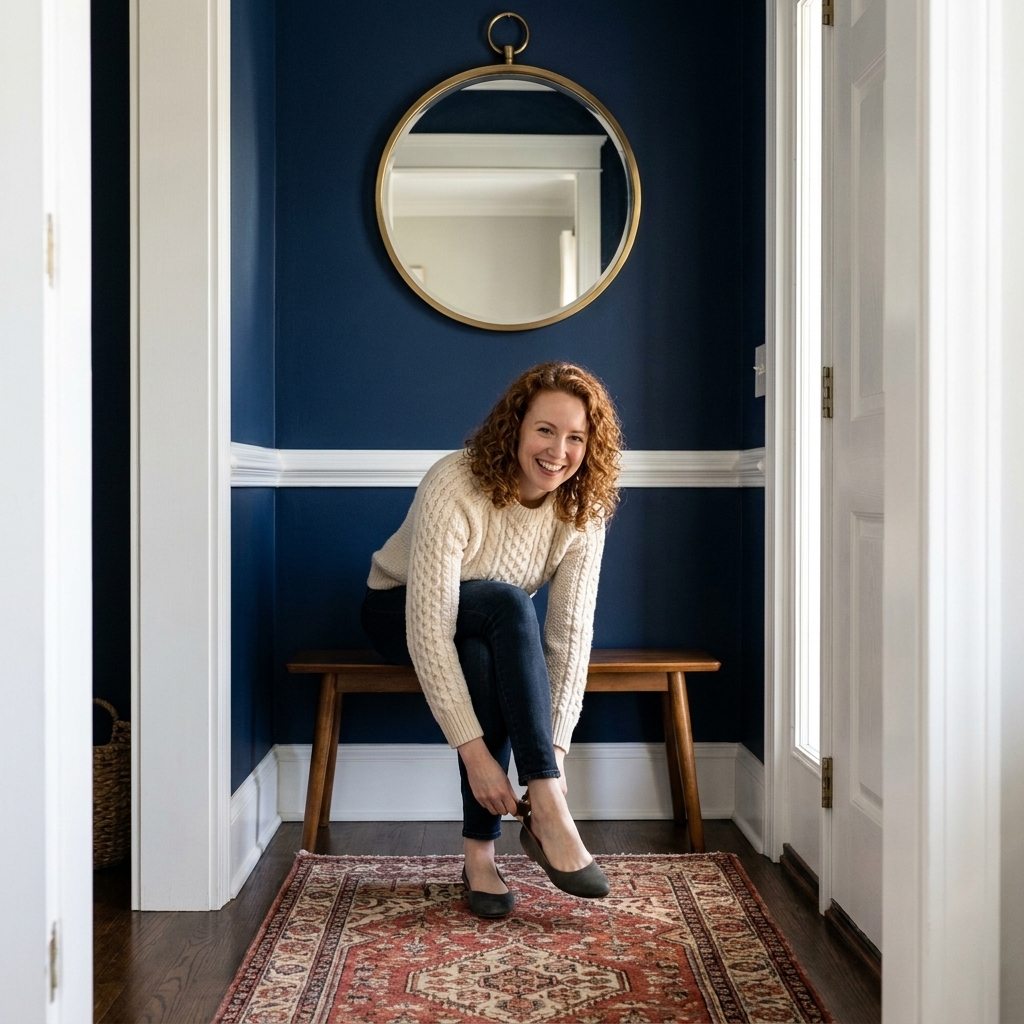
Forest green
Why it works: Green feels restorative and rooted. It also plays nicely with wood floors and natural textures.
Try: Benjamin Moore Essex Green, Sherwin-Williams Ripe Olive, Farrow & Ball Studio Green.
Pairs well with: Antique brass, black hardware, terracotta accents, and framed botanical prints.
Terracotta clay
Why it works: Clay tones feel human and cozy. They also tend to flatter skin tones in warm indoor light, which is a nice bonus when you are checking your look before heading out the door.
Try: Benjamin Moore Terra Cotta Tile, Sherwin-Williams Cavern Clay, Farrow & Ball Red Earth.
Pairs well with: Creamy trim, jute, aged wood, and warm metals.

Inky teal
Why it works: Teal sits between blue and green, so it feels bold yet sophisticated. It is especially stunning with vintage rugs and cozy light.
Try: Benjamin Moore Aegean Teal, Sherwin-Williams Riverway, Farrow & Ball Vardo (brighter, playful).
Pairs well with: Aged brass, creamy whites, and dark stained wood.
Neutral entryway paint colors
Neutrals are not boring when you choose them intentionally. The best entryway neutral is one that makes the space feel calm the second you step inside.
Creamy off-white
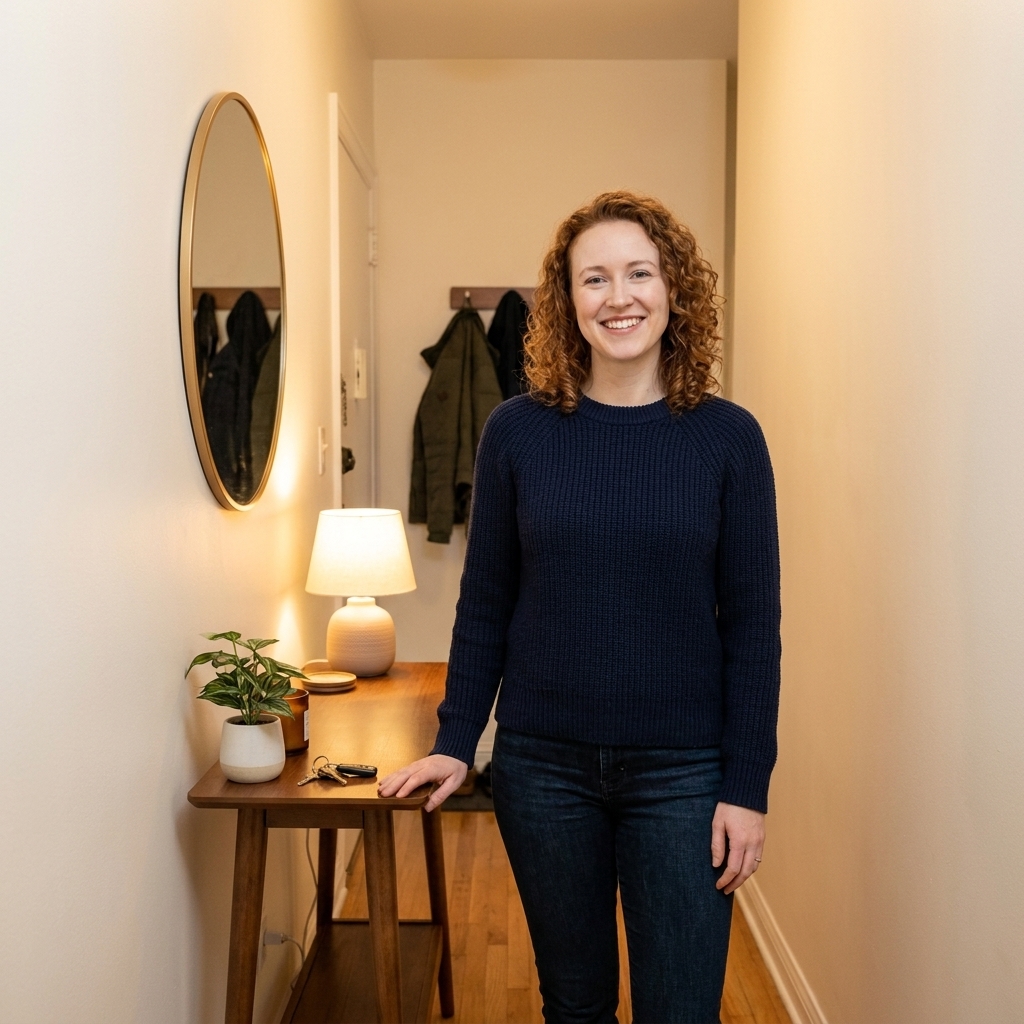
Why it works: Creamy whites are welcoming in a way stark whites rarely are. They soften shadows and make narrow halls feel more generous.
Try: Benjamin Moore White Dove, Sherwin-Williams Alabaster, Farrow & Ball School House White.
Pairs well with: Natural wood tones, black accents, woven textures, and any rug palette.
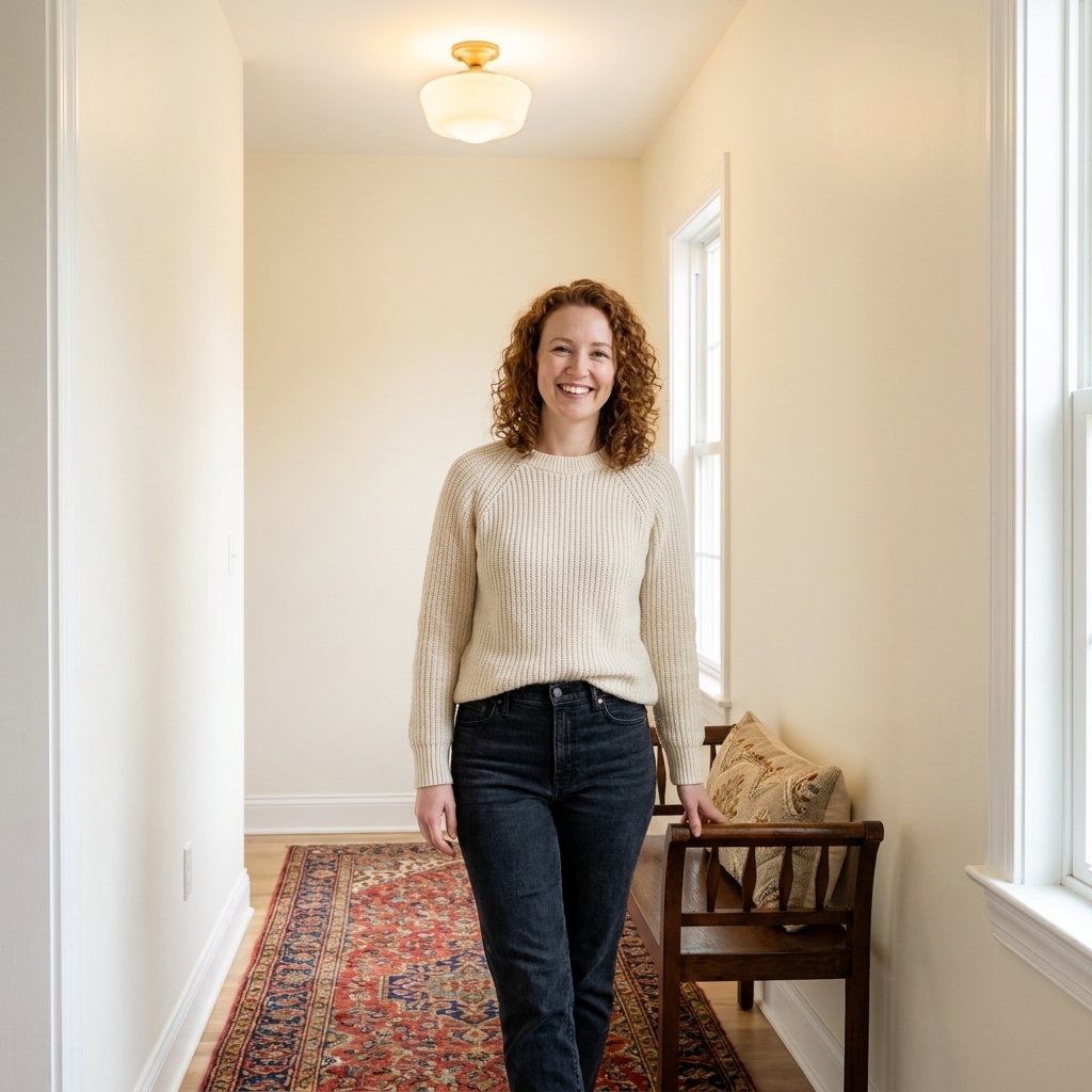
Warm greige
Why it works: A balanced greige bridges warm and cool elements, which is handy if your entryway connects rooms with different styles.
Try: Benjamin Moore Edgecomb Gray, Sherwin-Williams Accessible Beige, Farrow & Ball Drop Cloth.
Pairs well with: Brushed nickel or black hardware, warm oak floors, and soft linen textiles.
Mushroom taupe
Why it works: Taupe has quiet depth. It feels elevated, especially in foyers with lots of trim or paneling.
Try: Benjamin Moore Pashmina, Sherwin-Williams Balanced Beige, Farrow & Ball Skimming Stone.
Pairs well with: Layered neutrals, stone planters, and cozy lighting.
Soft putty beige
Why it works: Putty tones are gentle and forgiving. They make colorful coats, bags, and artwork stand out without visual noise.
Try: Benjamin Moore Pale Oak, Sherwin-Williams Natural Linen, Farrow & Ball Dimity.
Pairs well with: Matte black hooks, a woven basket for shoes, and pale wood consoles.
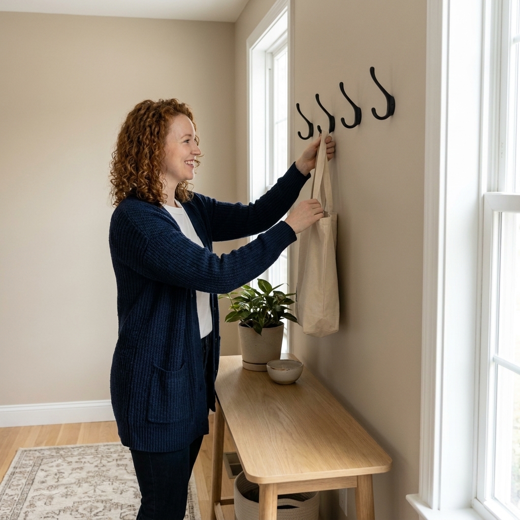
Moody entryway paint colors
If your entryway is small or lacks windows, moody color can be magic. Think of it like a velvet curtain at the start of a show. It signals intention and makes the rest of the house feel even brighter by comparison.
Charcoal gray
Why it works: Charcoal feels architectural. It is sleek, modern, and surprisingly inviting when paired with softer bulbs.
Try: Benjamin Moore Kendall Charcoal, Sherwin-Williams Peppercorn, Farrow & Ball Railings.
Pairs well with: Bright white trim, oak floors, and a bold runner.
Chocolate brown
Why it works: Brown is back because it feels grounding. In an entry, it reads cozy and elevated, especially with warm metals and textured textiles.
Try: Benjamin Moore Bittersweet Chocolate (deeper), Sherwin-Williams Turkish Coffee, Farrow & Ball Tanner’s Brown.
Pairs well with: Brass, cream upholstery, and vintage frames.

Smoky blue-gray
Why it works: This is the calm sweater of moody colors. It has depth without feeling heavy, and it transitions beautifully into open-plan spaces.
Try: Benjamin Moore Boothbay Gray, Sherwin-Williams Smoky Blue, Farrow & Ball De Nimes.
Pairs well with: Soft white trim, brass, and warm wood.
Dusty olive
Why it works: Olive reads natural and sophisticated. It also helps camouflage everyday wear in high-traffic hallways.
Try: Benjamin Moore Saybrook Sage (lighter), Sherwin-Williams Retreat, Farrow & Ball Olive.
Pairs well with: Vintage rugs, leather accents, and warm cream textiles.
My favorite entryway formulas
If you like a clear recipe, here are a few tried-and-true combinations that look pulled together fast.
- Navy walls + crisp white trim + brass light: Classic, high-contrast, always flattering.
- Cream walls + soft black accents + vintage runner: Bright and welcoming with instant character.
- Olive walls + wood bench + woven baskets: Earthy, relaxed, and beautifully functional.
- Charcoal walls + bright art + mirror: Modern drama with a gallery-like feel.
- Terracotta walls + creamy trim + natural fiber rug: Warm, sunny, and approachable.
Entryway paint tricks
Use paint to shape an awkward hallway
- Long, narrow hall: Paint the end wall a deeper shade to visually shorten the run.
- Low ceiling: Keep the ceiling a clean, bright white and use a lighter wall color, or bring the wall color just a couple inches onto the ceiling to soften harsh edges.
- Lots of doors: Consider painting doors the same color as the walls for a calmer, more custom look.
Do not forget the ceiling
A subtle ceiling color can make an entryway feel designed, not just painted. Try a softer version of the wall color or a warm white that matches your trim undertone.
Dark paint loves good prep
Moody colors can spotlight wall texture and dings, especially in raking light. A little sanding, patching, and a quality primer goes a long way. If your walls get a lot of contact, consider a more washable paint line in eggshell or satin.
Pick bulbs that flatter the paint
Entryways generally look best in a warmer range. Aim for roughly 2700K to 3000K. 2700K reads cozier, 3000K can feel neutral-warm, and it varies by bulb and fixture.
If you go moody, this detail matters.
Quick FAQs
Should an entryway be lighter or darker than the rest of the house?
Either can work. A lighter entryway feels airy and open. A darker entryway feels intentional and cozy, and it can make adjoining rooms feel brighter. The best choice is the one that matches your home’s mood and your real-life lighting.
What paint colors help a small entryway feel bigger?
Creamy whites, soft putty beiges, and warm greiges tend to expand space visually. Pair them with a large mirror and a simple runner to keep the sightline clean.
Can I use a bold color if my entryway has no natural light?
Yes. Saturated color can look especially rich in a windowless foyer. The trick is cozy bulbs, a finish that reflects a little light (eggshell or satin), and a lighter rug to keep the floor feeling lifted.
What is the most forgiving color for scuffs and fingerprints?
Mid-tone colors in eggshell or satin are usually the most forgiving. Think warm greige, dusty olive, smoky blue-gray, and charcoal.
A final designer secret
If your entryway color makes you want to turn around and look at it after you shut the door, you picked the right one. Paint is one of the fastest ways to make your home feel like it has a heartbeat. Start at the front door, and the rest of your spaces will follow.